- Fuego Yámana
- /
- Robles
Robles
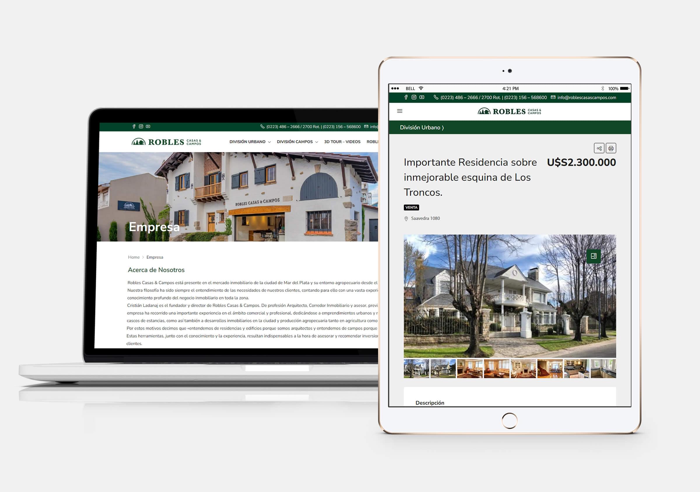
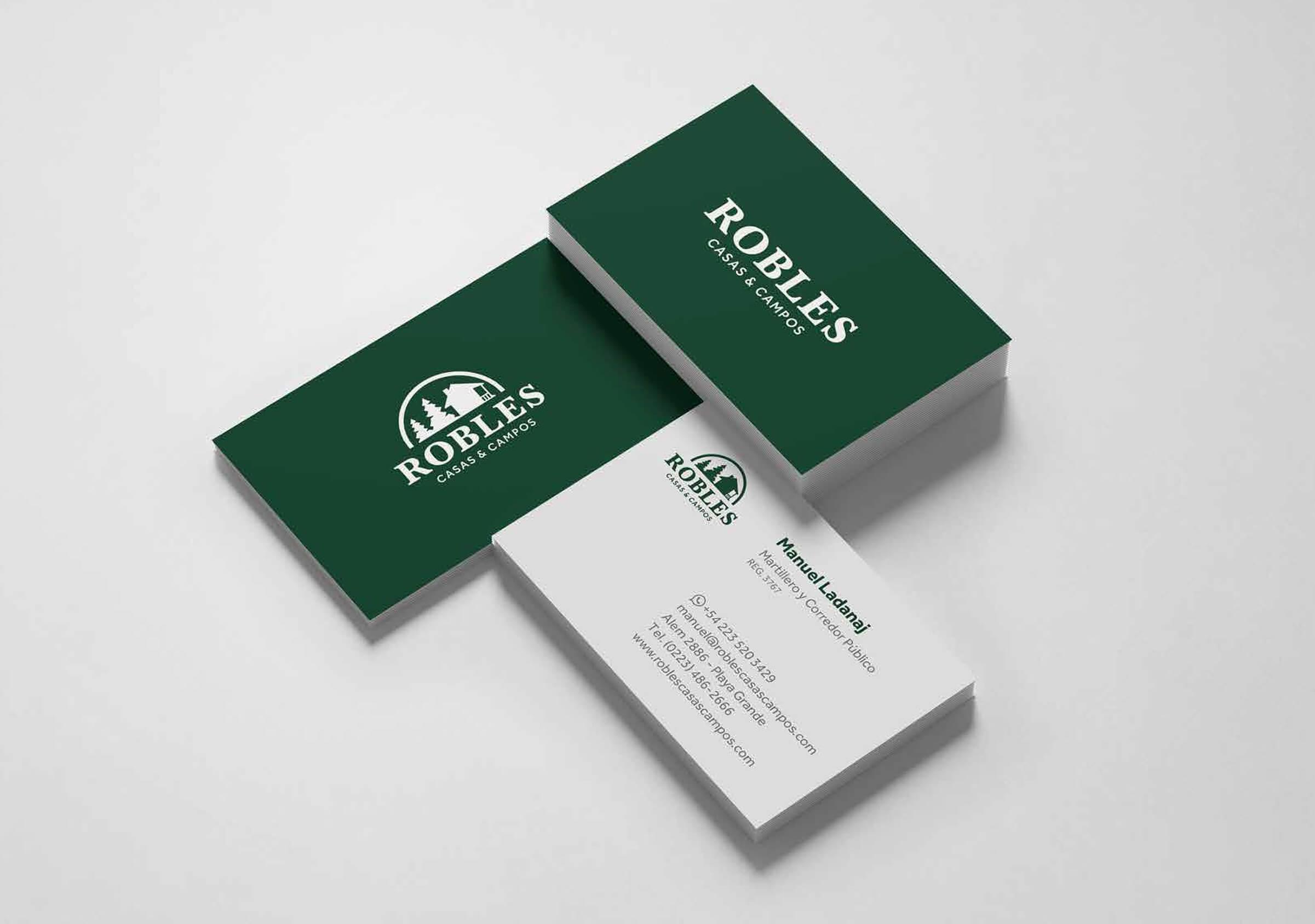
Brand refresh and web development for the prestigious real estate agency Robles. The new brand sought to give more visibility and freedom to its application, both in the digital and offline world, resolving two main issues: an excess of elements in the graphic pieces and the lack of standardization in the use of its corporate identity. Regarding the website, the objective was to organize the offer of its two divisions, houses and fields, with site that has 90% of its content dynamic and it’s connected to its CRM.
roblescasascampos.com/
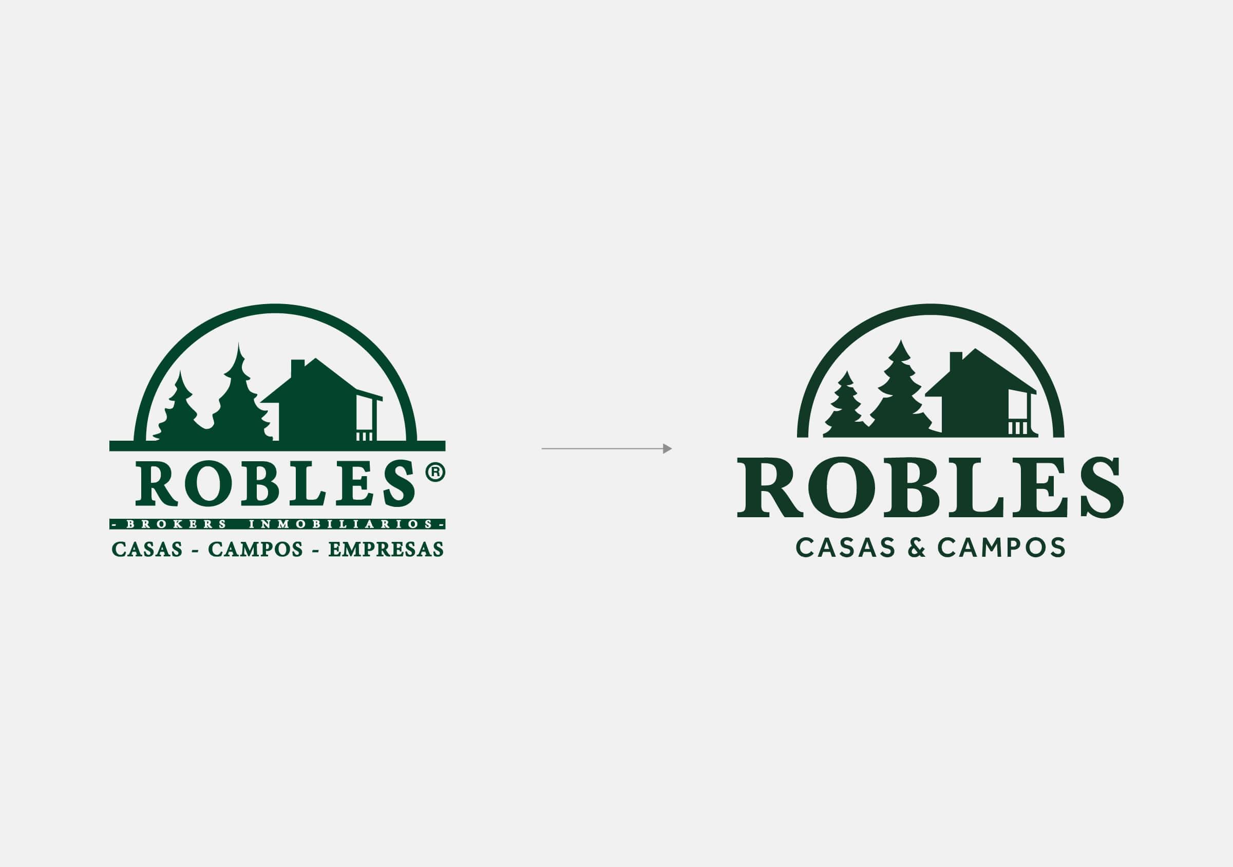
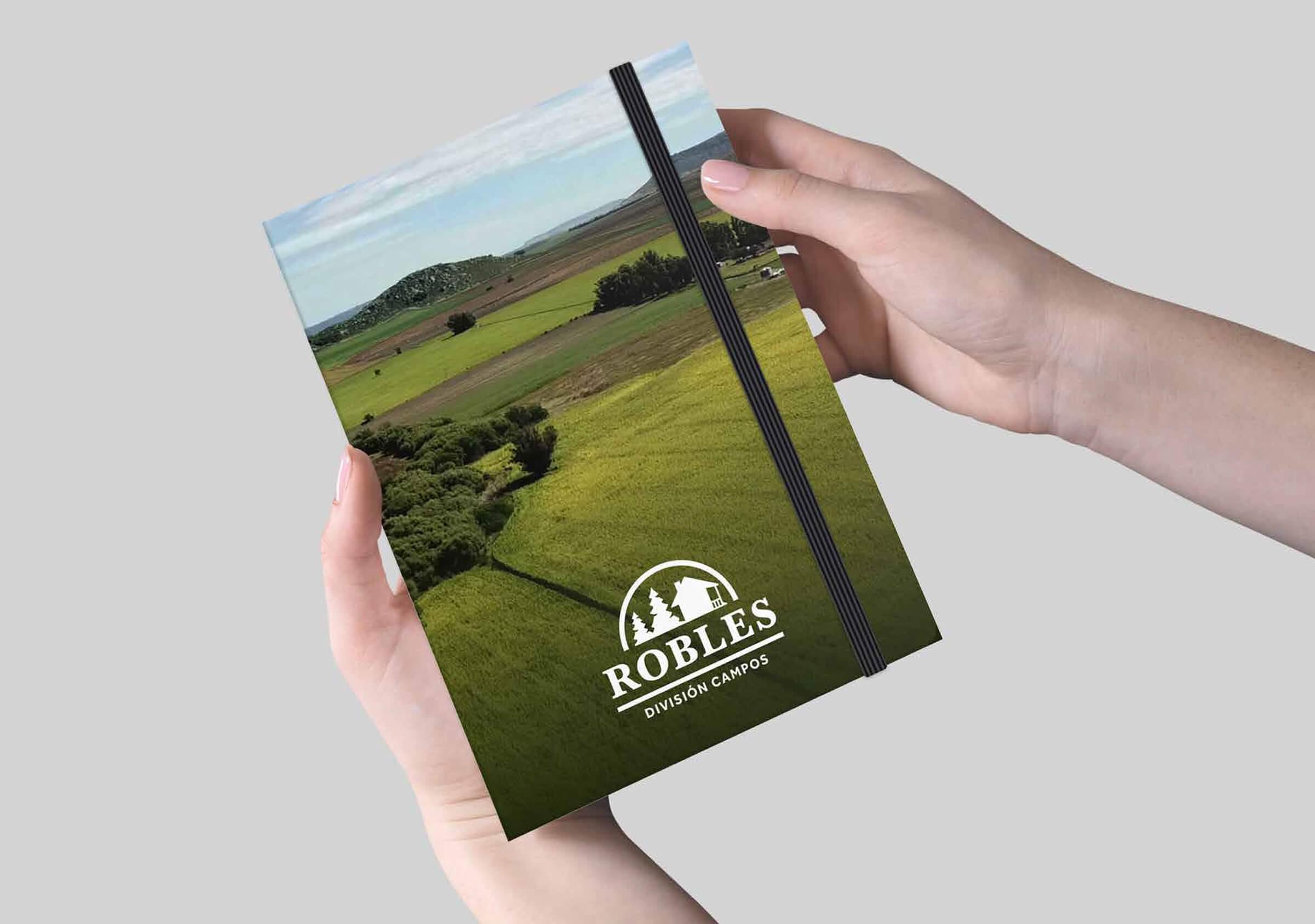
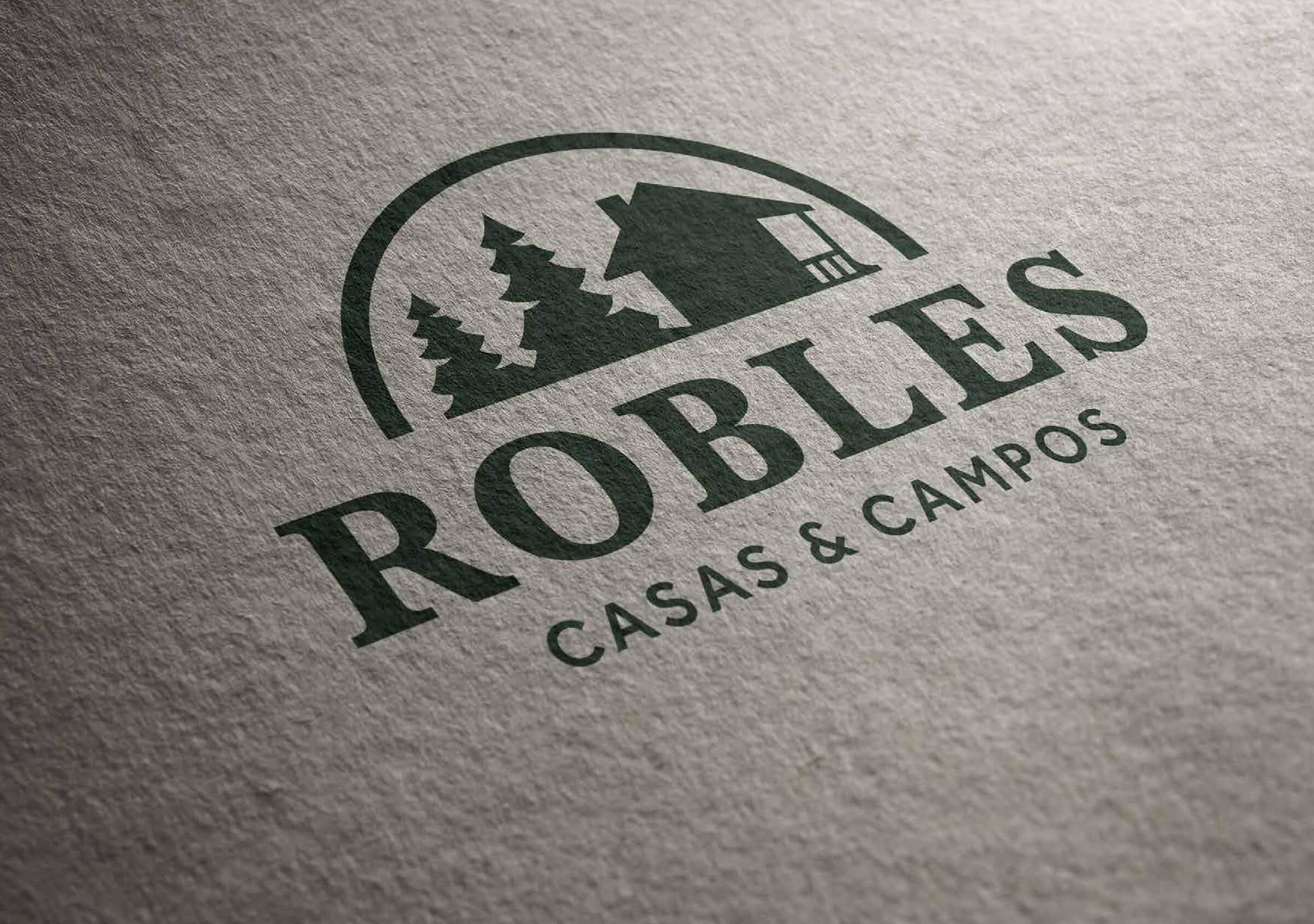
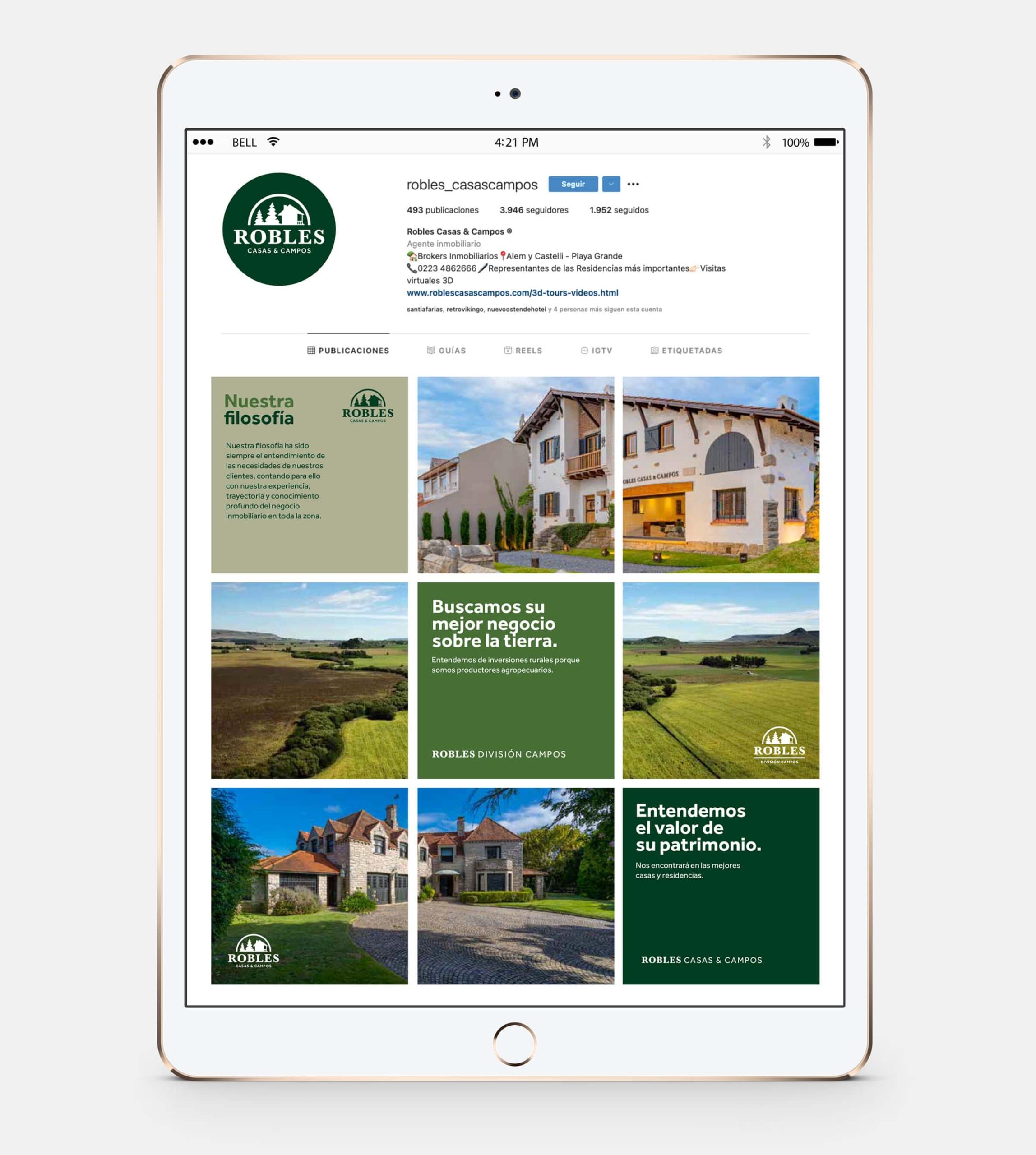
Starting from a figurative symbol (a house with two pines) and a primary color palette already defined and recognized in the market, the project focused on reviewing and optimizing the different elements of the visual identity program, as well as their uses.
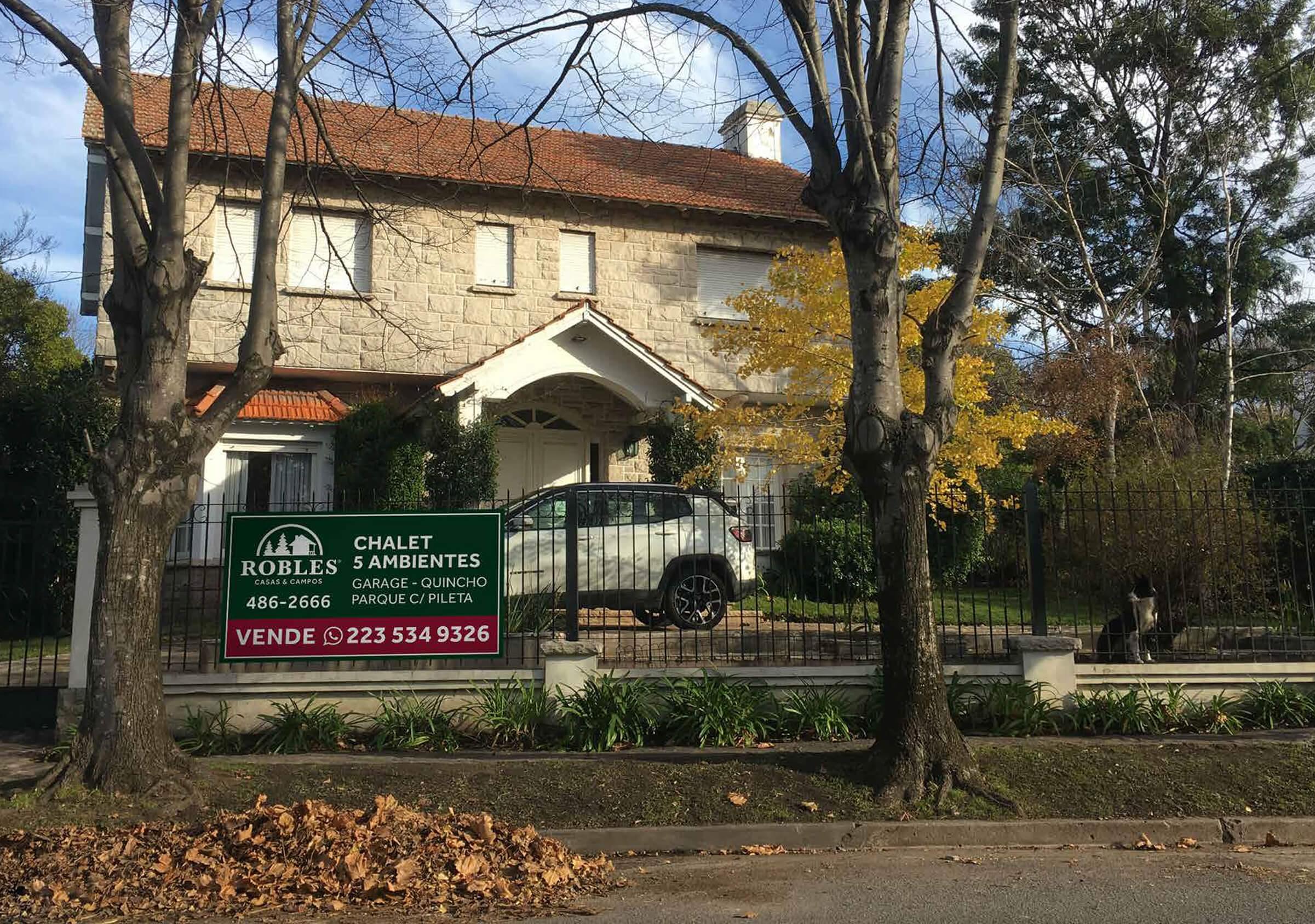
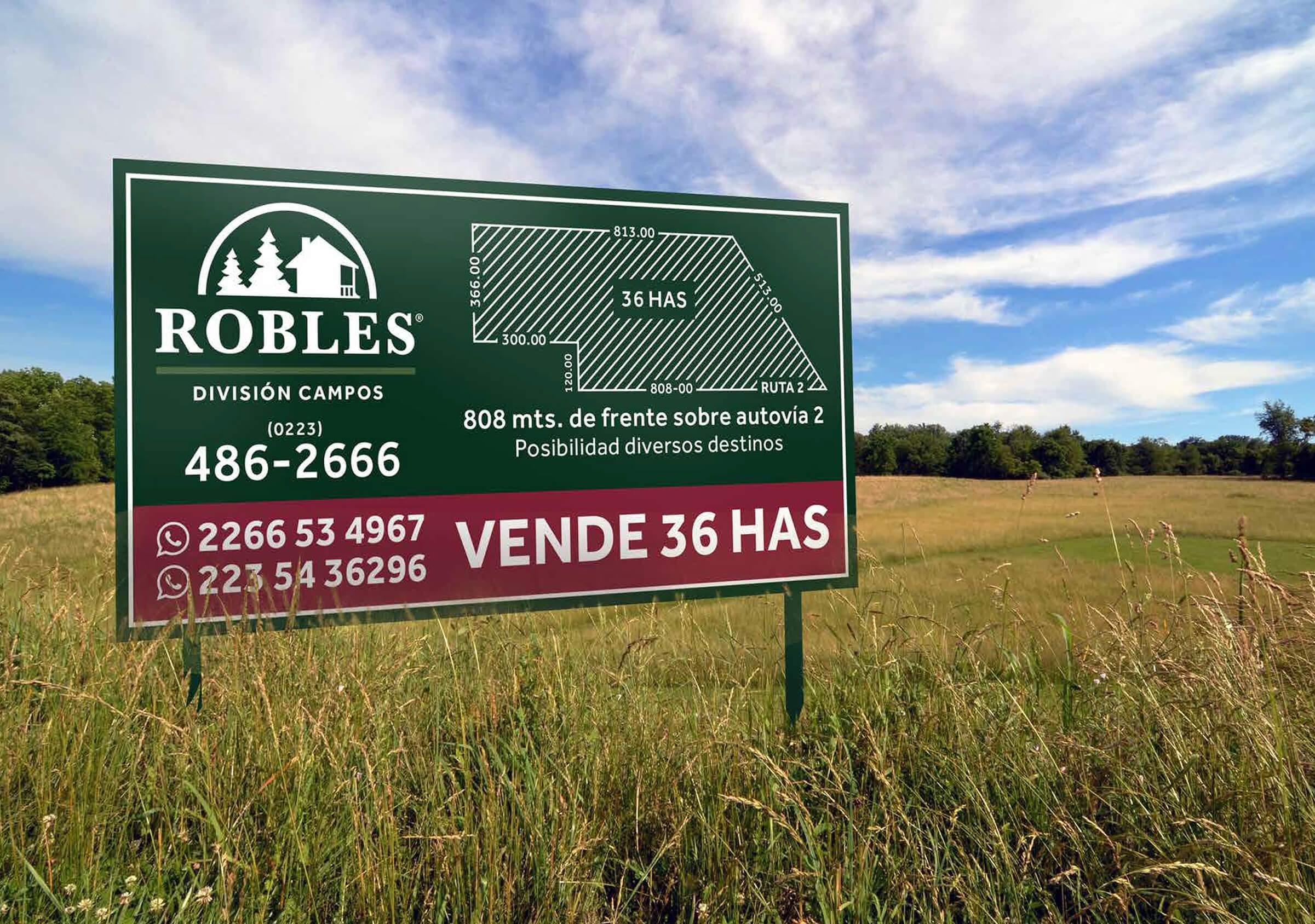
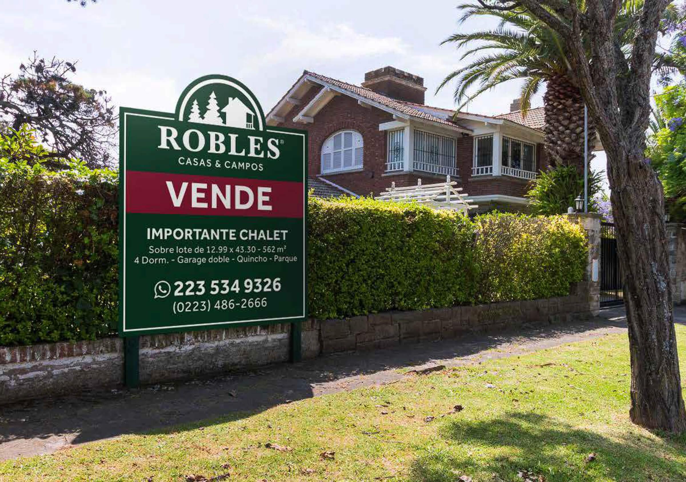
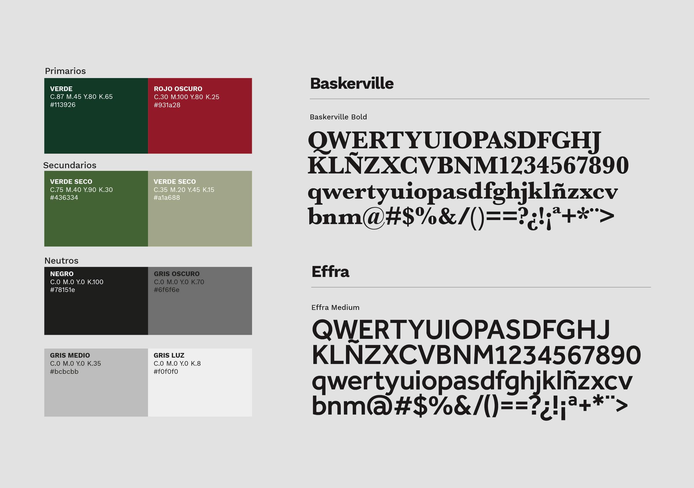
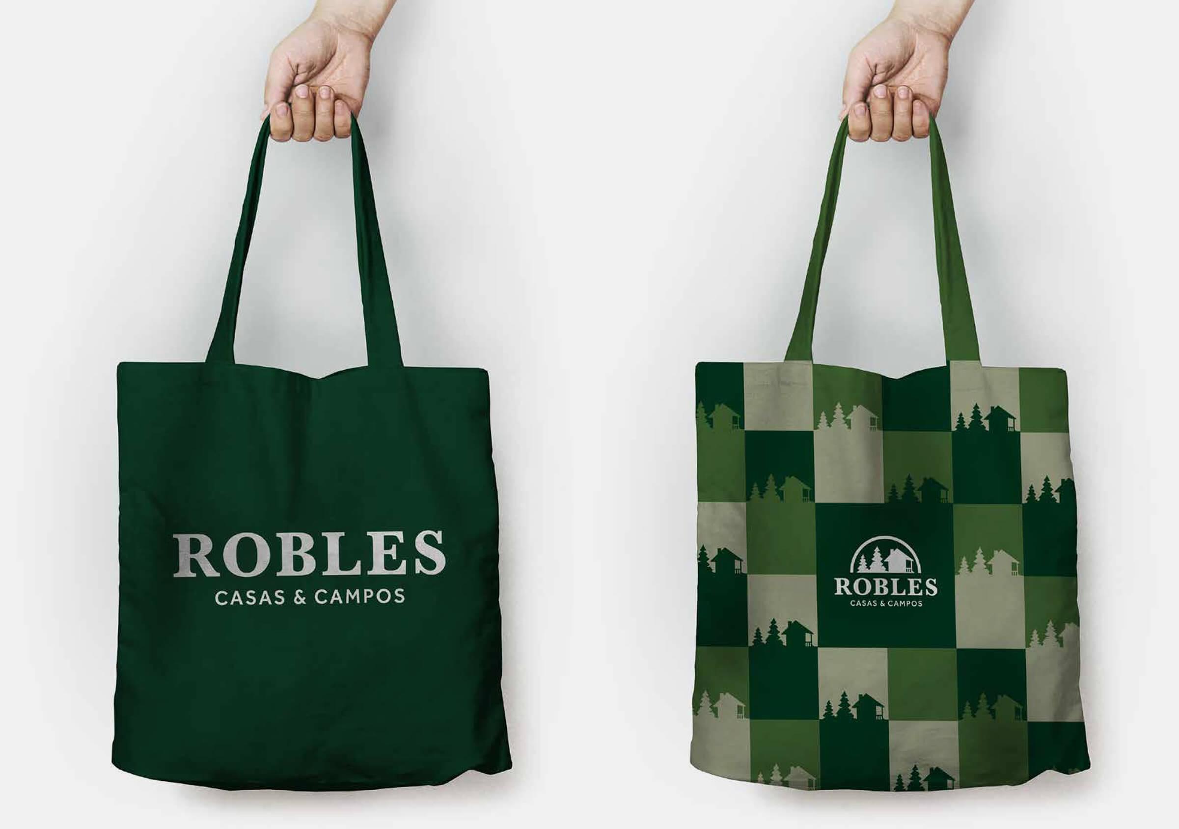
New fonts were chosen for the brand, selecting Baskerville as the main type for the logo and Effra as the complementary alternative. At the same time, the color palette was normalized, providing a new range of greens and neutral tones that collaborates in the architecture of the brand.
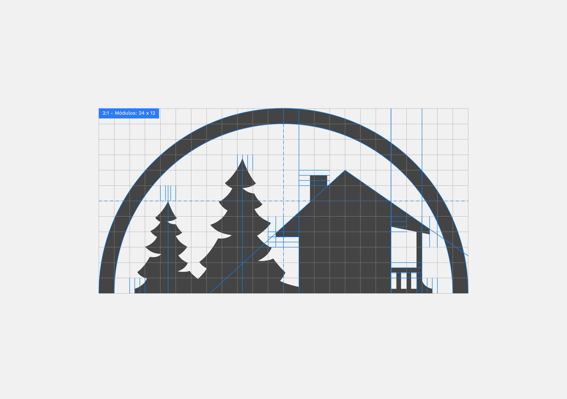
The company requested to keep its symbol as close as possible to the original version, so we worked on the technical improvement of the drawing to optimize its functioning. An important change was the modification of the half arch that frames the drawing: by releasing it from the base, it immediately added more versatility to the application of the logo, also allowing the adjustment of proportions, increasing the legibility of the word Robles.
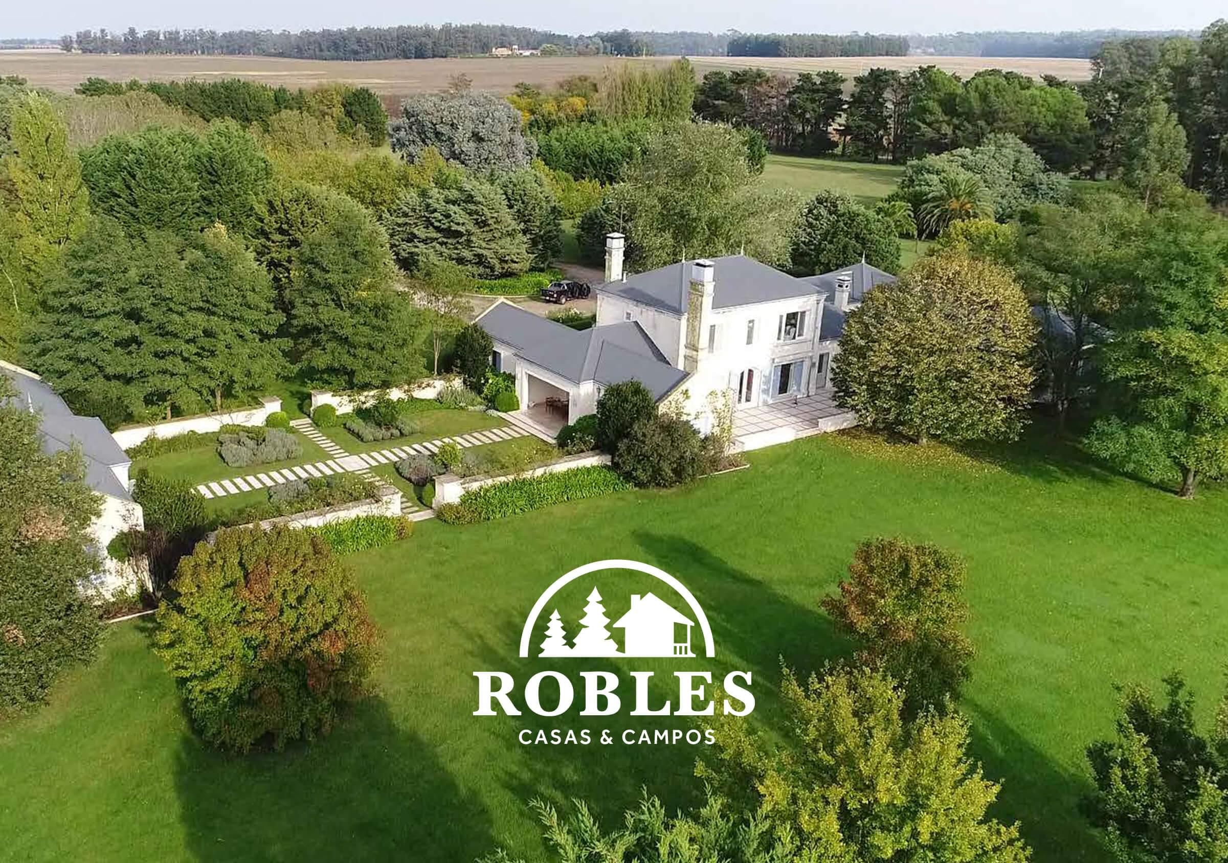
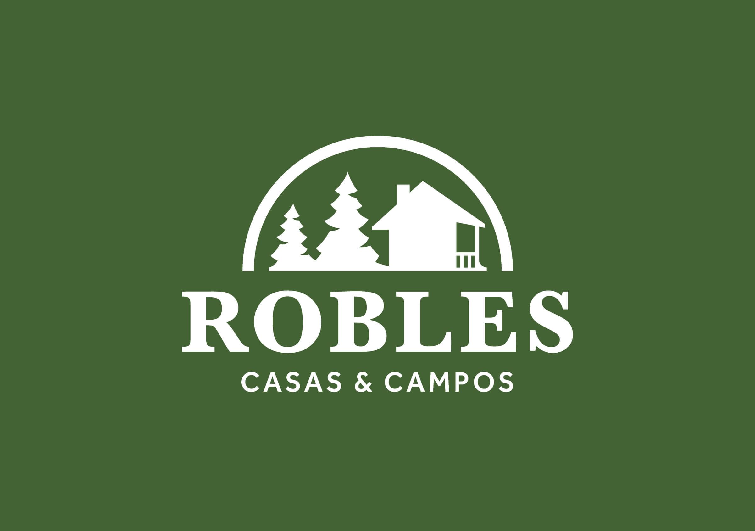
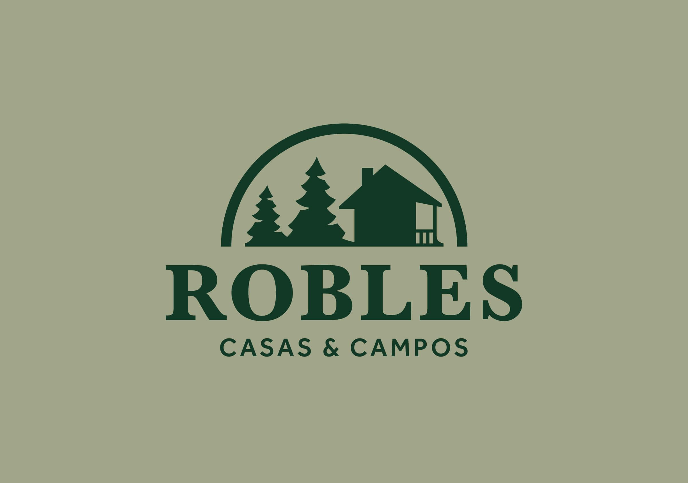
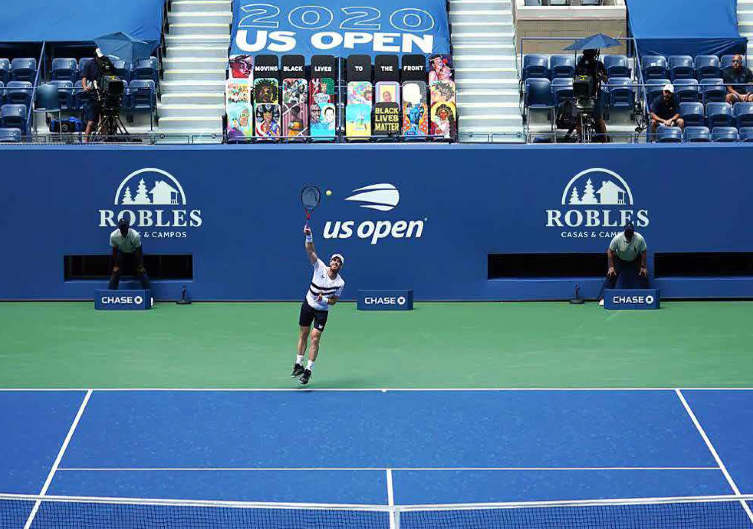
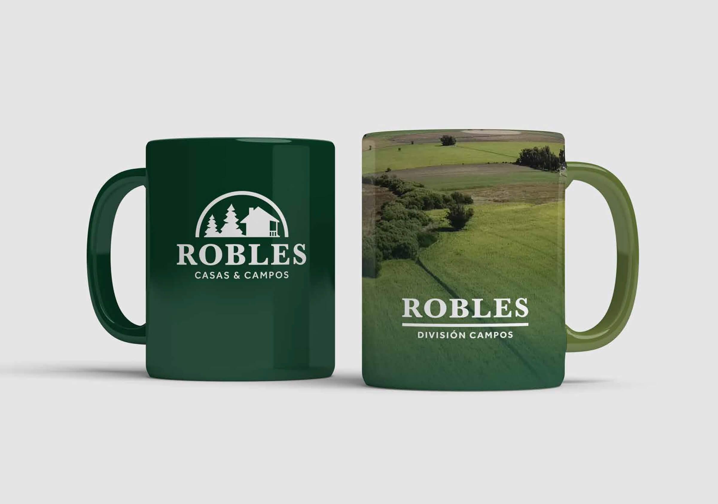
The result is a simpler, more compact logo that gains visibility and clarity in every brand application, revaluing and raising the visual level of the brand.

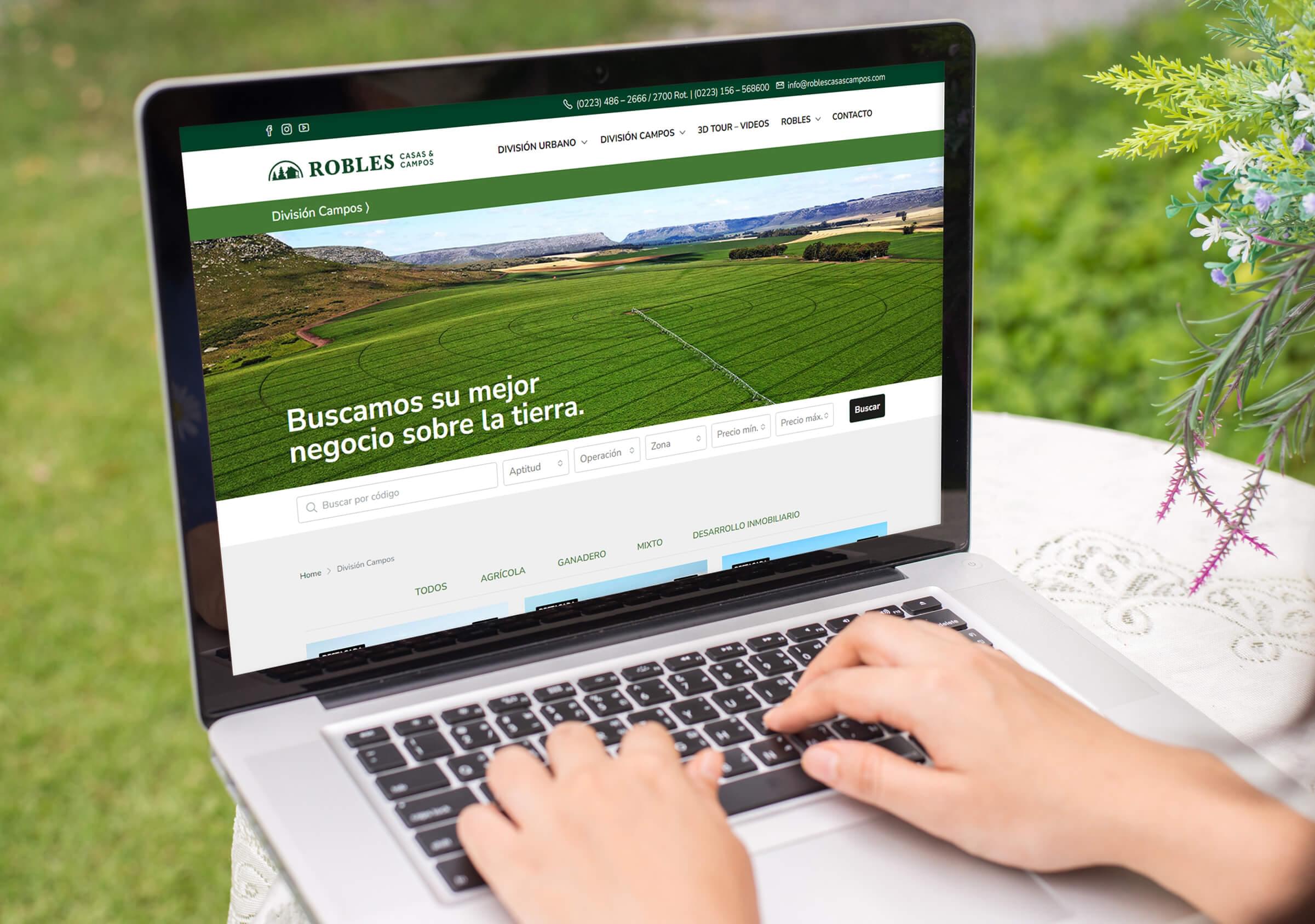
The Robles website presented the challenge of requiring to show the offer of its two divisions: Urban and Fields, each one of them with its peculiarities in terms of information and way of displaying the properties.
We worked together with the real estate team in adapting and personalizing the fields division so that it would show a different magnitude (hectares instead of square meters) and the same in terms of the typologies of each field: agricultural – rancher – mixed – real estate development. In the same way, the search engines for each of the divisions were customized.
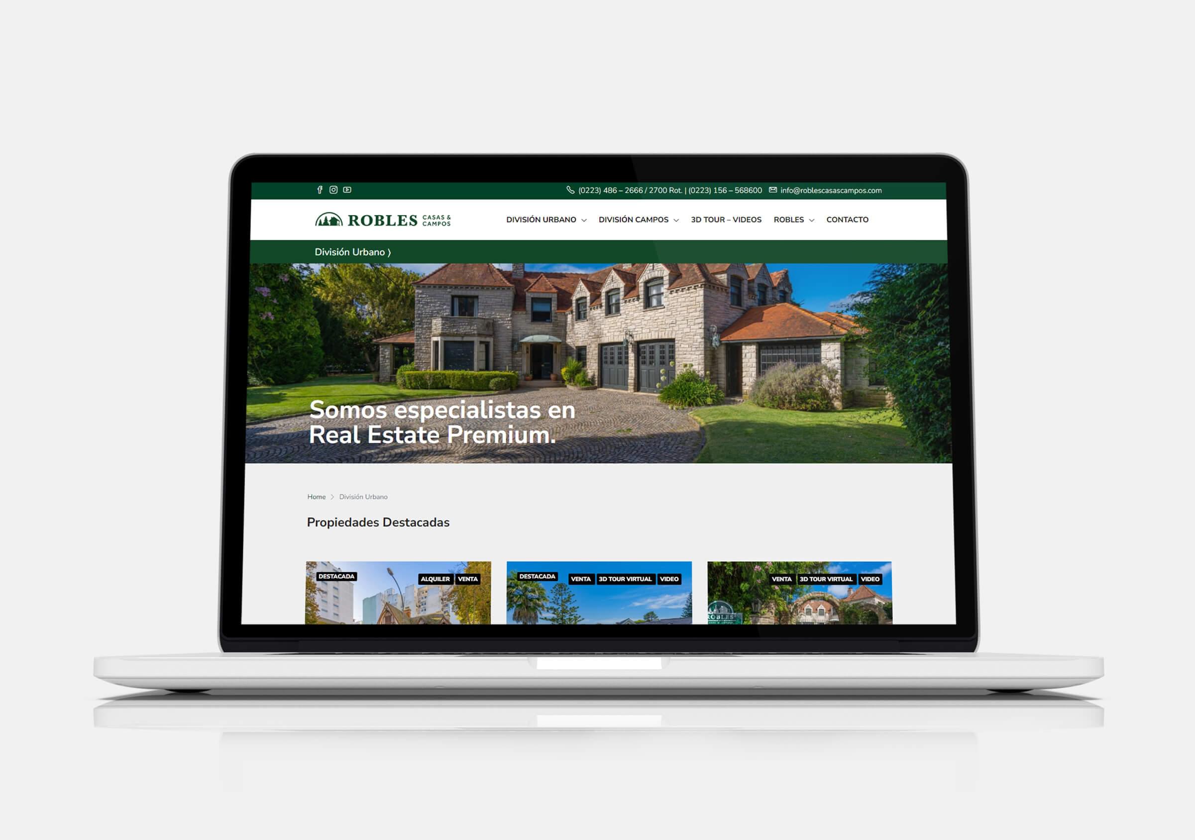
The website is structured with a main Home page, where access to both divisions and the institutional section of the company is provided.
90% of the web content is dynamic, since the site is connected to a CRM that the company uses to manage the properties, and they are automatically synchronized to the site. The rest of the website responds to static and institutional content, where the history of the company is told, the way of working, the history of the chalet where the real estate company is located and the company’s staff.
