- Fuego Yámana
- /
- Line Up
Line Up Coworking
While this new coworking space was being built in the Playa Grande area, Mar del Plata, Fuego Yámana was designated to come up with its name and giving the space its identity through the creation of its graphic brand, a conceptual brandbook and brand applications. Once the work was finished, we captured the essence of the space through a photo session aimed to create material for the design and development of its website and for the strategy and generation of content for social networks.
lineupcowork.com
With a differential proposal to that of other cowork, the client asked us to create a modern name that would relate the city of Mar del Plata to Silicon Valley (California), where the company has strong ties, while being associated with the idea of membership and belonging.
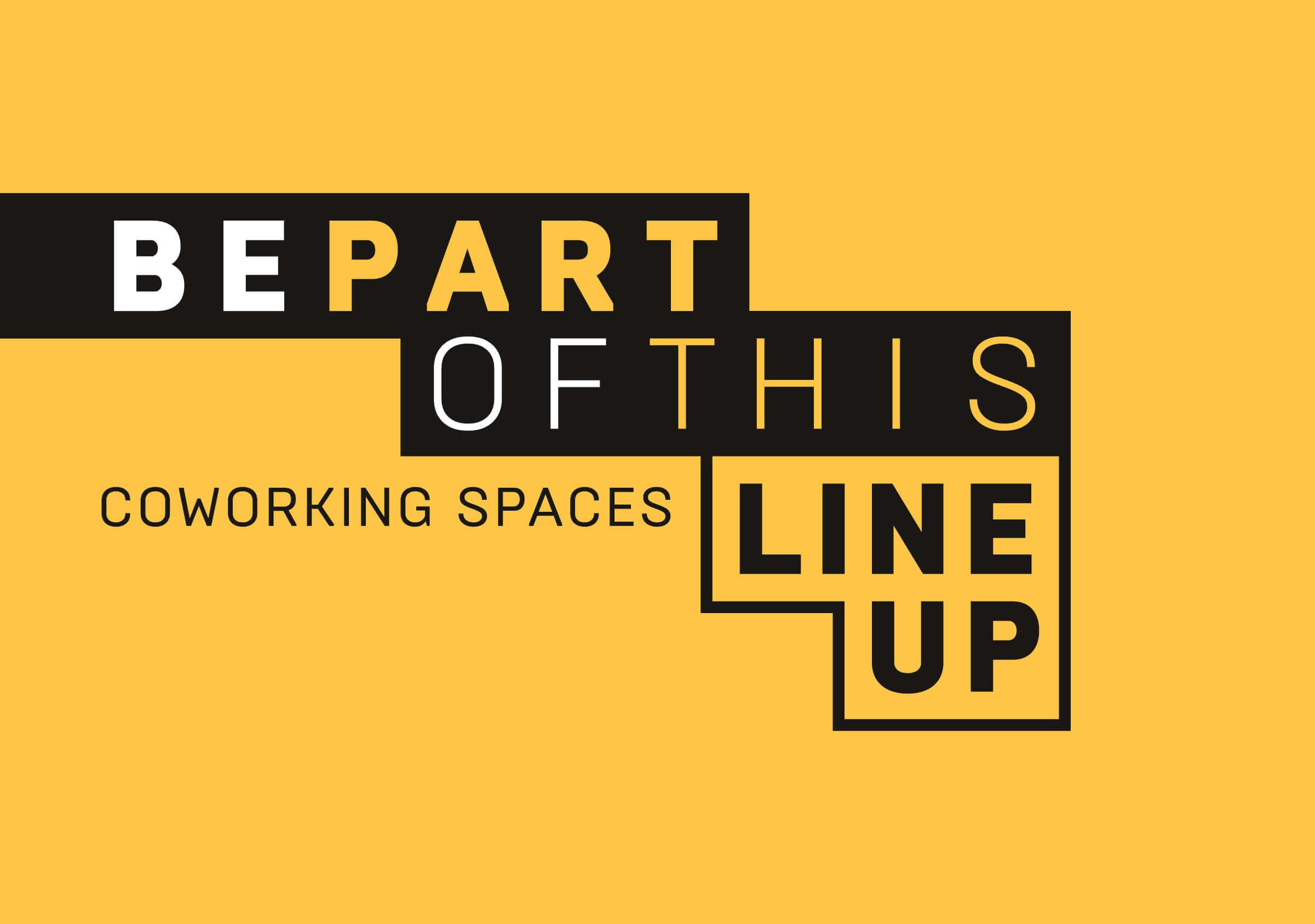
Anchored in one of the common points of the two cities, surfing, the name ‘Line Up’ was recommended, which refers to the area where surfers gather to catch a wave.
It is an English term, easy to pronounce in both languages, associated with the concepts of line, group and teamwork, that can be related to the spirit of the cowork of promoting collaboration and knowledge exchange.
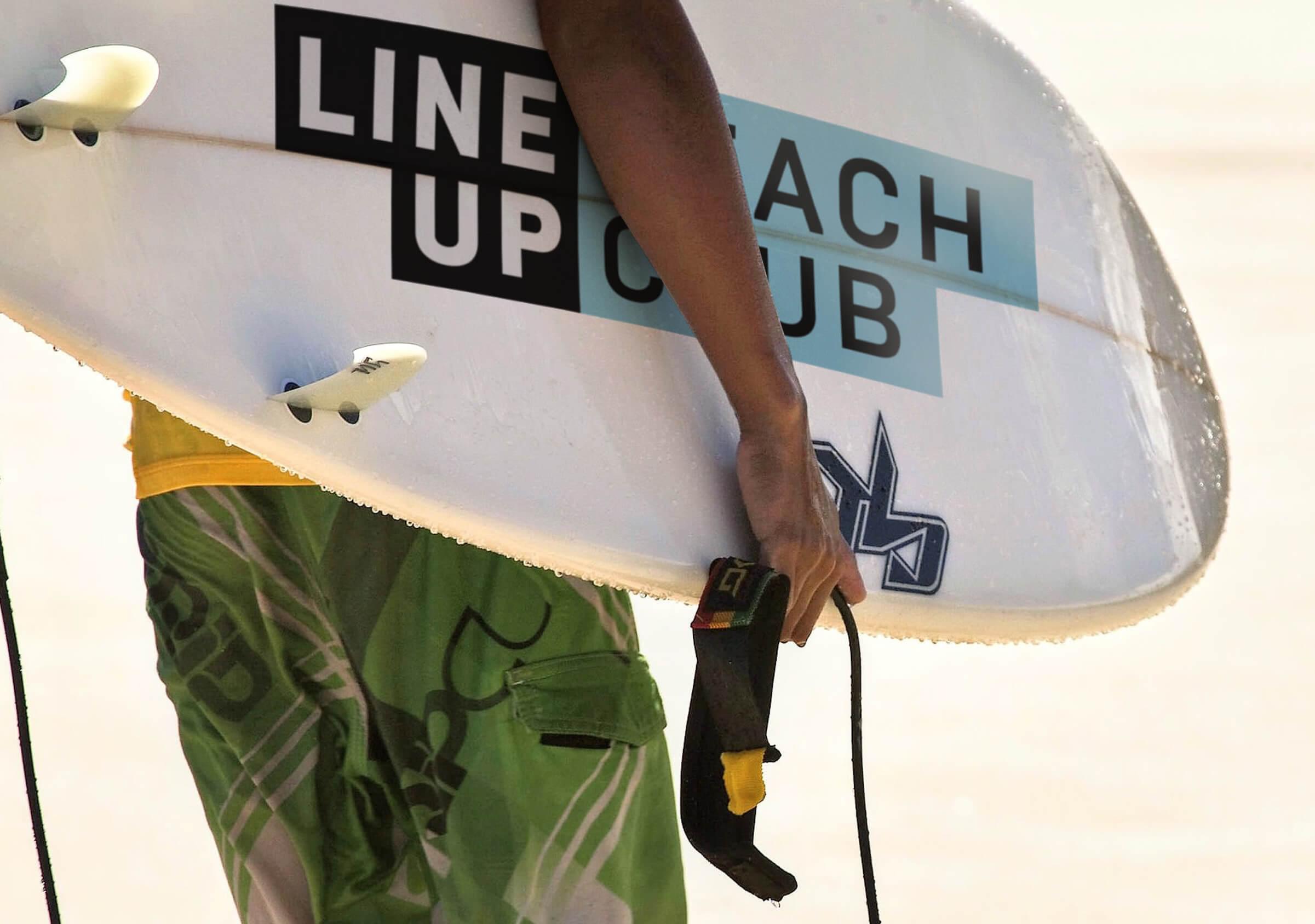
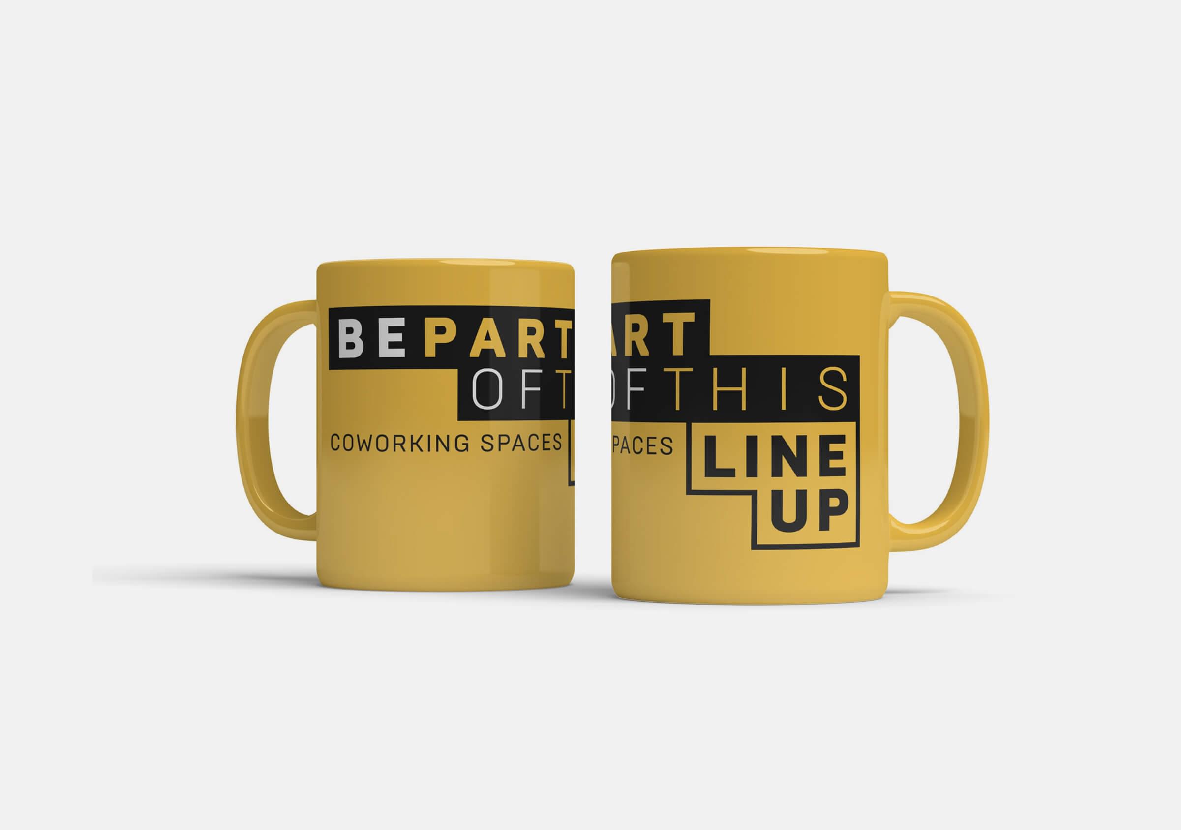
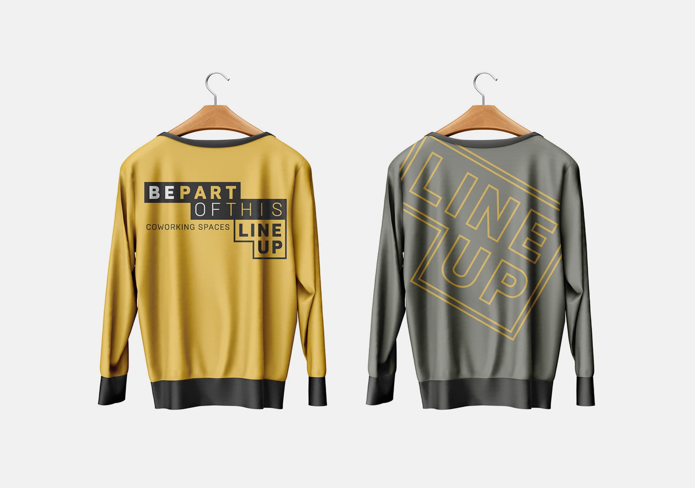
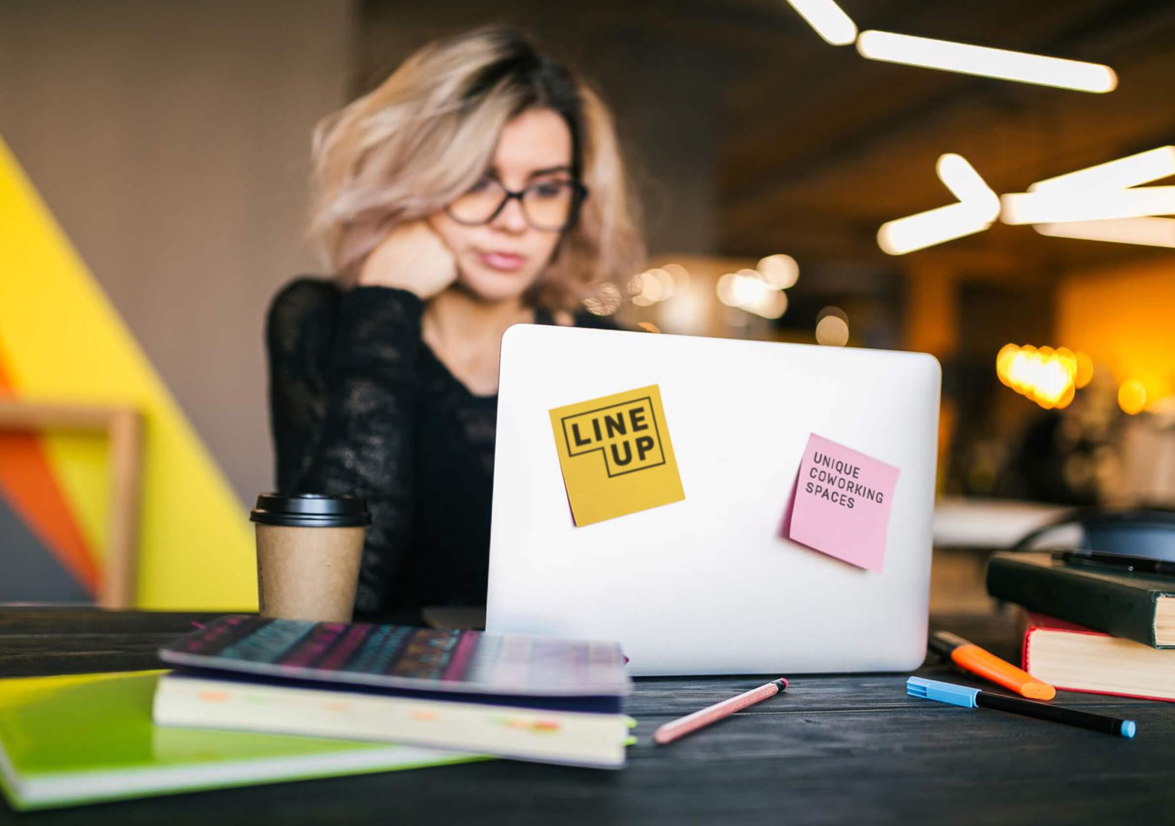
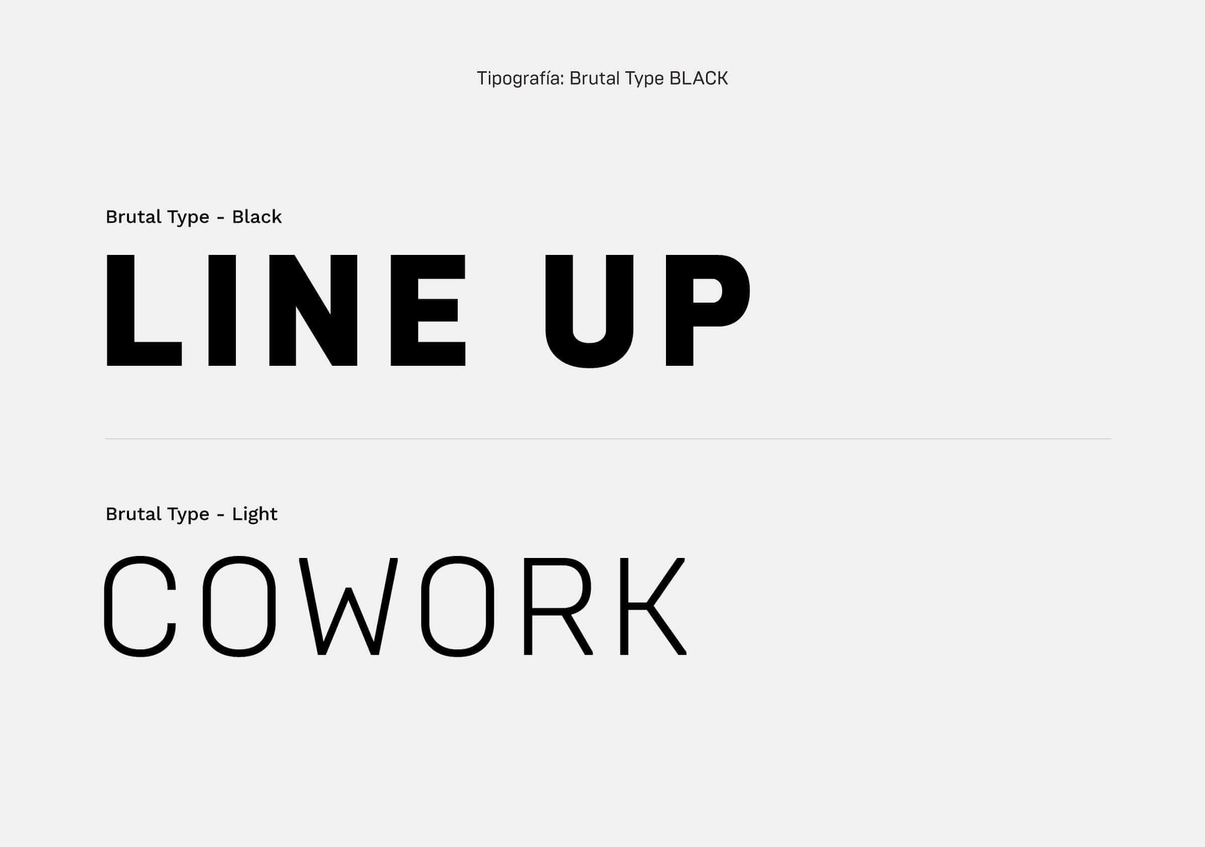
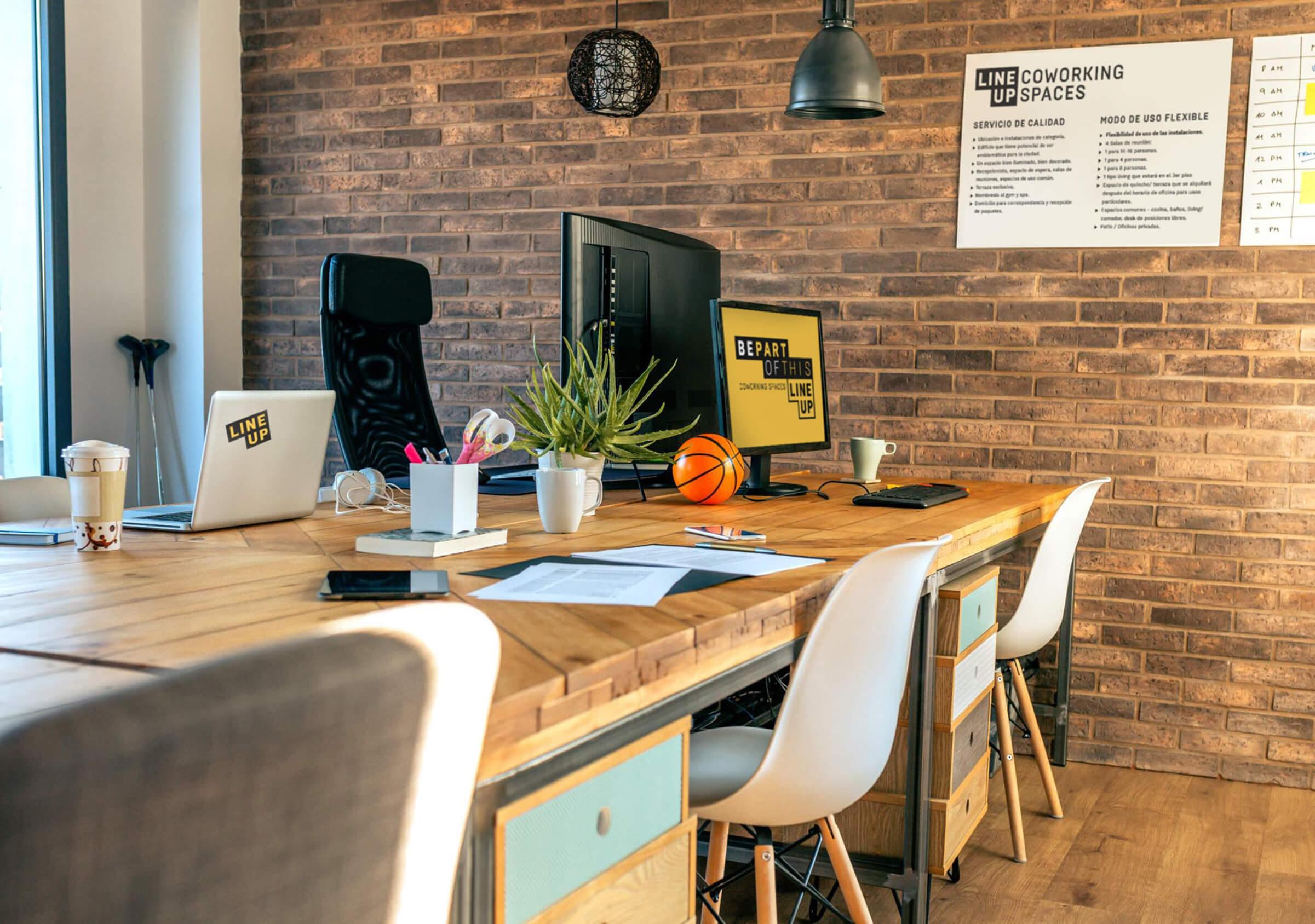
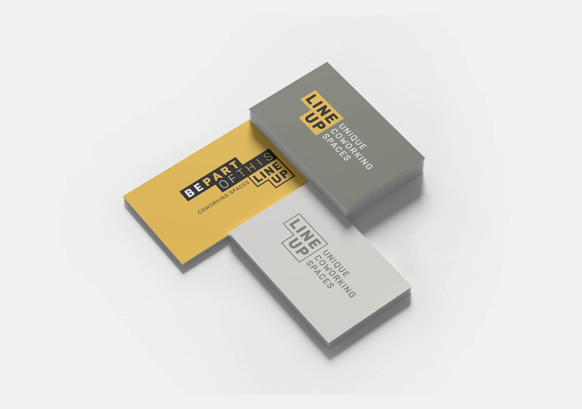
From the visual standpoint, we created a modular brand, which plays both with the more physical aspect of the building and the construction of the cowork, as well as with the more conceptual meanings of the name. We designed a logo with support, with a complementary shape that can be used as a background or outline, with the brand written in Brutal Type font.
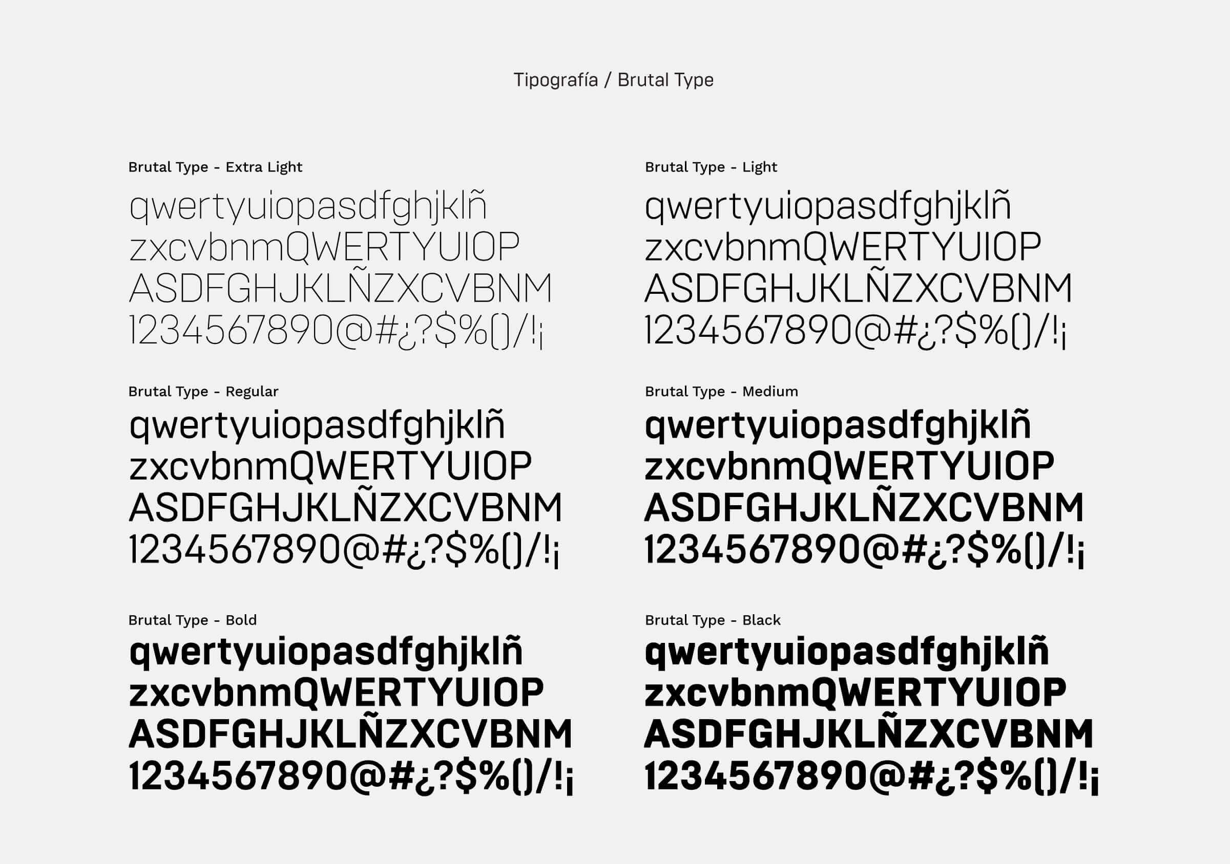
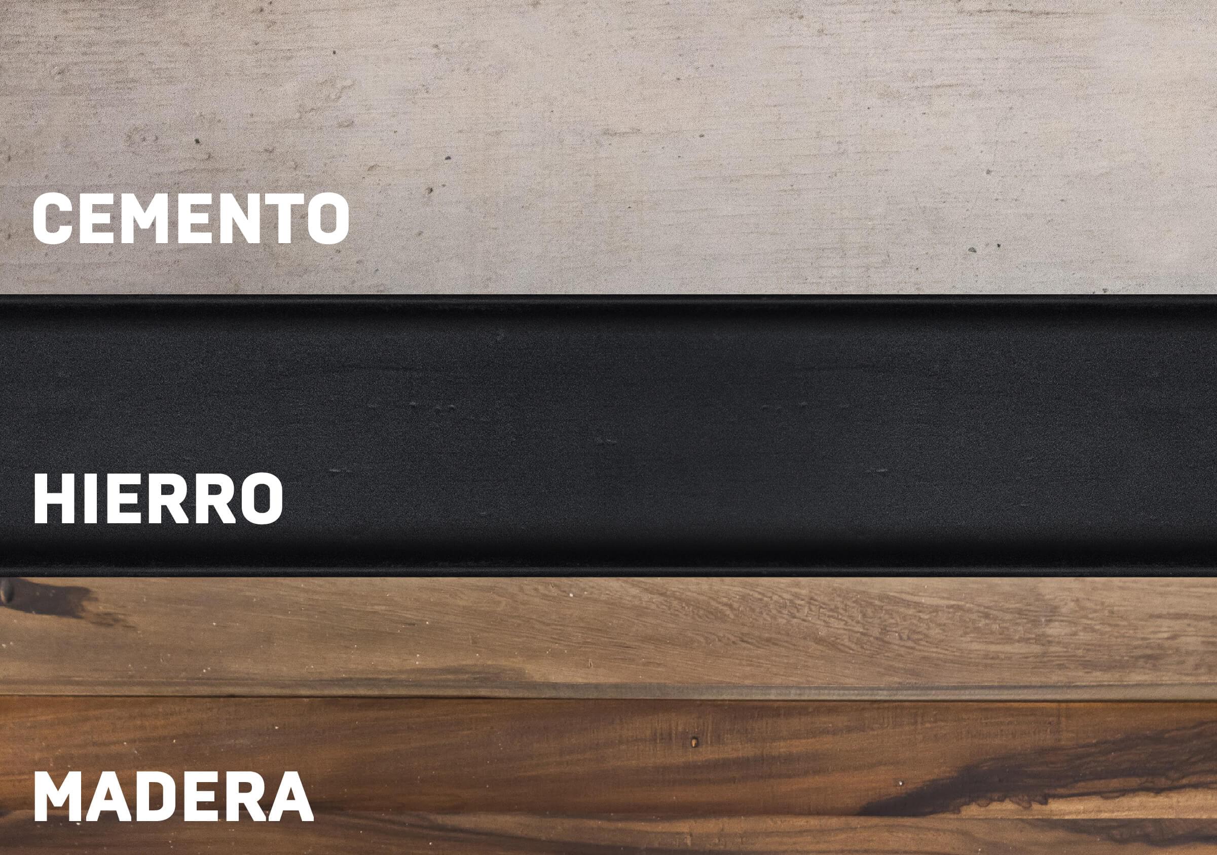
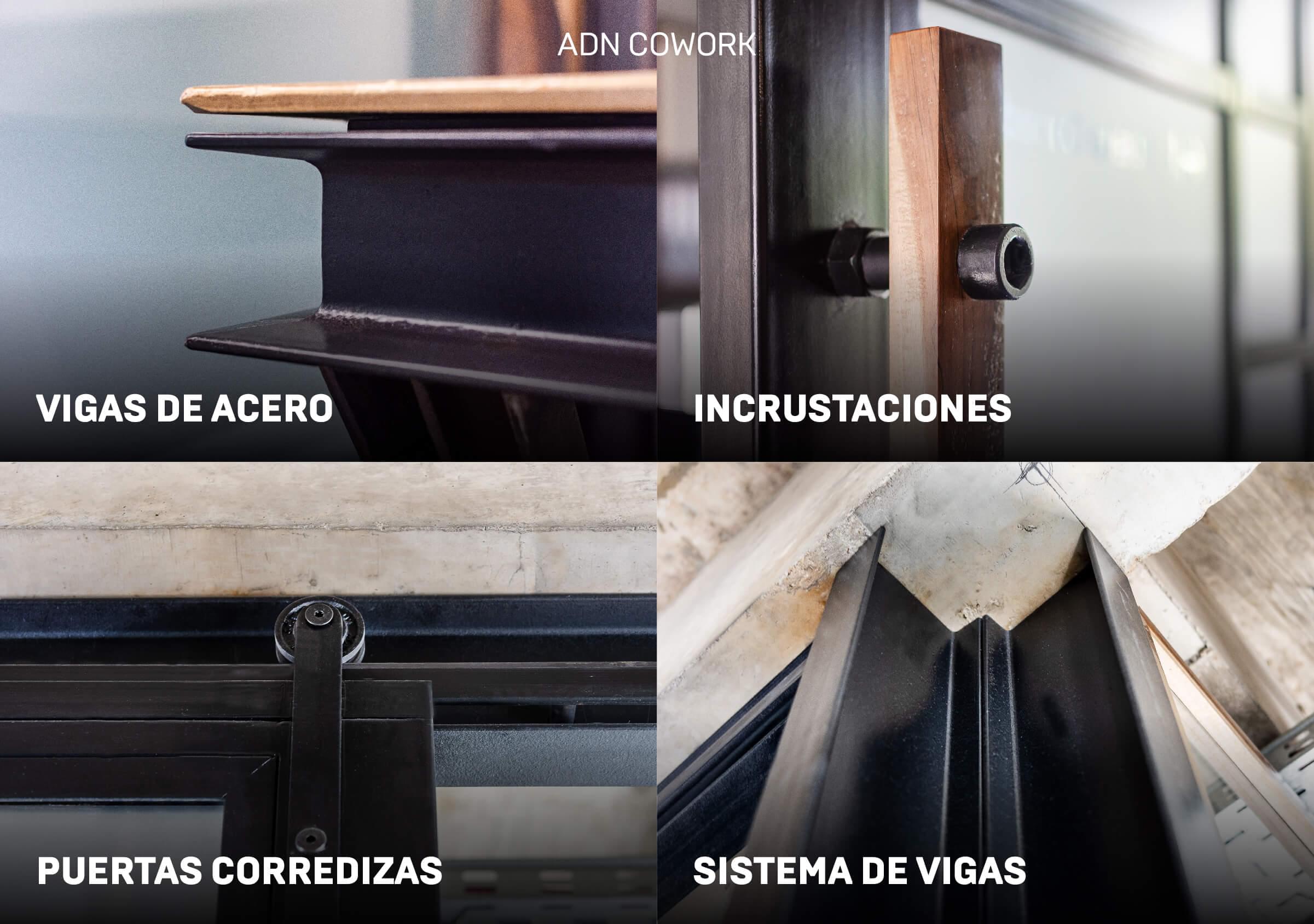
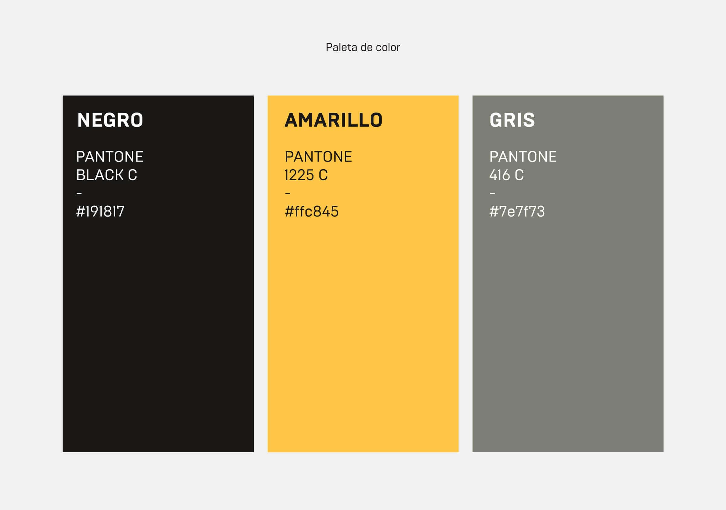
The color palette is inspired by the context of the environment, with three primary tones that arise from the iron, cement and wood characteristic of the site.
Yellow brings dynamism and energy, with a color that is defined as the tone of curiosity and new ideas, intelligence, inspiration and positivism. When complemented with black, it allows to create high contrast, achieving the cool and modern presence that was sought.
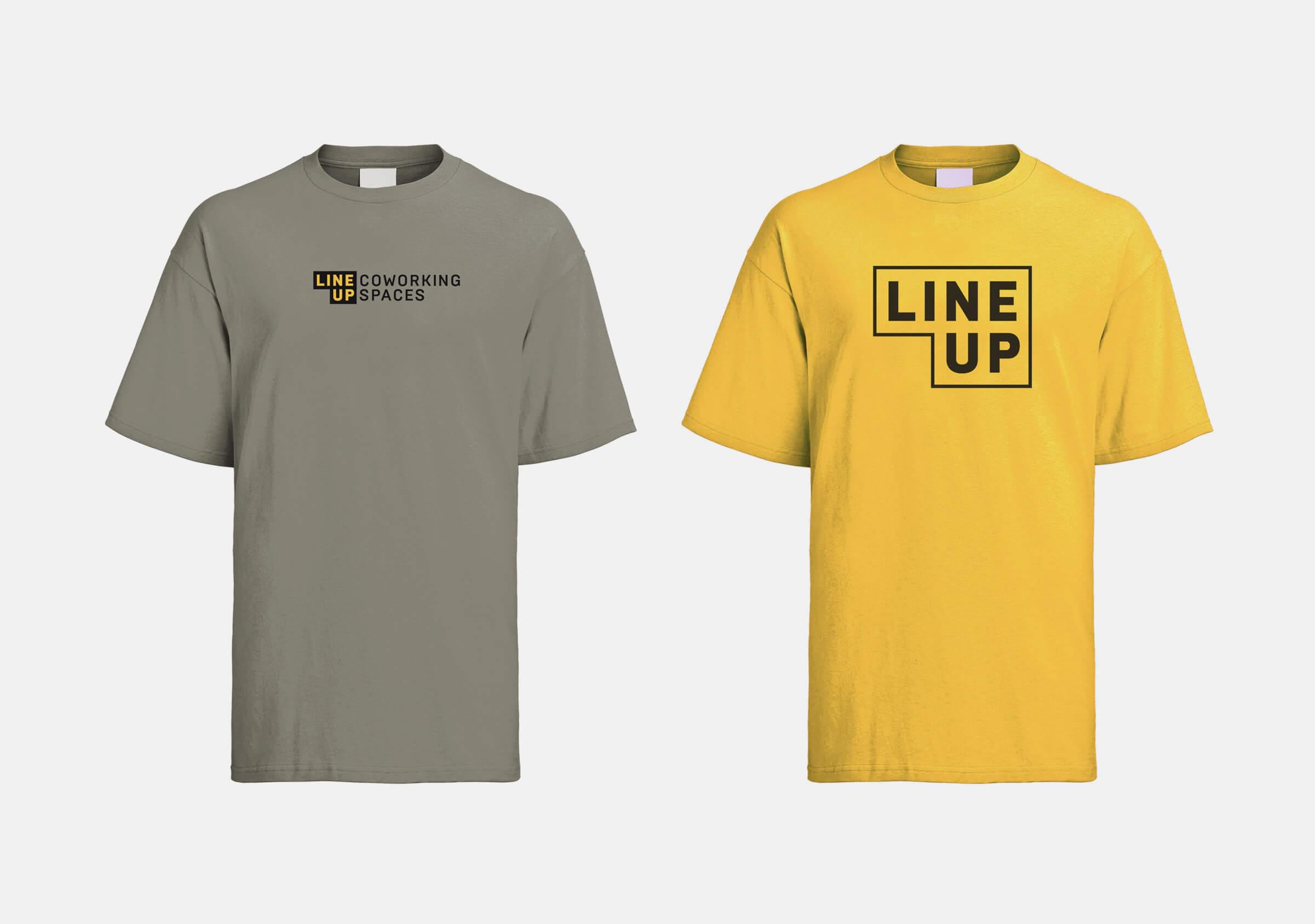
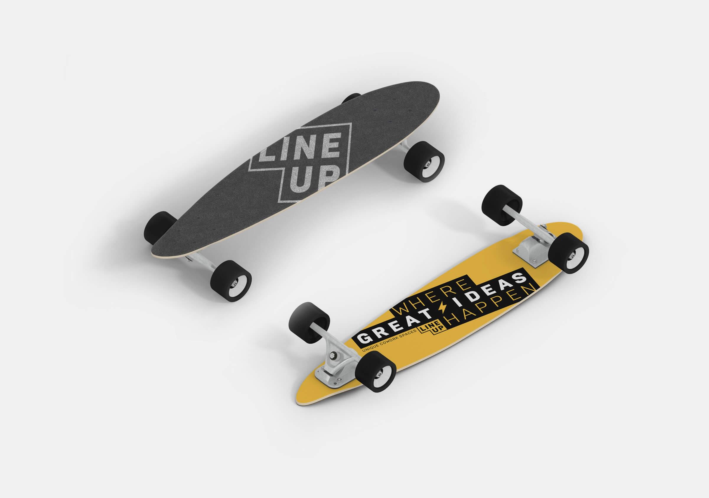
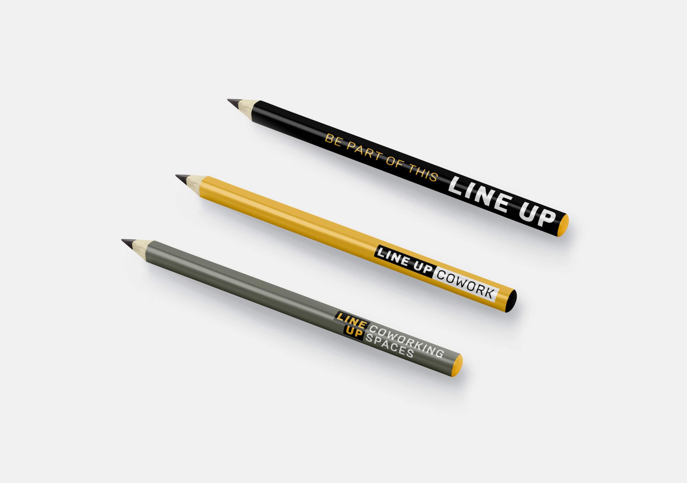
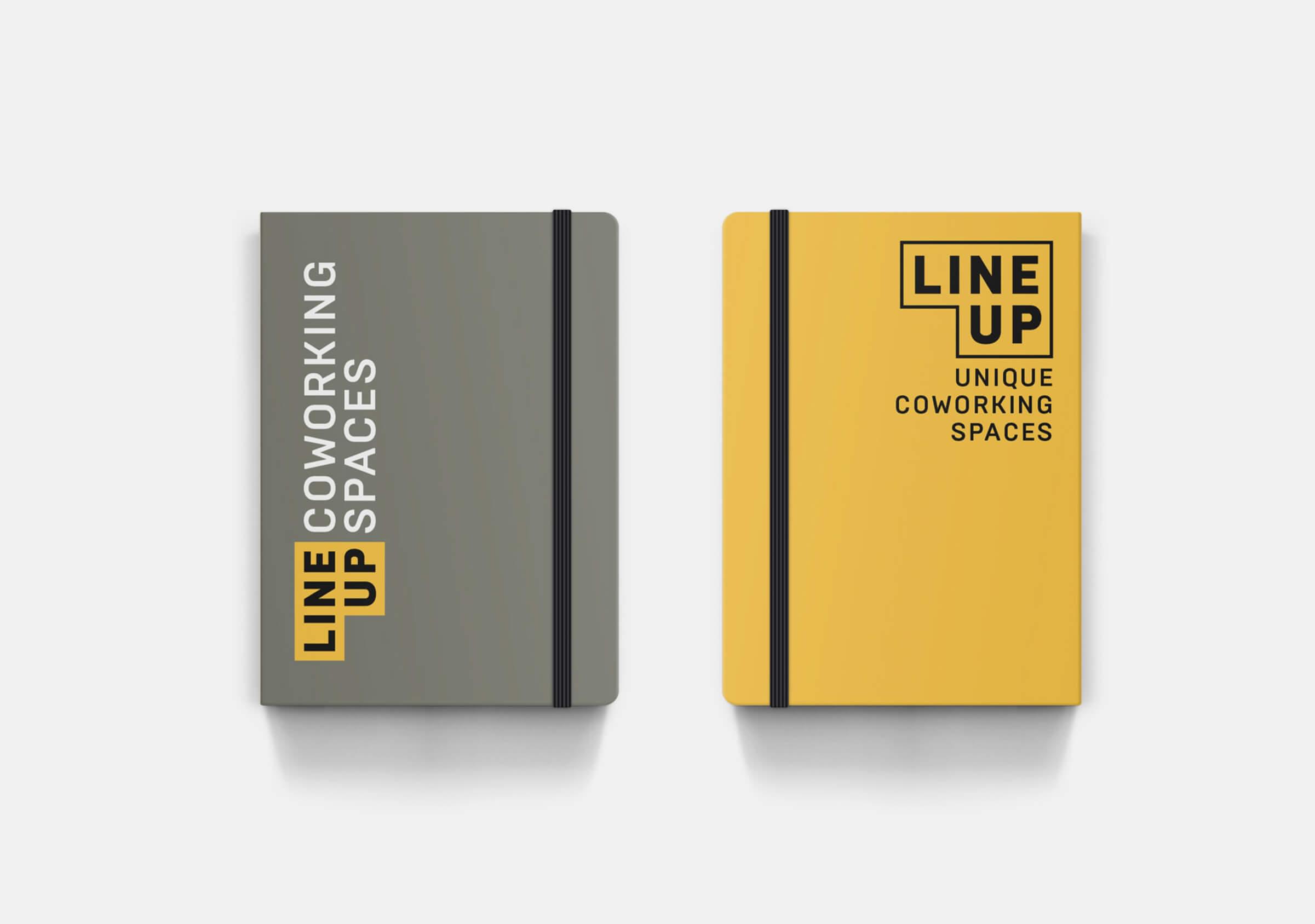
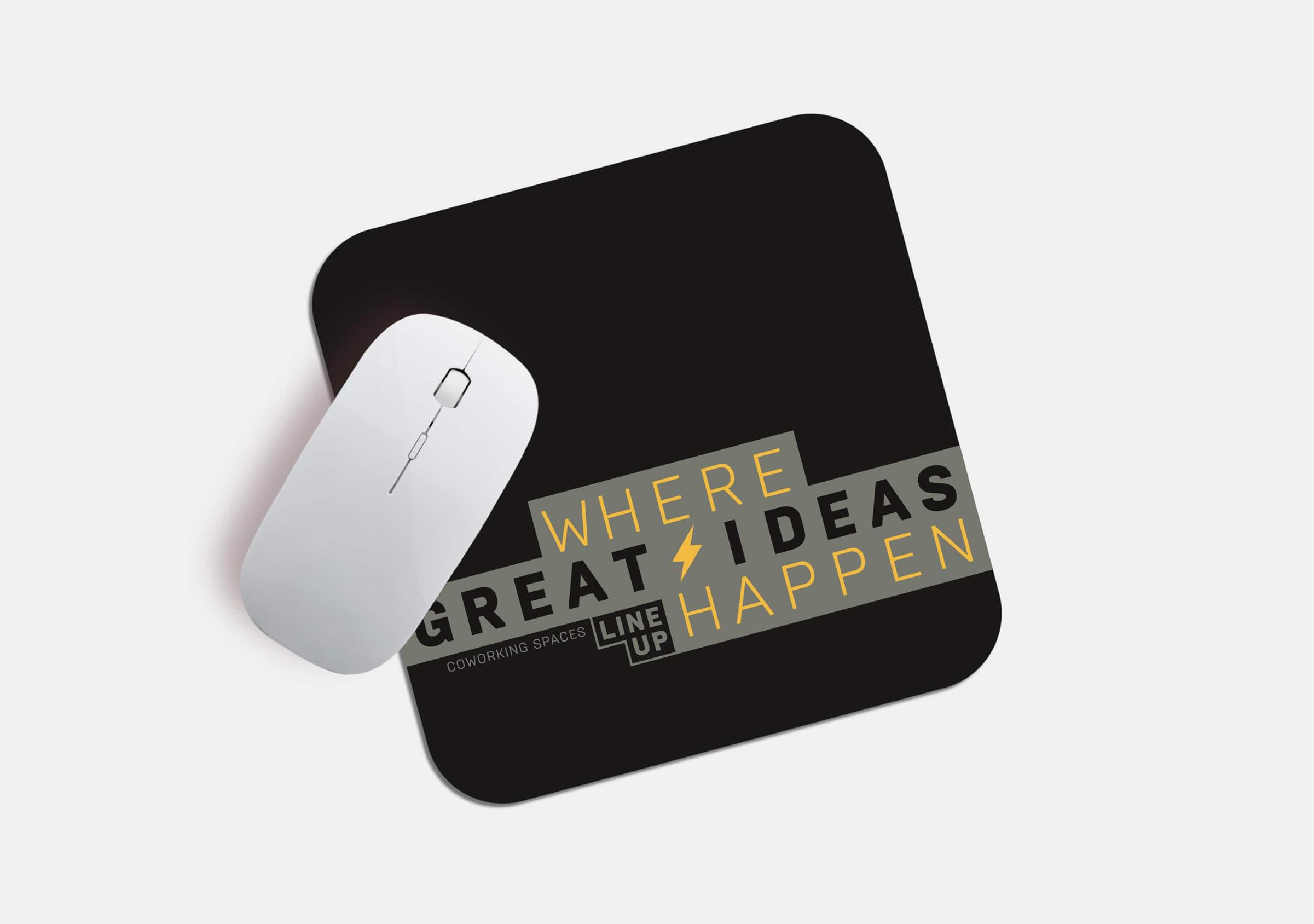
From the morphology of the logo, a visual language emerges that proposes the assembly of key messages using grids, modules and implementing the primary color palette.
The result is a fun and dynamic brand with a very wide application universe, but which at the same time appears solid and professional.
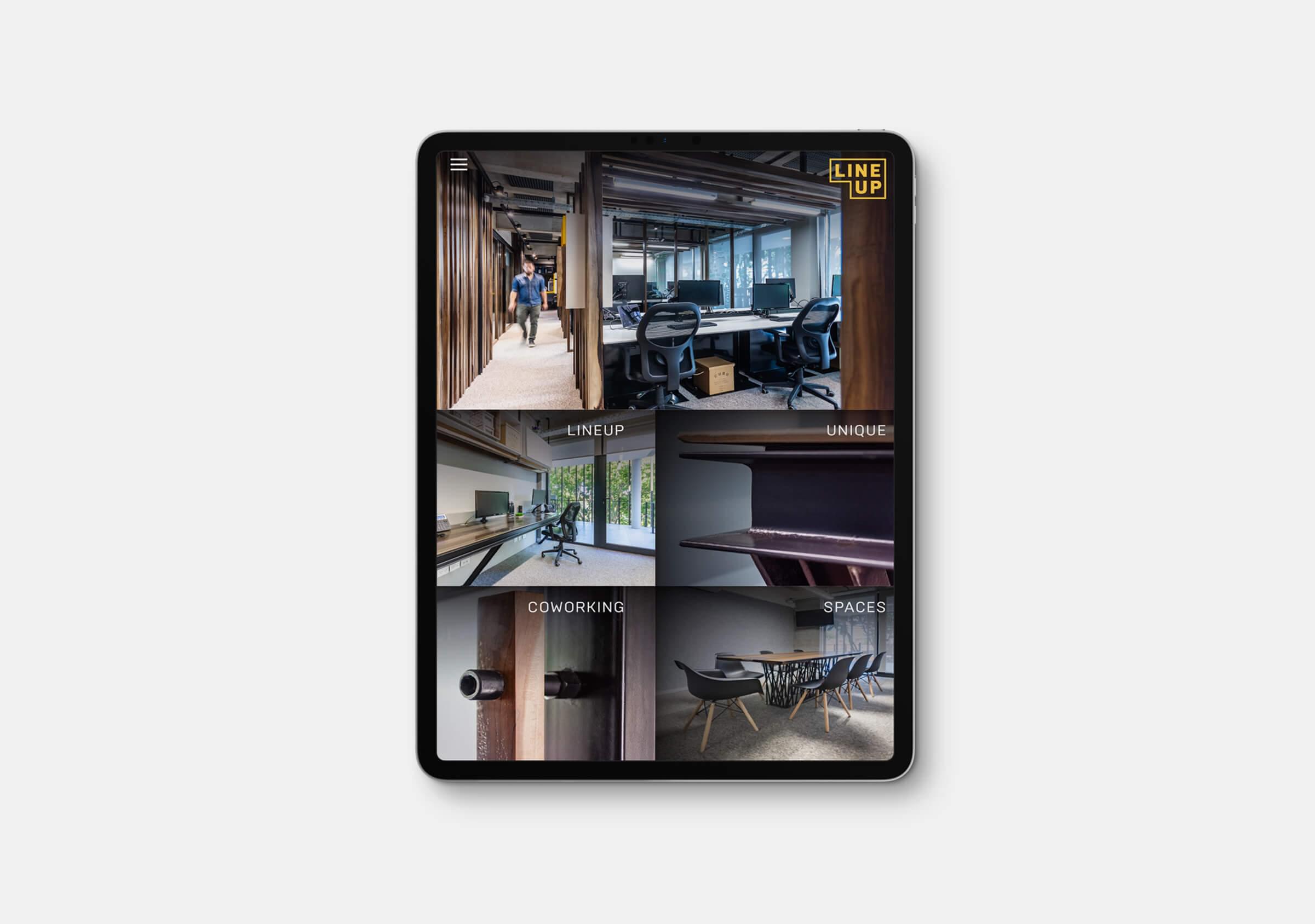
Regarding their digital presence, we designed and developed a landing page that seek to highlight its main differentiating characteristics: the services offered by the coworking, as well as a good gallery of images that shows both the design details and construction quality, as well as the comfort of the spaces.
Then we set up the foundations of their presence in social networks through the preparation of a communication strategy, the creation of their Instagram and Linkedin profiles and the generation of content for the first months of activity on those accounts. Based on the content axes established in the strategy, we proposed the tone and kind of content to share, the featured stories to use, hashtags, as well as resources for free use such as a set of brand digital stickers.
