- Fuego Yámana
- /
- QM
QM
QM is an industrial equipment company, which came to the agency with the need to rebrand and create a new website, to show itself to the world as the company it is today, with more than 200 employees and a 31,000m2 manufacturing plant.
qm-equipment.com
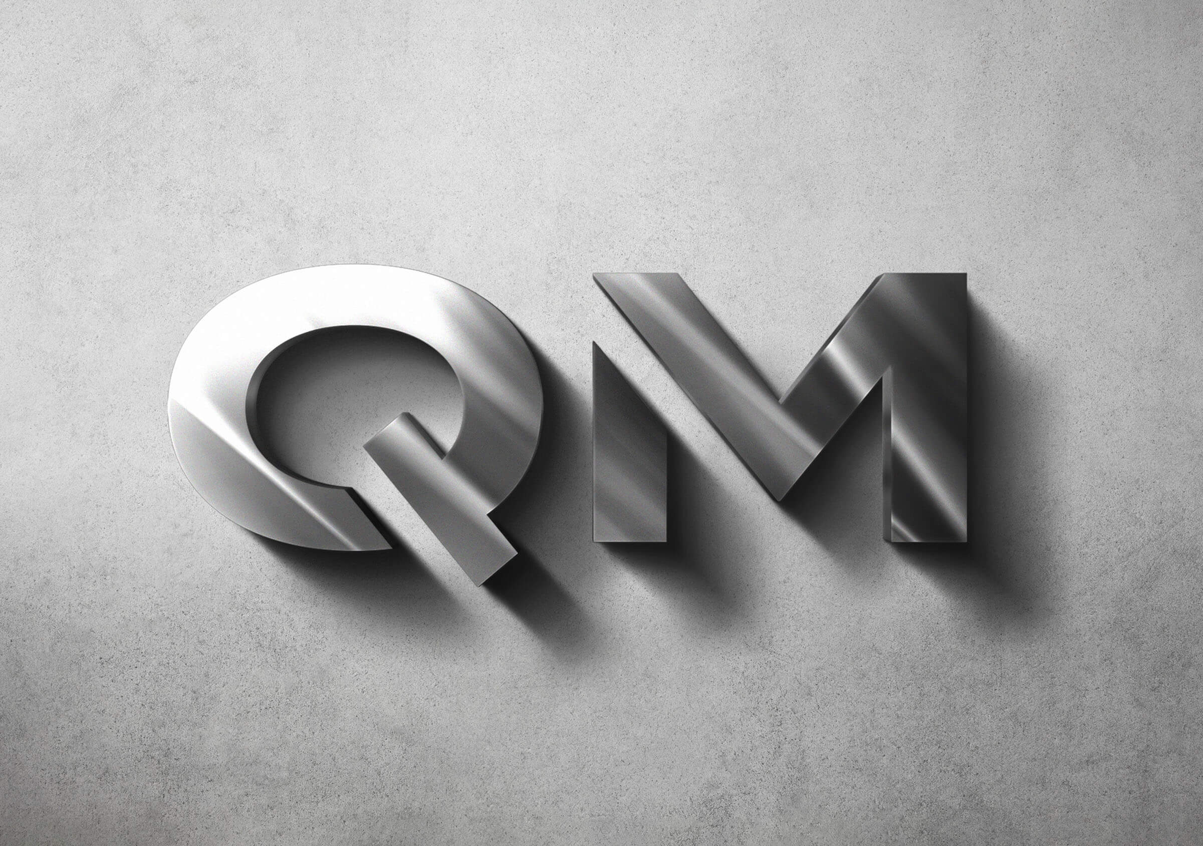
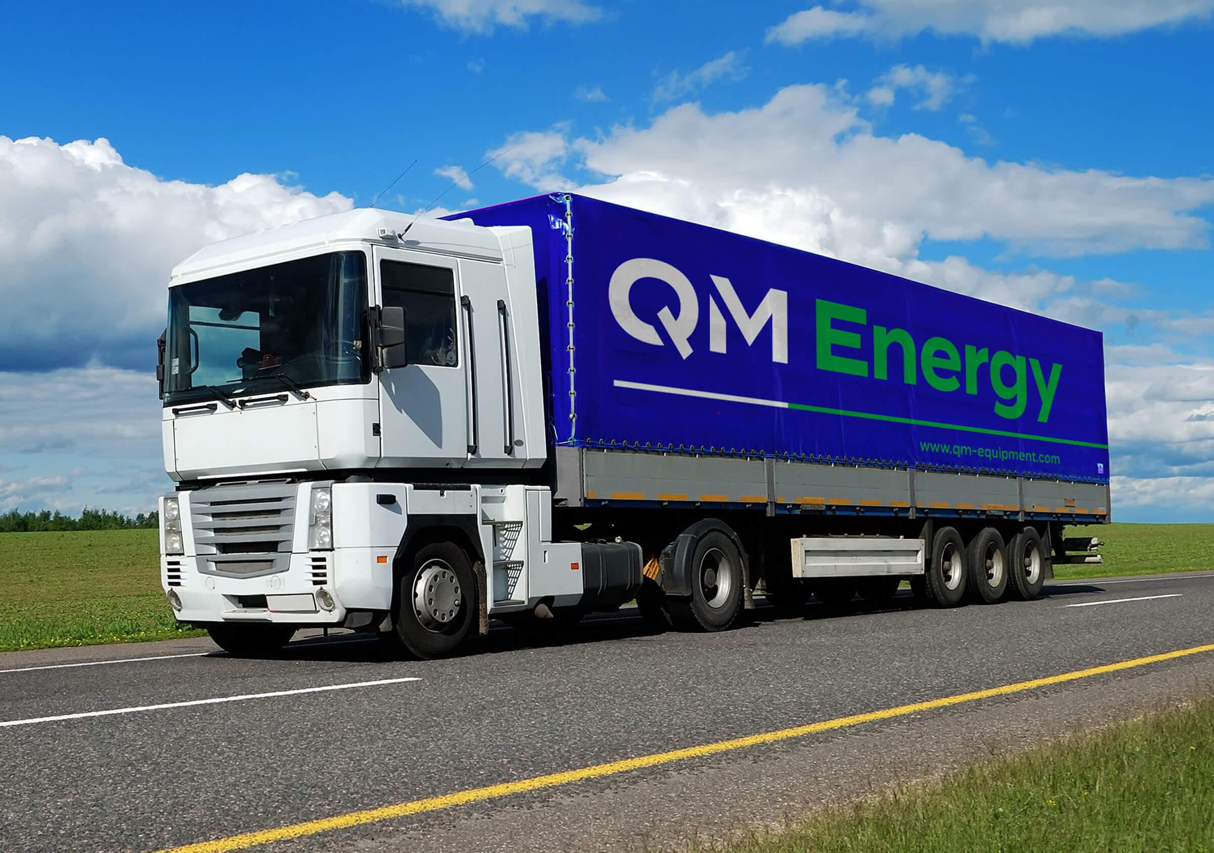
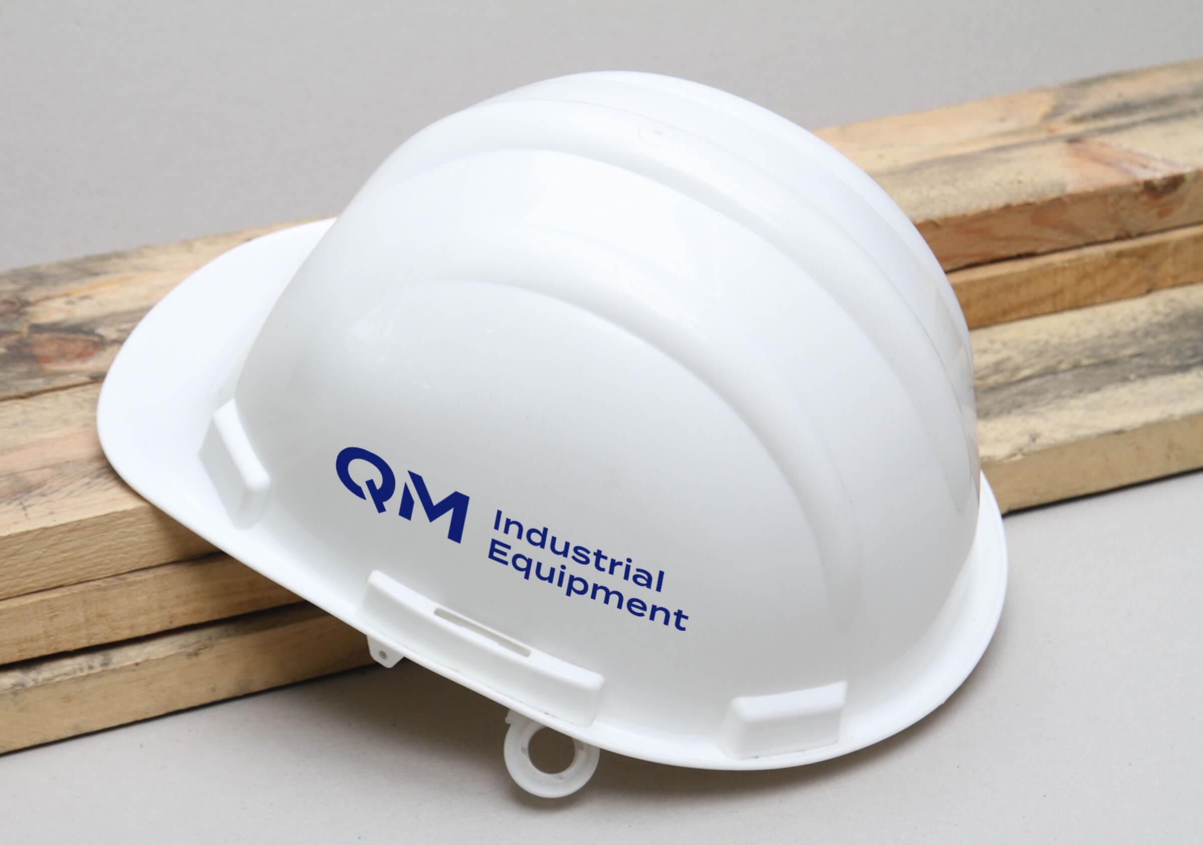
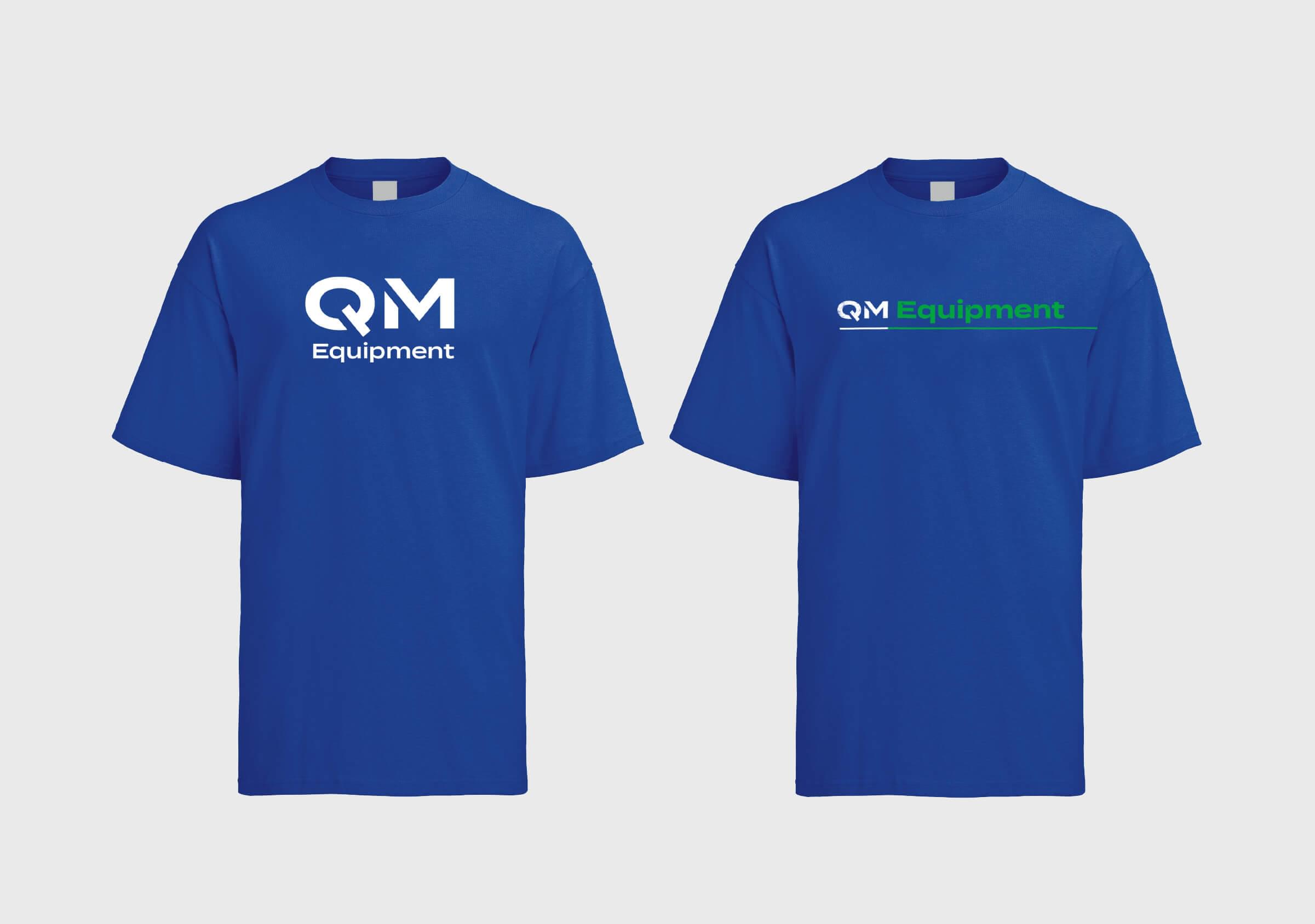
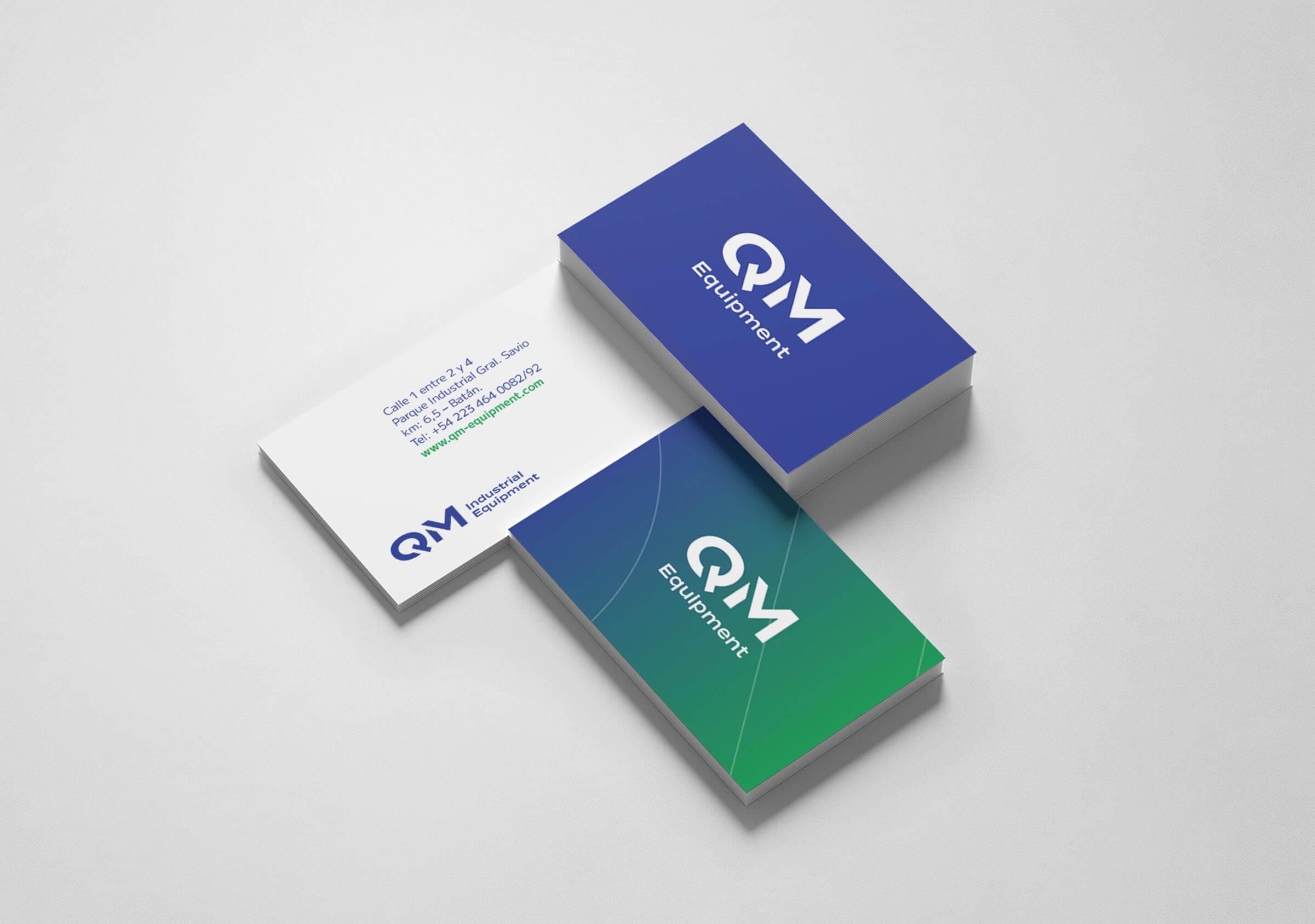
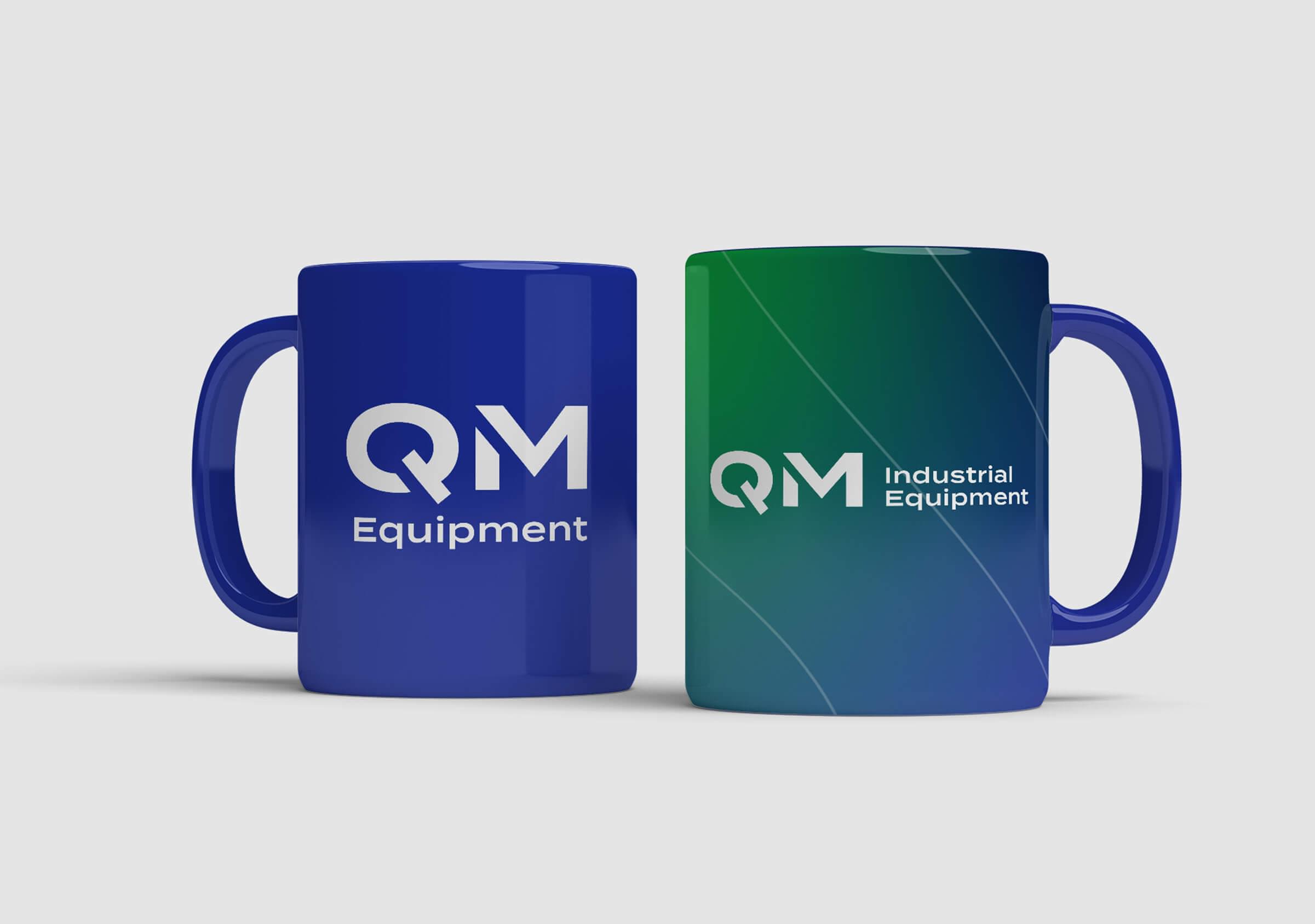
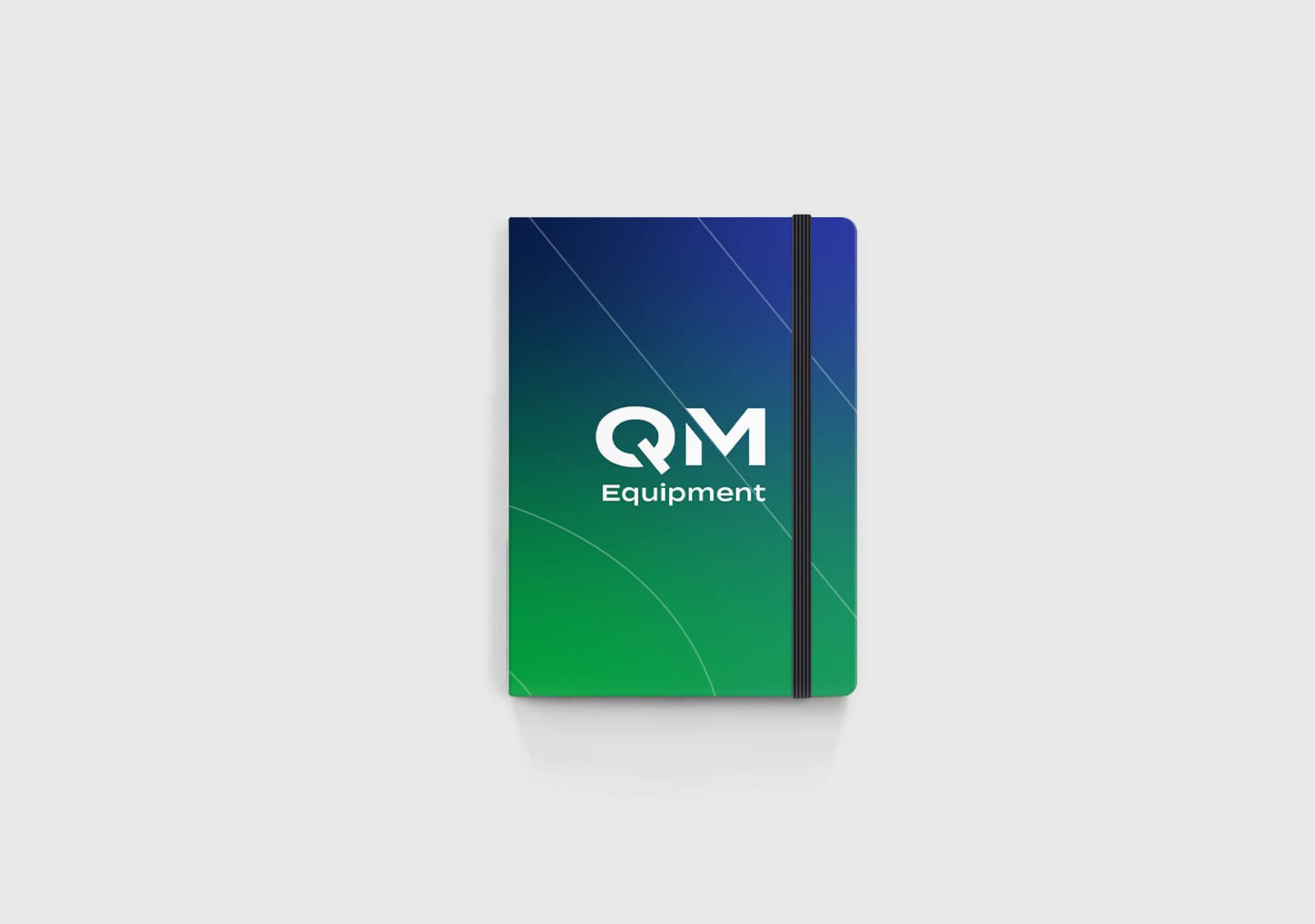
The objective of the rebranding project was to create an evolved, industrial and professional brand, capitalizing on the accumulated value of its main colors: green and blue, but adjusting and optimizing its use.

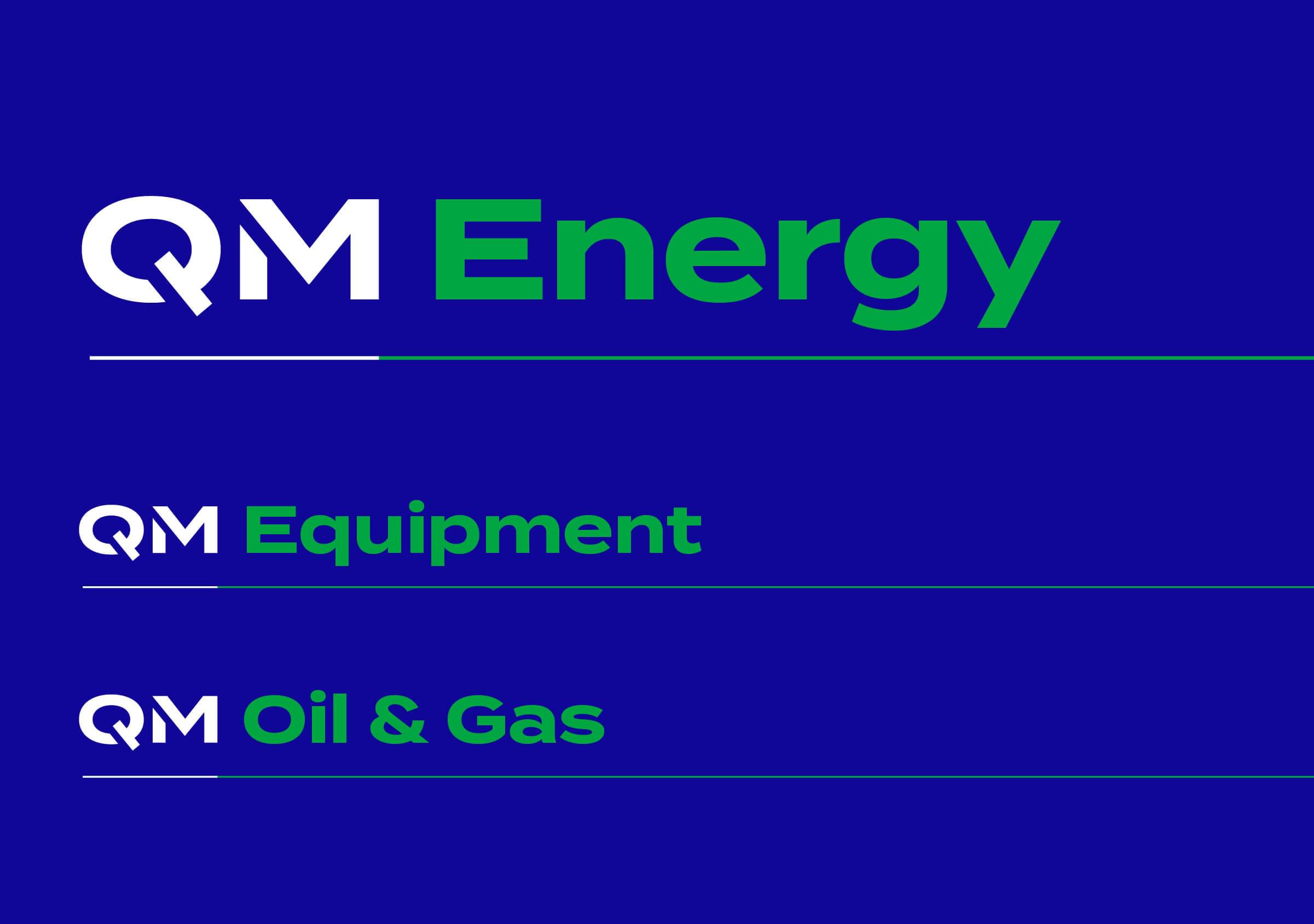

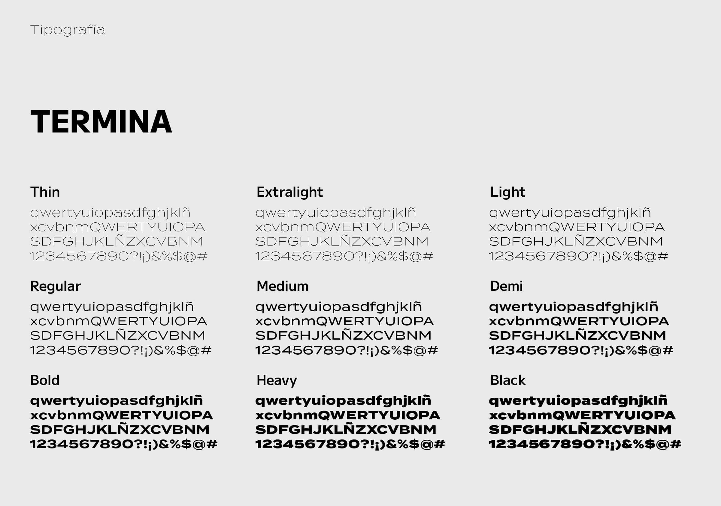
Taking precision, rigor and the ability to simplify the most complex processes as key qualities that characterize the company, we defined a geometric, simple and clear typography to identify the capital letters Q and M. Inspired by the cuts of laser machines that they use in their manufacturing processes and contemplating that the logo could be cut out on the chassis of the equipment, we made some typographical touch-ups, including some oblique cuts as a stencil.

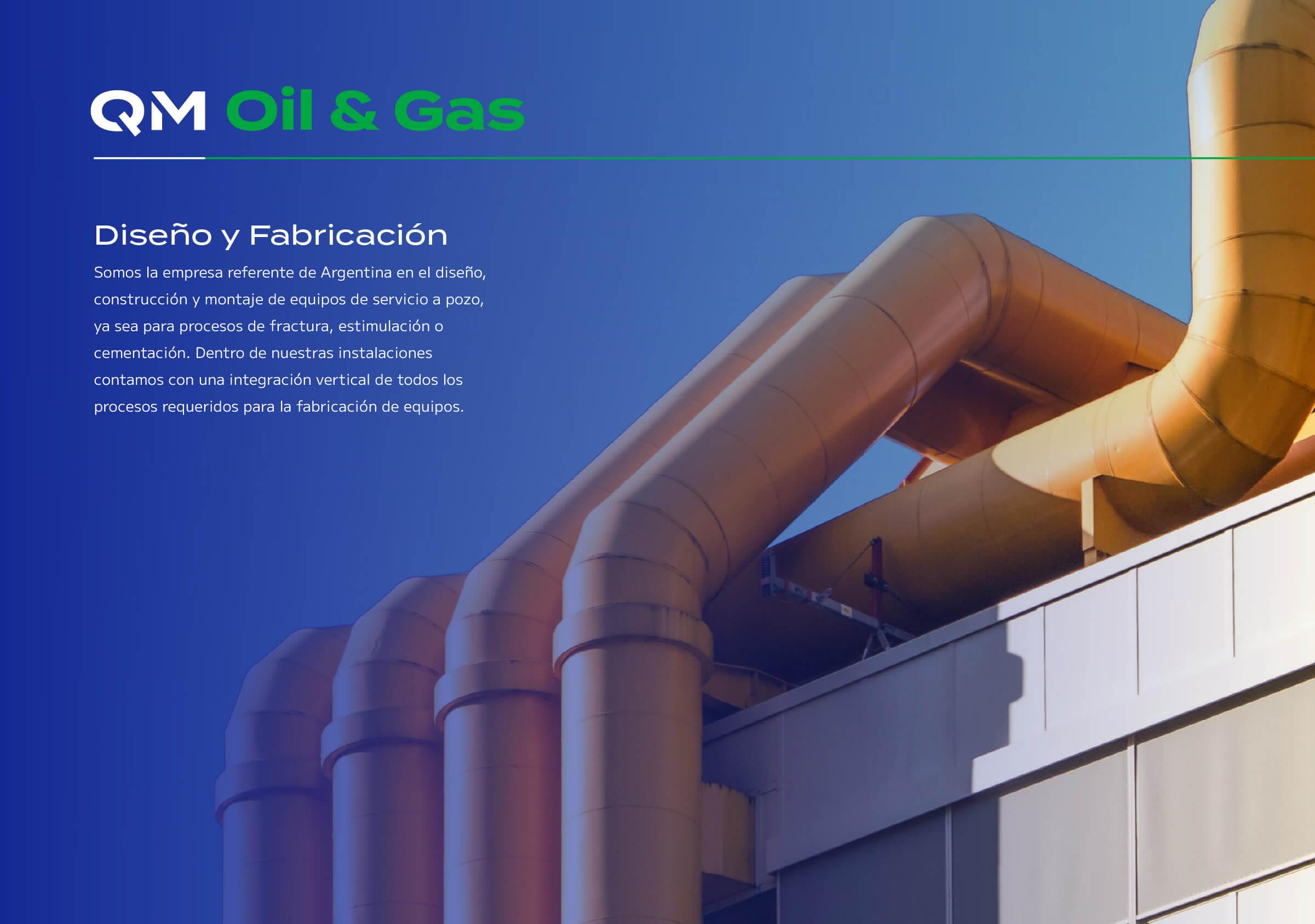
From these cuts we also generated the visual language of the brand, with white lines that start from the logo and are combined with intense full colors and gradient backgrounds, resulting in a vibrant image that contrasts and complements the sober and dull nature of the metal.
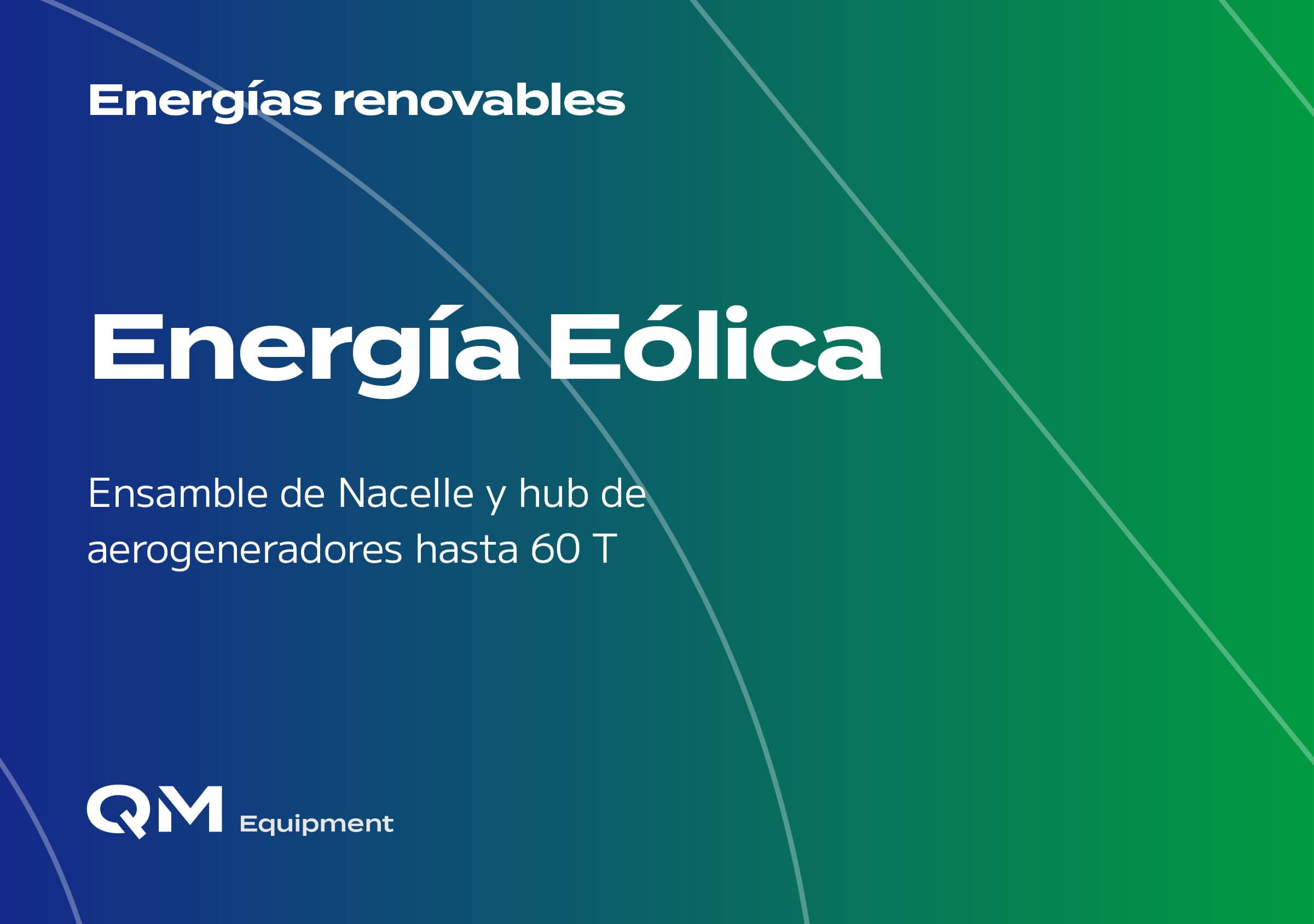
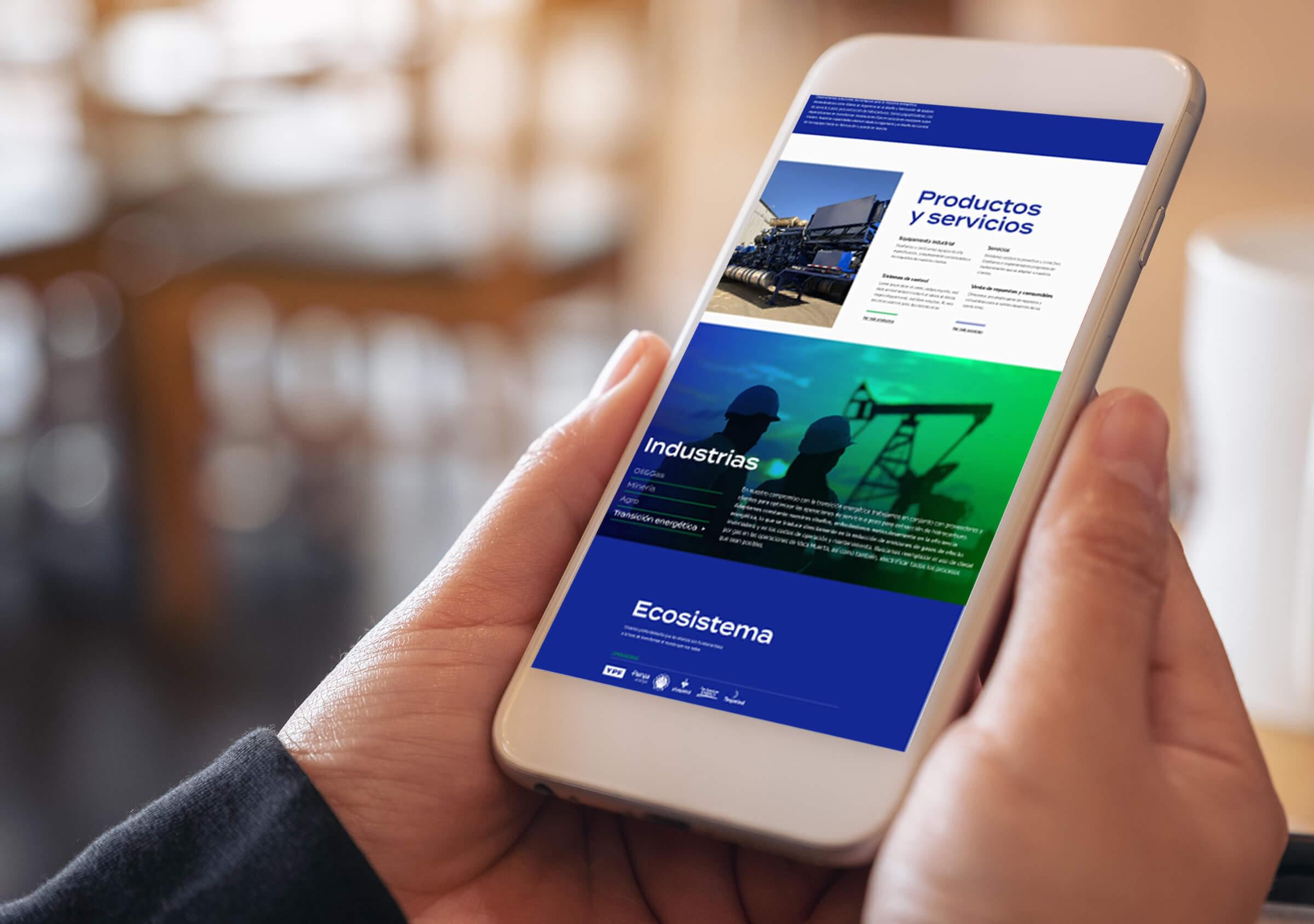
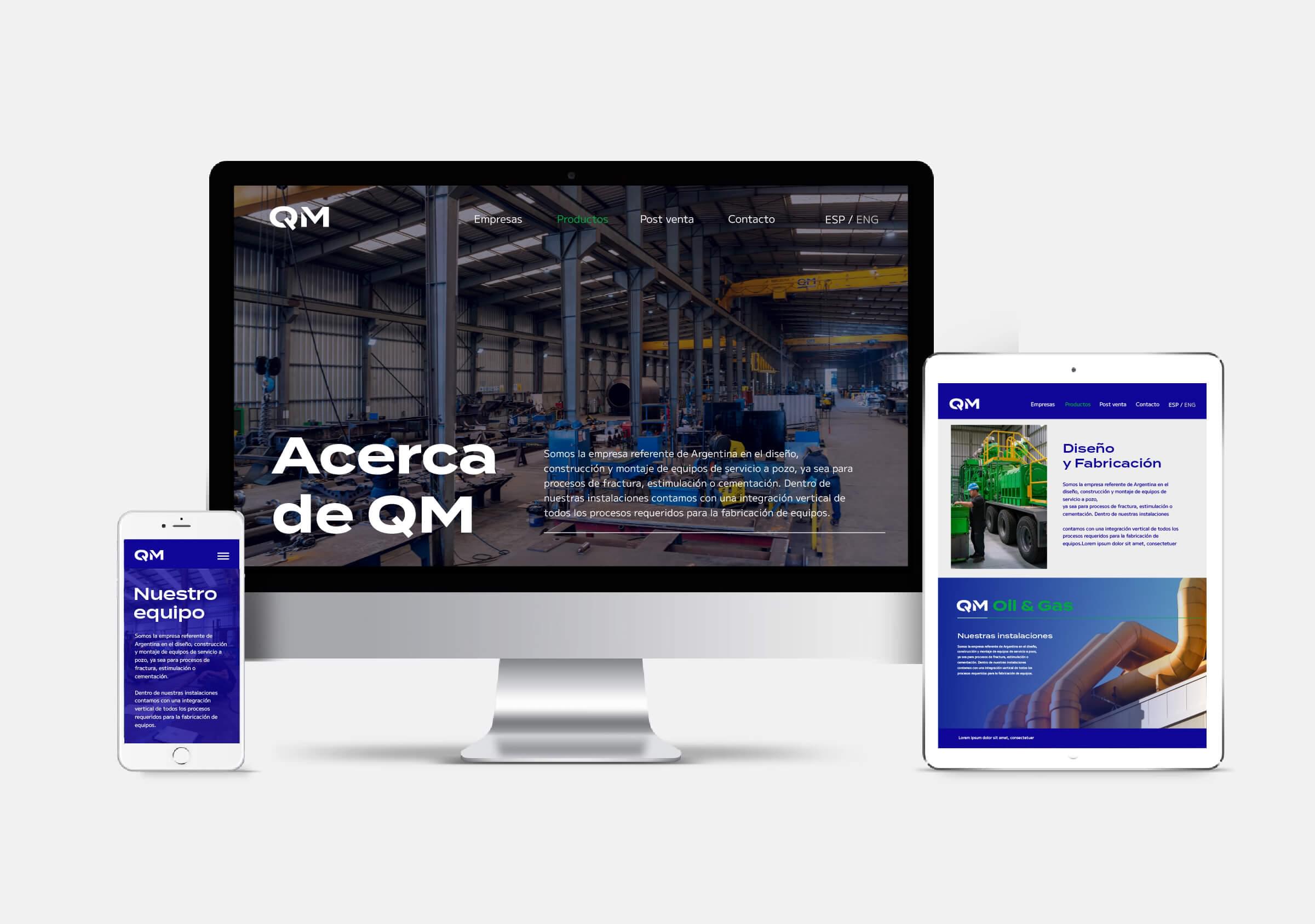
On the other hand, the multilingual website enhances these same resources (lines and gradients) along with video shots and images, to present and transmit the weight and experience of the company.
