- Fuego Yámana
- /
- Gitti
Gitti
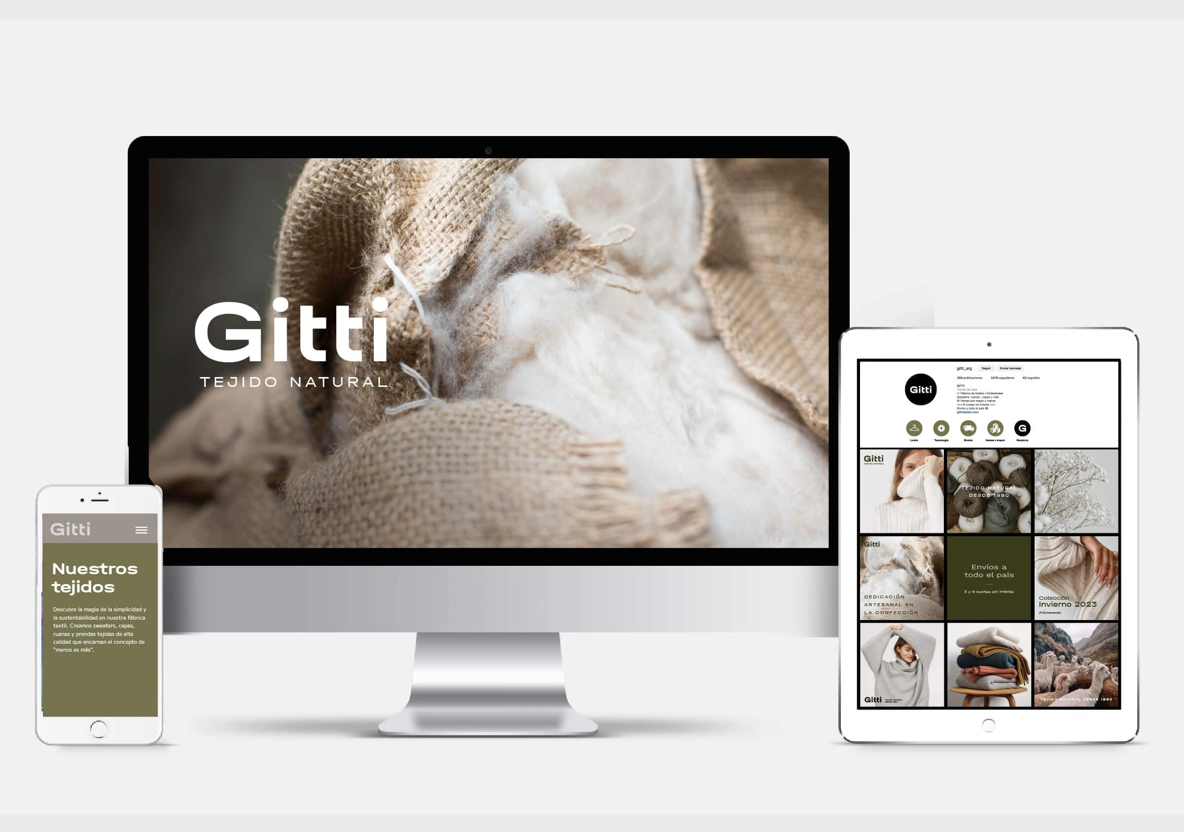
The textile company Gitti requested a rebranding project to define its new visual identity. The proposal focused on a total clean up of its graphic brand.
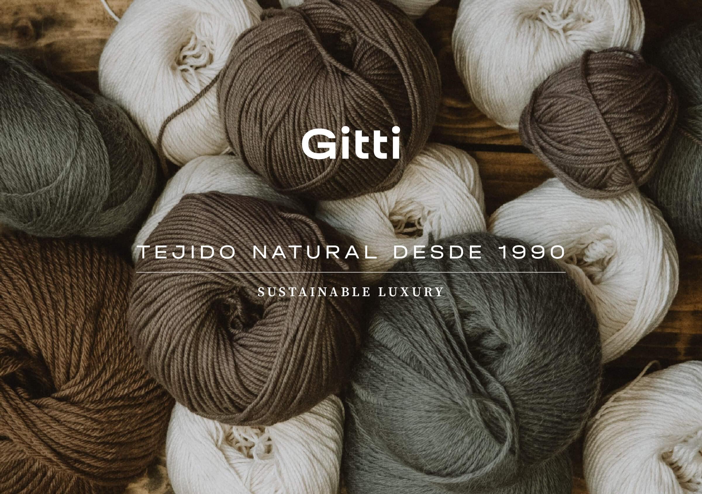
As it often happens with companies, Gitti did not possess a stable brand, capable of being preserved over the years and capitalizing on the identifying value that time grants. This visual instability had led to the use of different marks, having previously used both sans serif, serif and handwritten typefaces.

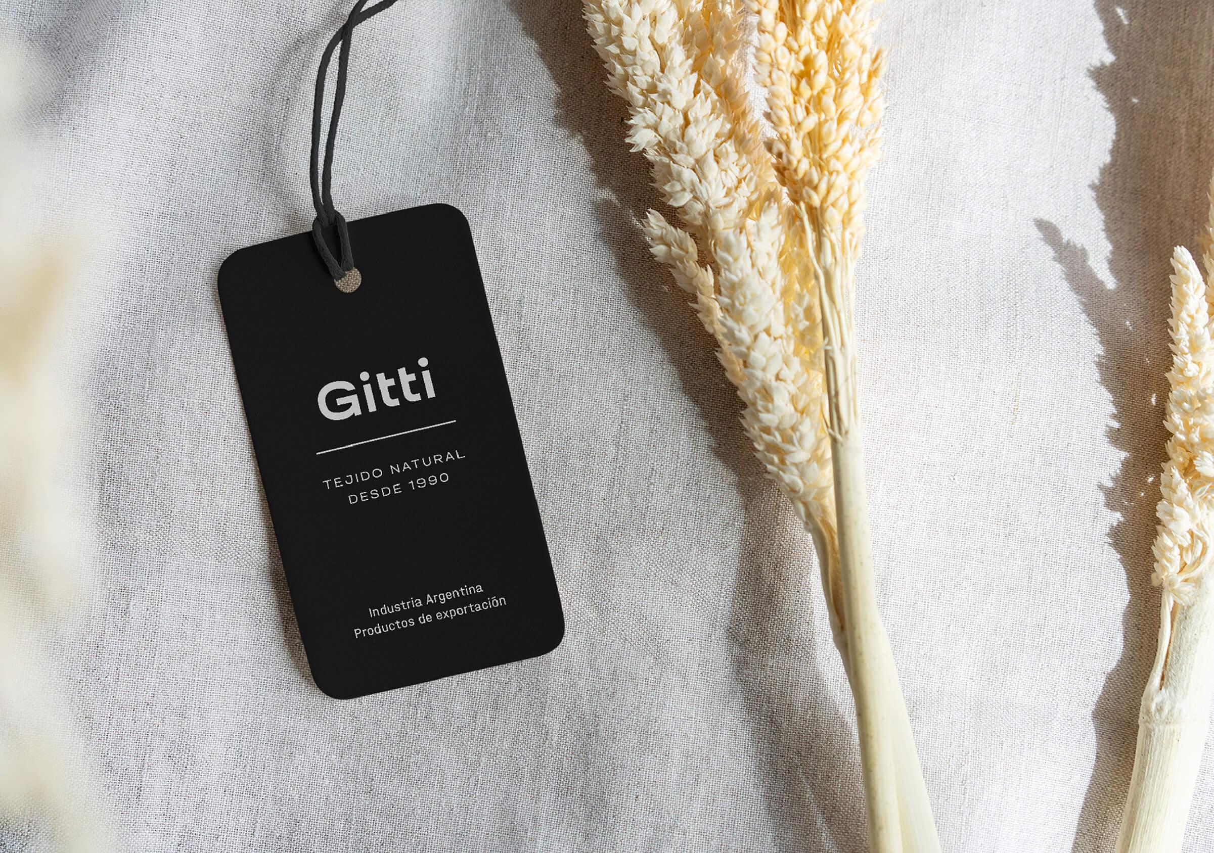
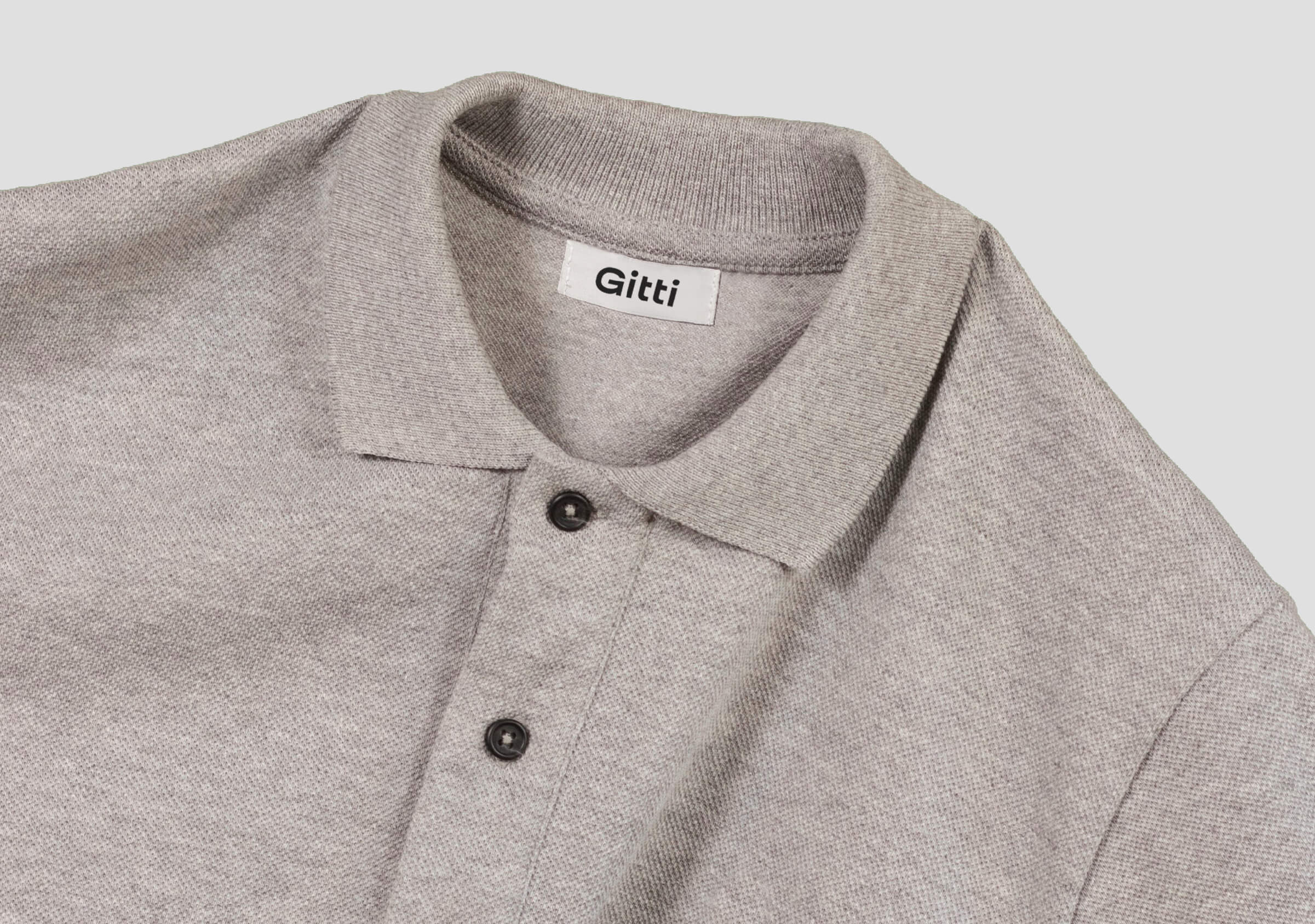
The project idea focused on designing a new identity, which would normalize the application of the brand, to build a more consistent and distinctive presence, while making it modern, legible and recognizable.
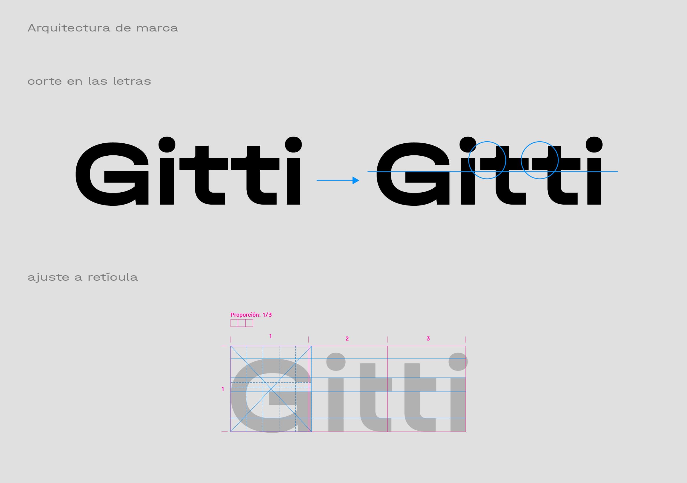
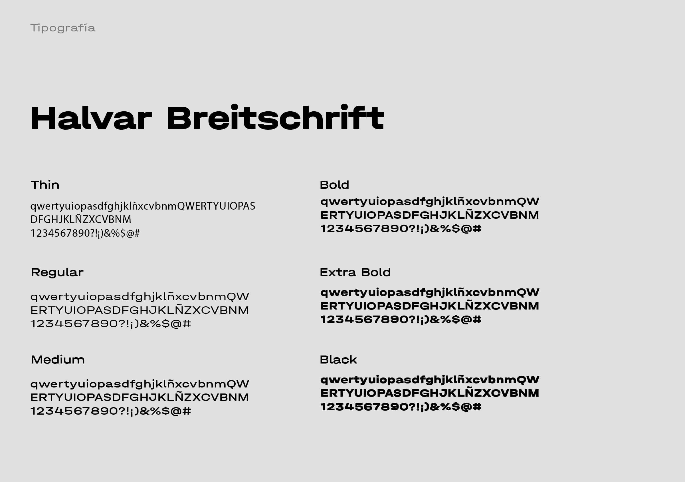
The immersion, analysis and strategy stage of the project focused on the investigation of the competitive landscape and an in-depth typographical study, to define both the conformation of the name (use of upper and lower case letters) and the ideal type font to achieve a correct reading of the word Gitti, with a pleasing morphology to the eye and containing some characteristic feature.
For the color palette, we selected harmonious tones linked to natural fabrics: bone, beige and pale shades of green.
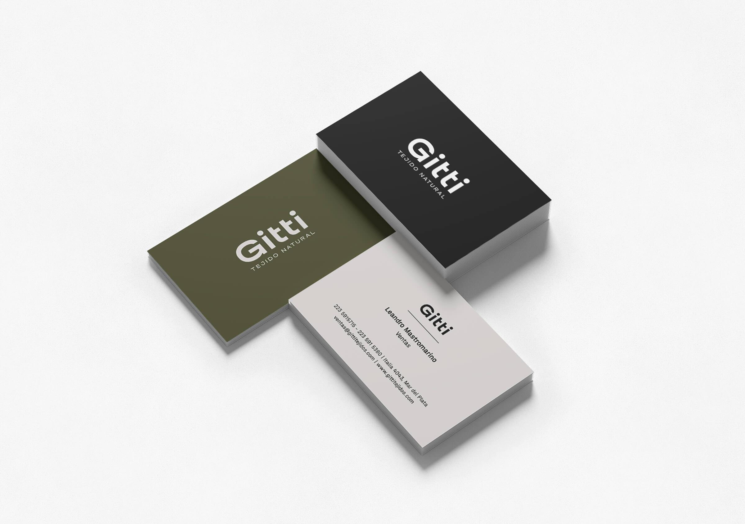
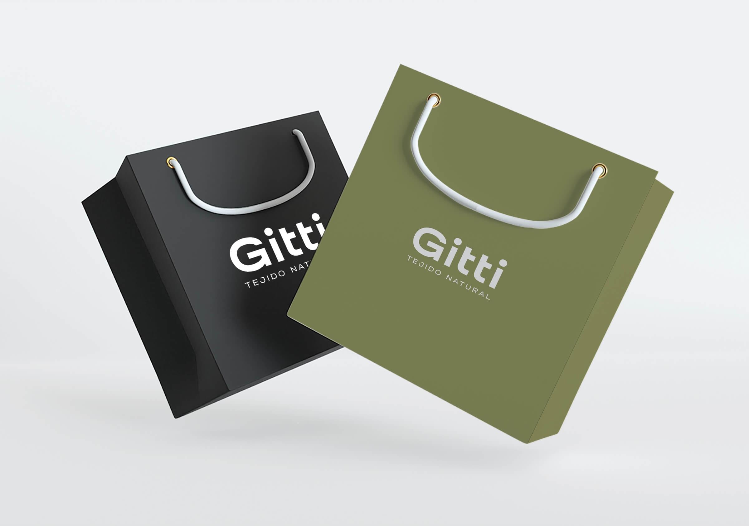
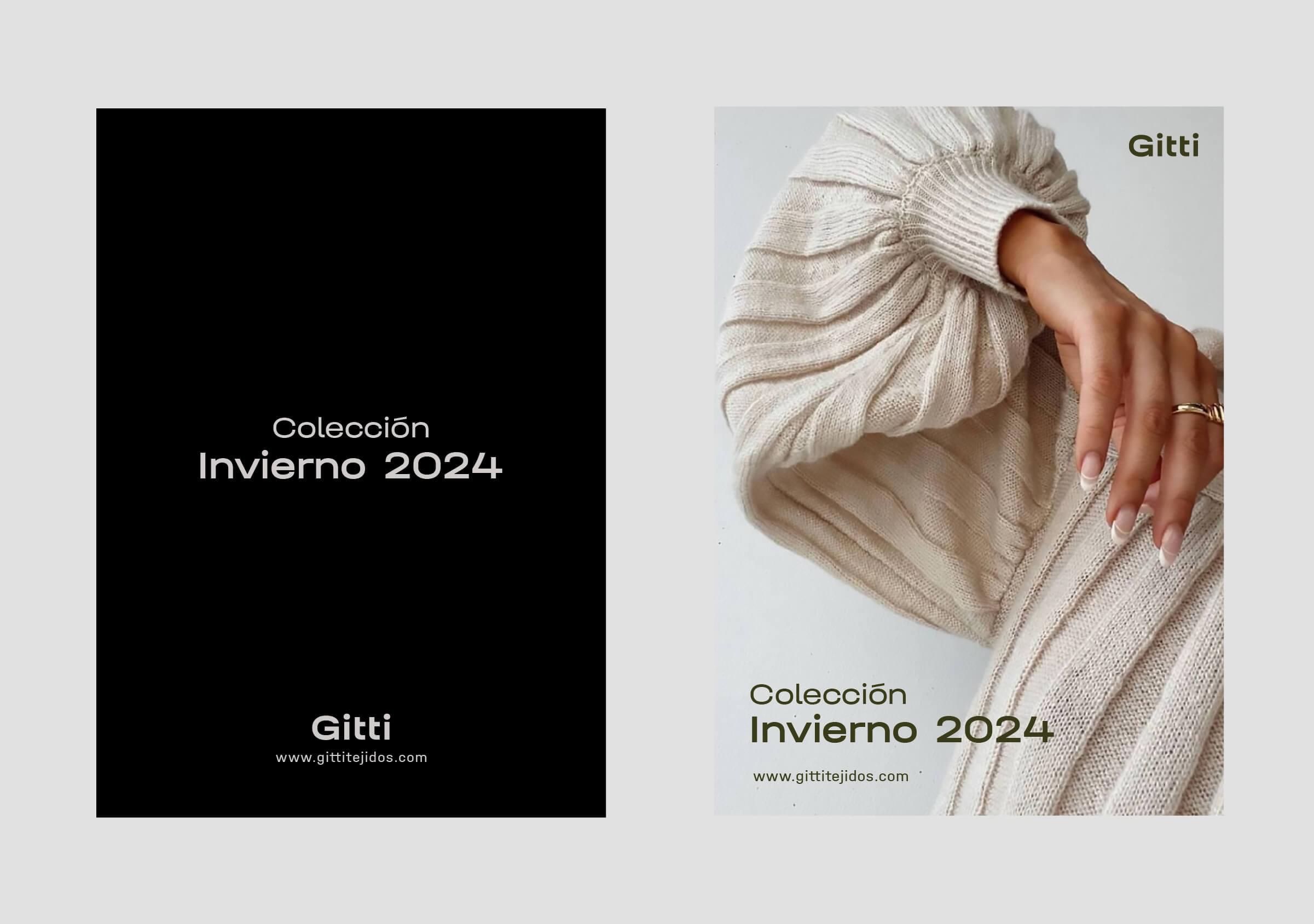

The new brand focuses its power on the 5 letters “Gitti”. Maximum readability and versatility. Purity and simplicity. Sans-serif typeface, BOLD thickness, with classic geometric curves. Capable of evoking modernity and distinction, and connecting with a universe linked to sustainability. A classic logo, stable and capable of being the identifying sign of the company throughout the years.
