- Fuego Yámana
- /
- Menor Coste
Menor Coste
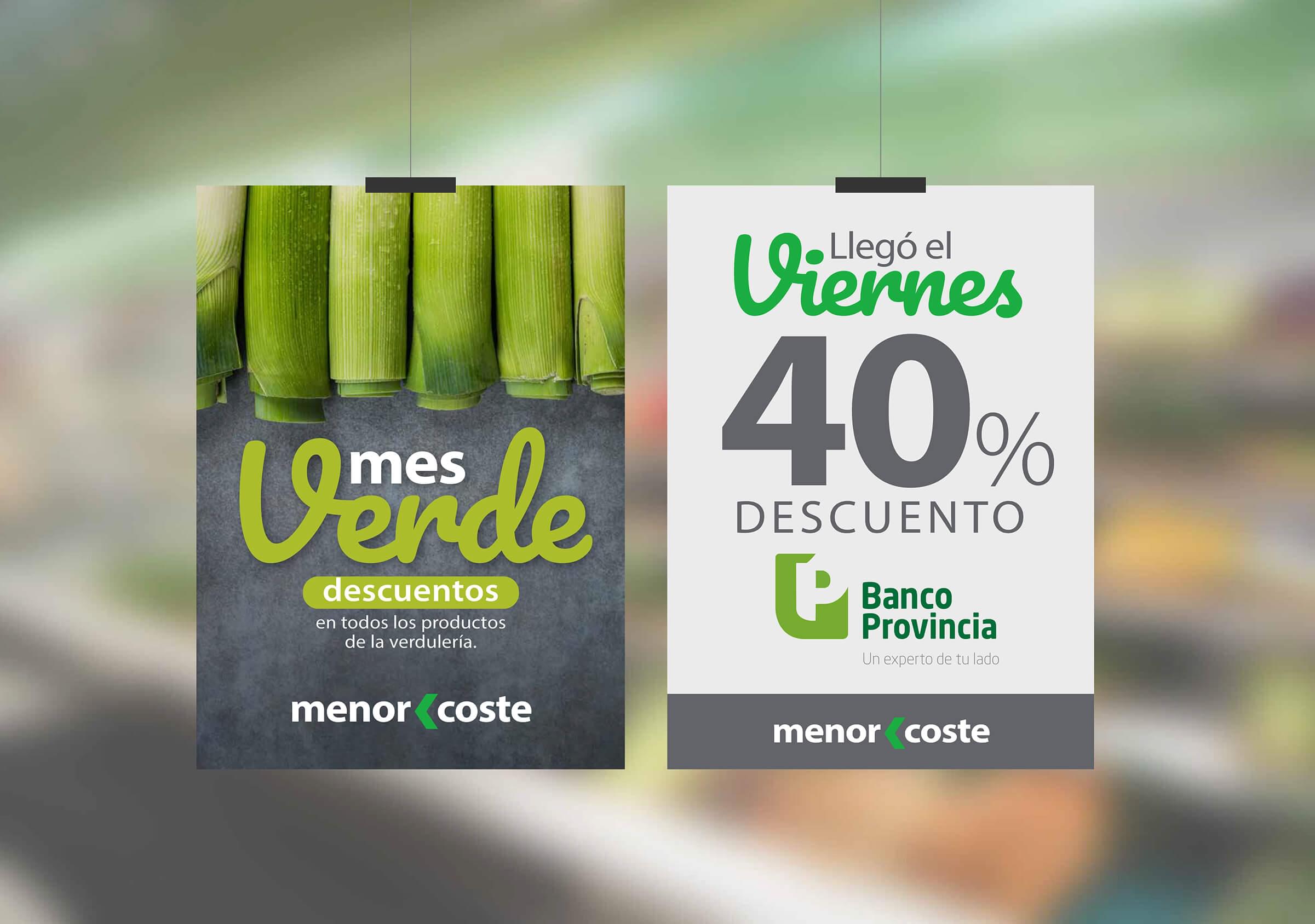
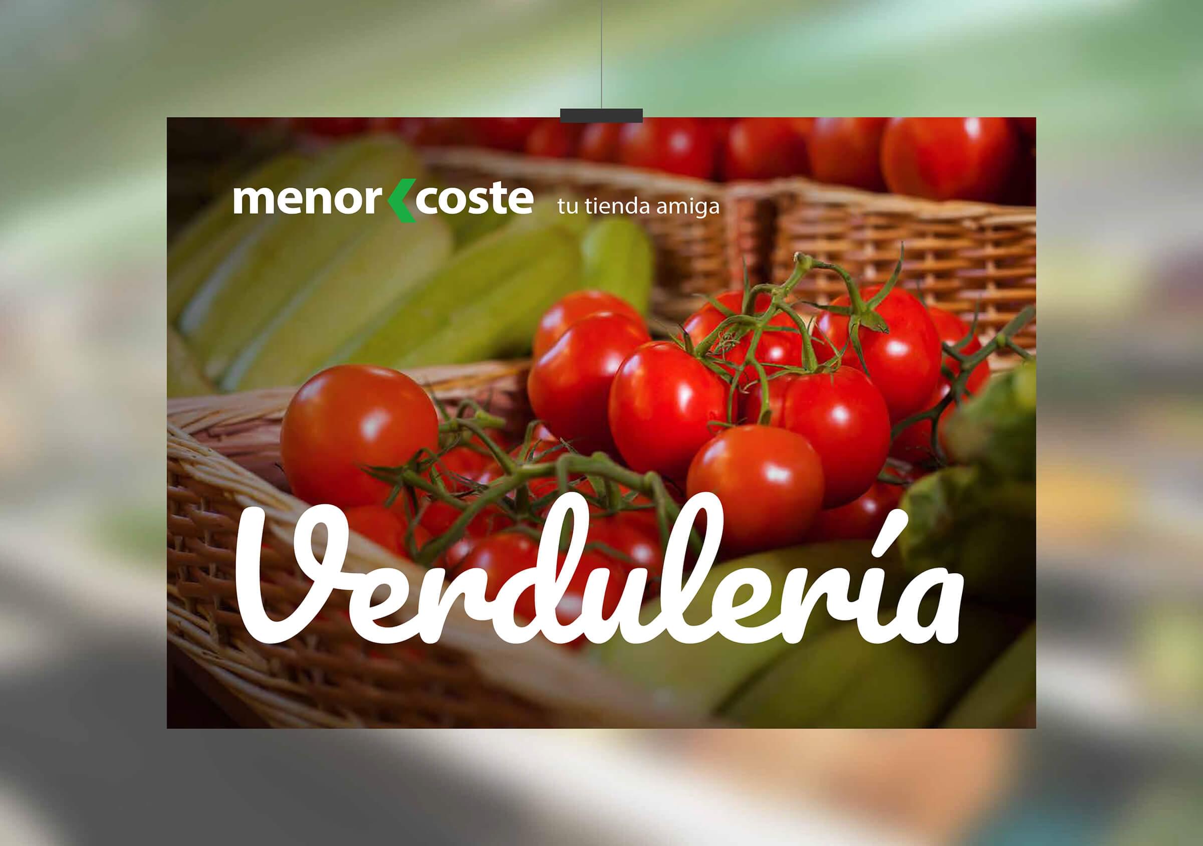
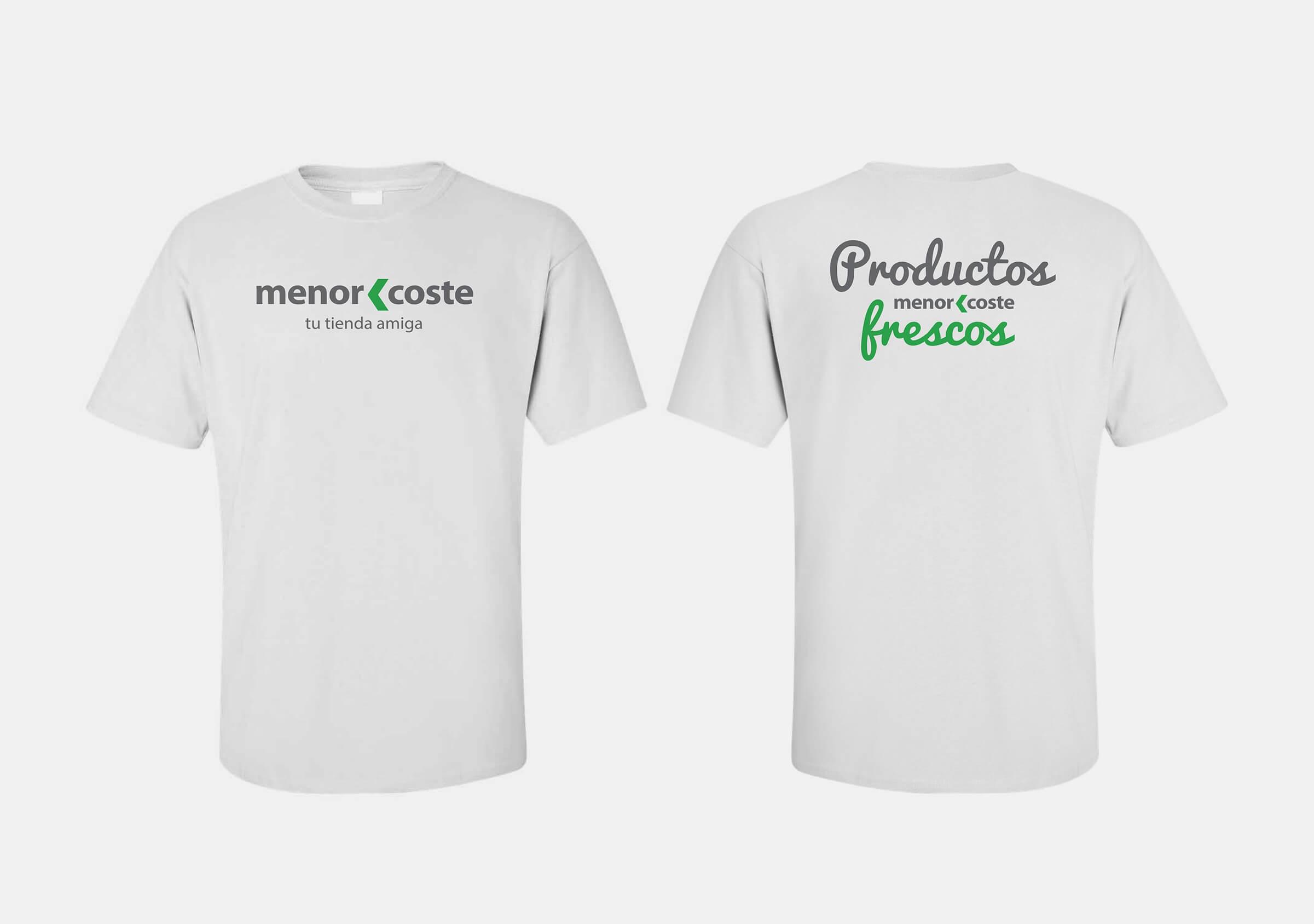
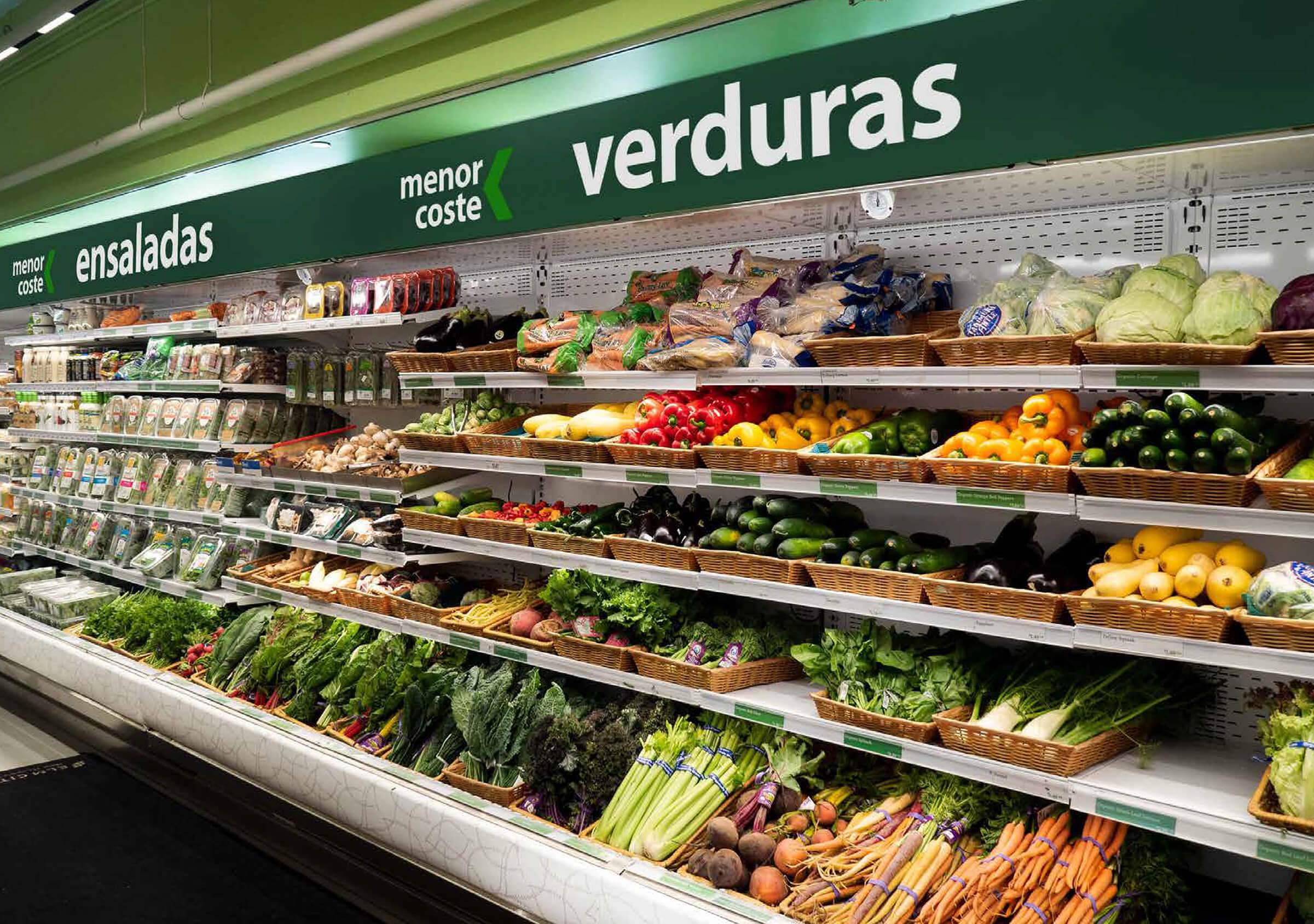
We developed a complete visual identity program for “Menor Coste”, a new chain of supermarkets that opens its first branch in the city of Mar del Plata. We design from the graphic brand, to different applications for the point of sale and the digital world.
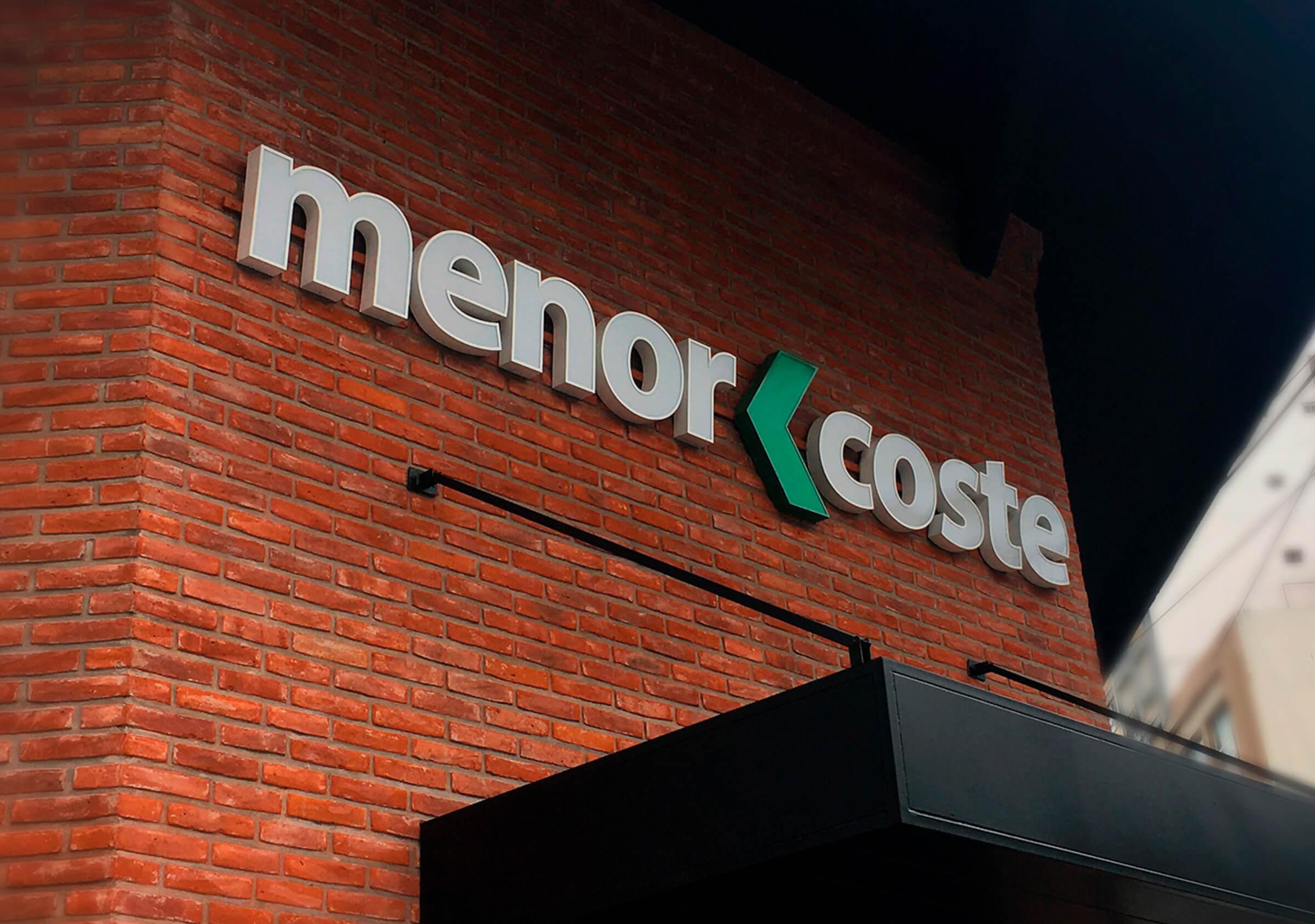

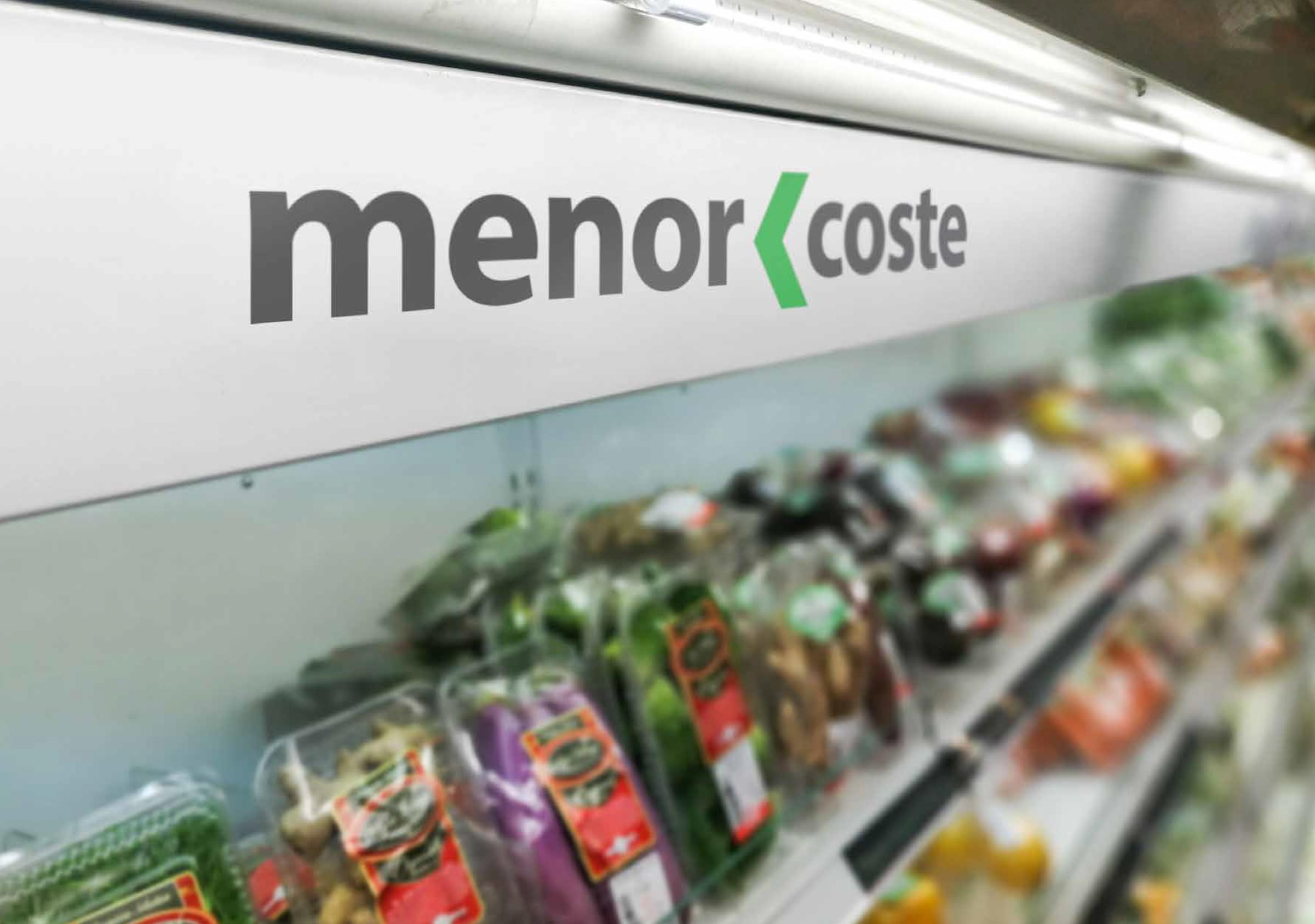
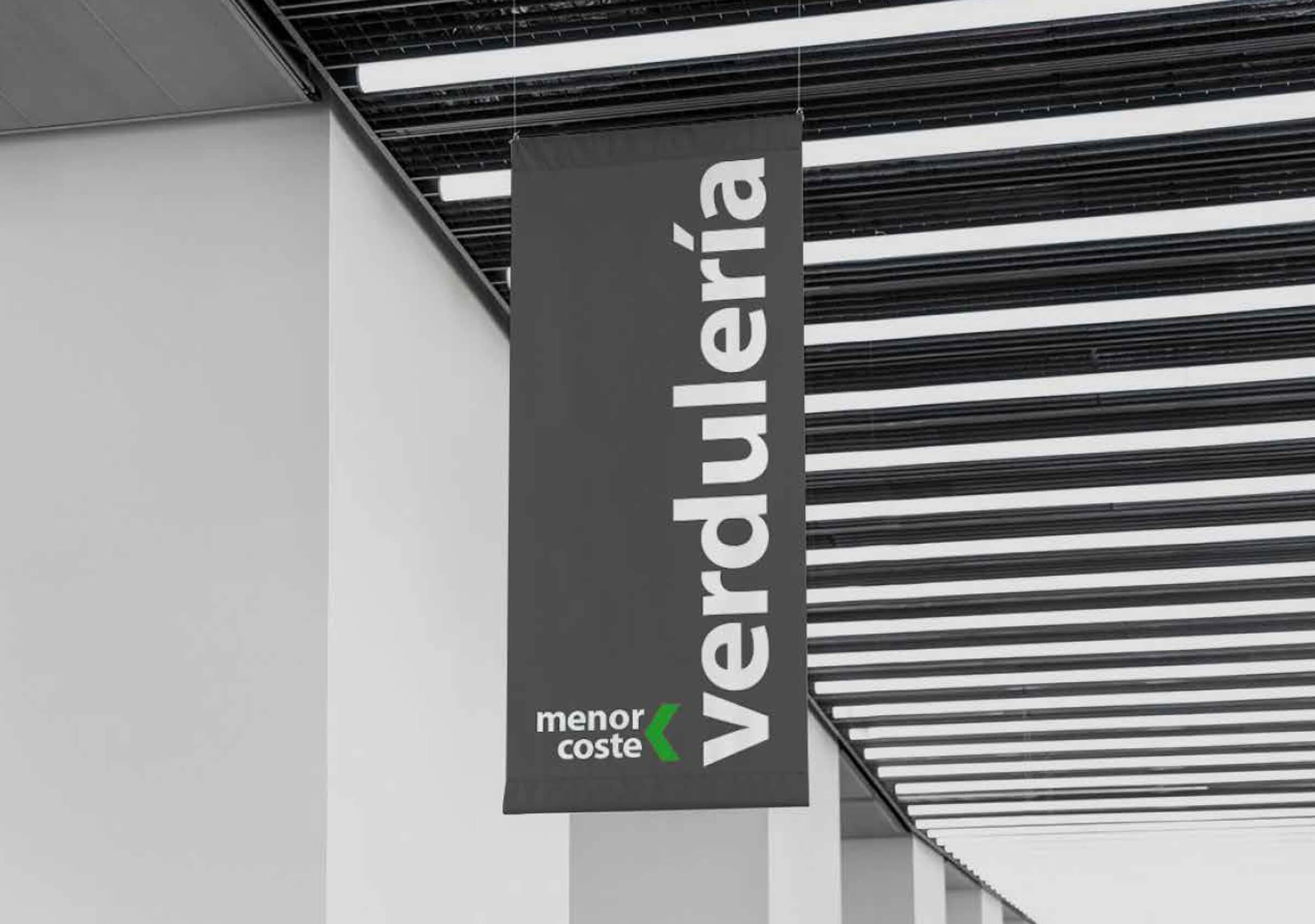
“Menor Coste” is a friendly and close, simple, fresh and transparent brand that promises its customers a unique experience at the point of sale, offering leading brands at lower prices and excellent customer service.
Its goal in the future is to compete in the national market, so we develop a dynamic brand design, appealing and reproducible, so that it can be applied to all media and adapt to any architectural situation. To represent the freshness we use a color palette based on the intense green that, complemented with the lead gray, transmits the elegance and simplicity characteristic of the brand.
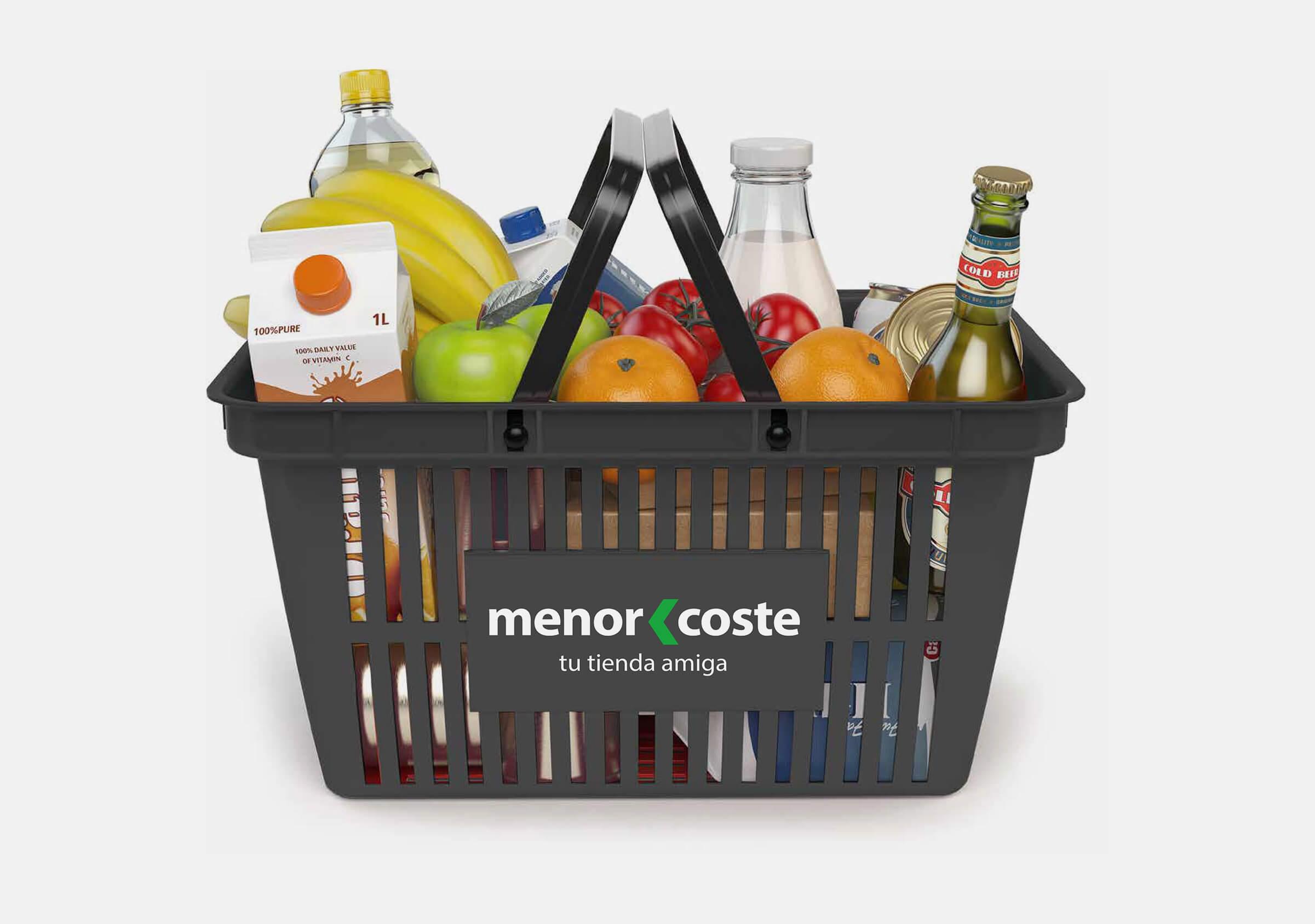
The brand name, “Menor Coste”, is the key to the strategy since, through a subtle play of words, it communicates directly the proposal offered by the supermarket: low prices.
In addition, through the combination of colors, they are in perfect harmony and convey tranquility; and the typeface chosen for the logo, with its gentle curves but without losing some rigidity, connote the reliability and professionalism that the brand promises to its customers.
To reach these results, we start from a broad brand scenario composed of two groups: competition and aspirational brands. We carry out an analysis on different qualities such as the selection and presentation of the products, the architecture at the point of sale and the corporate visual identity of each one and we obtained as a result an original, attractive brand that conveys freshness, warmth and reliability.
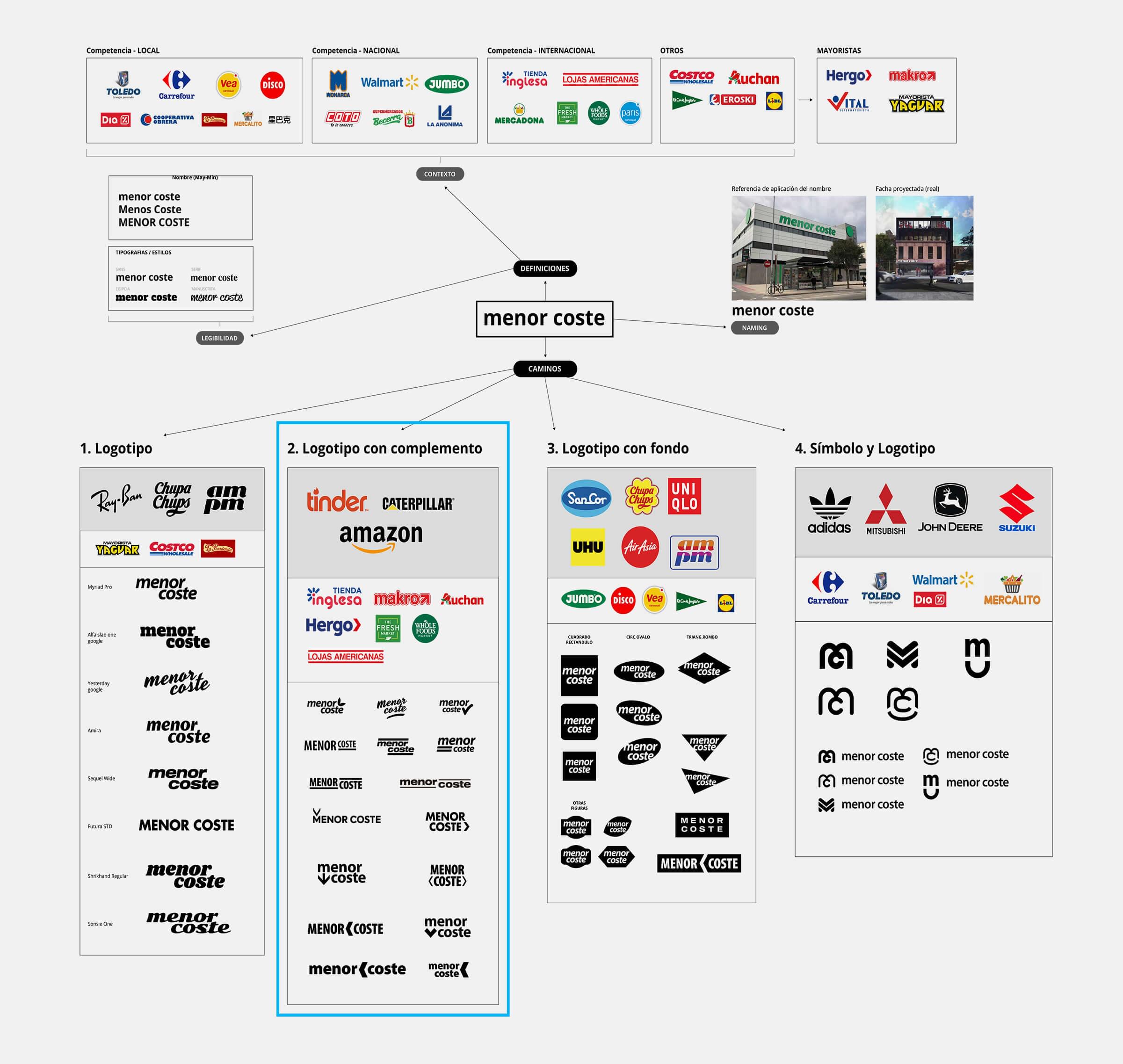
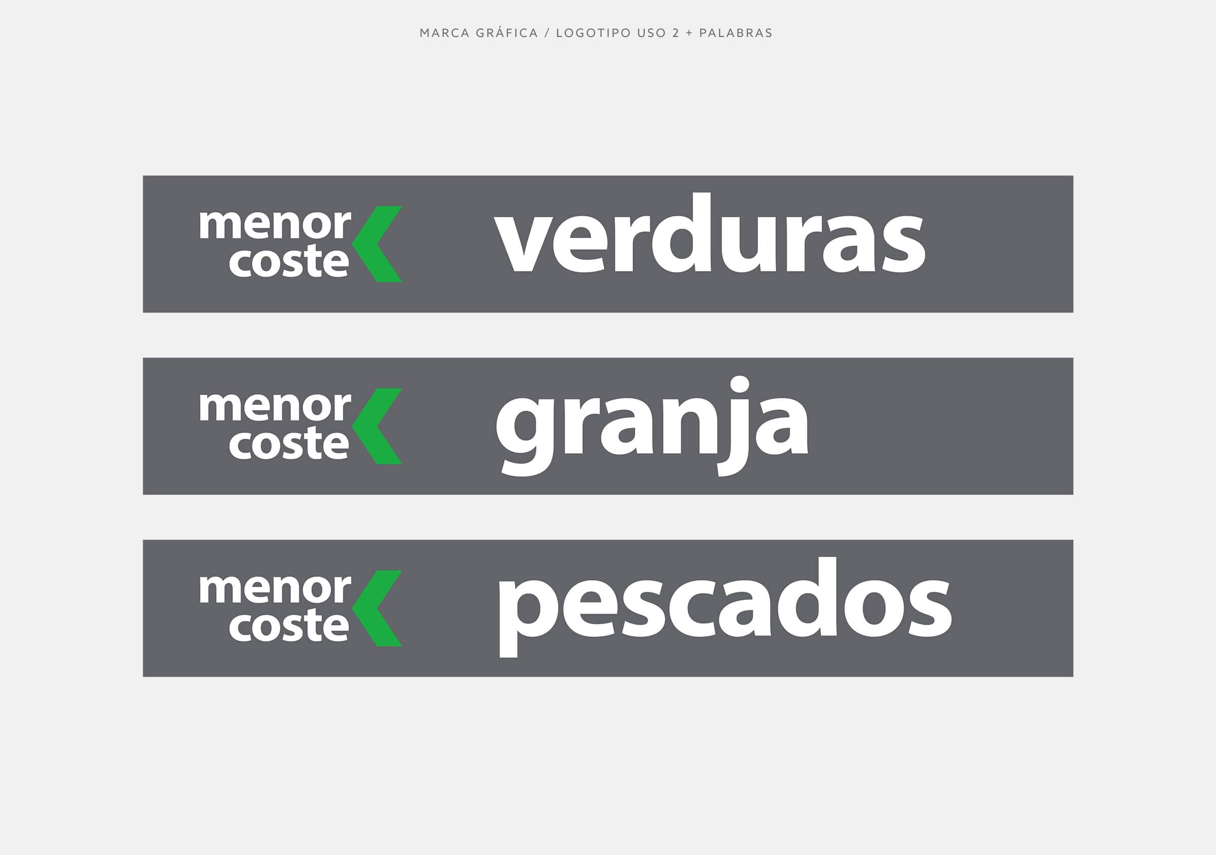
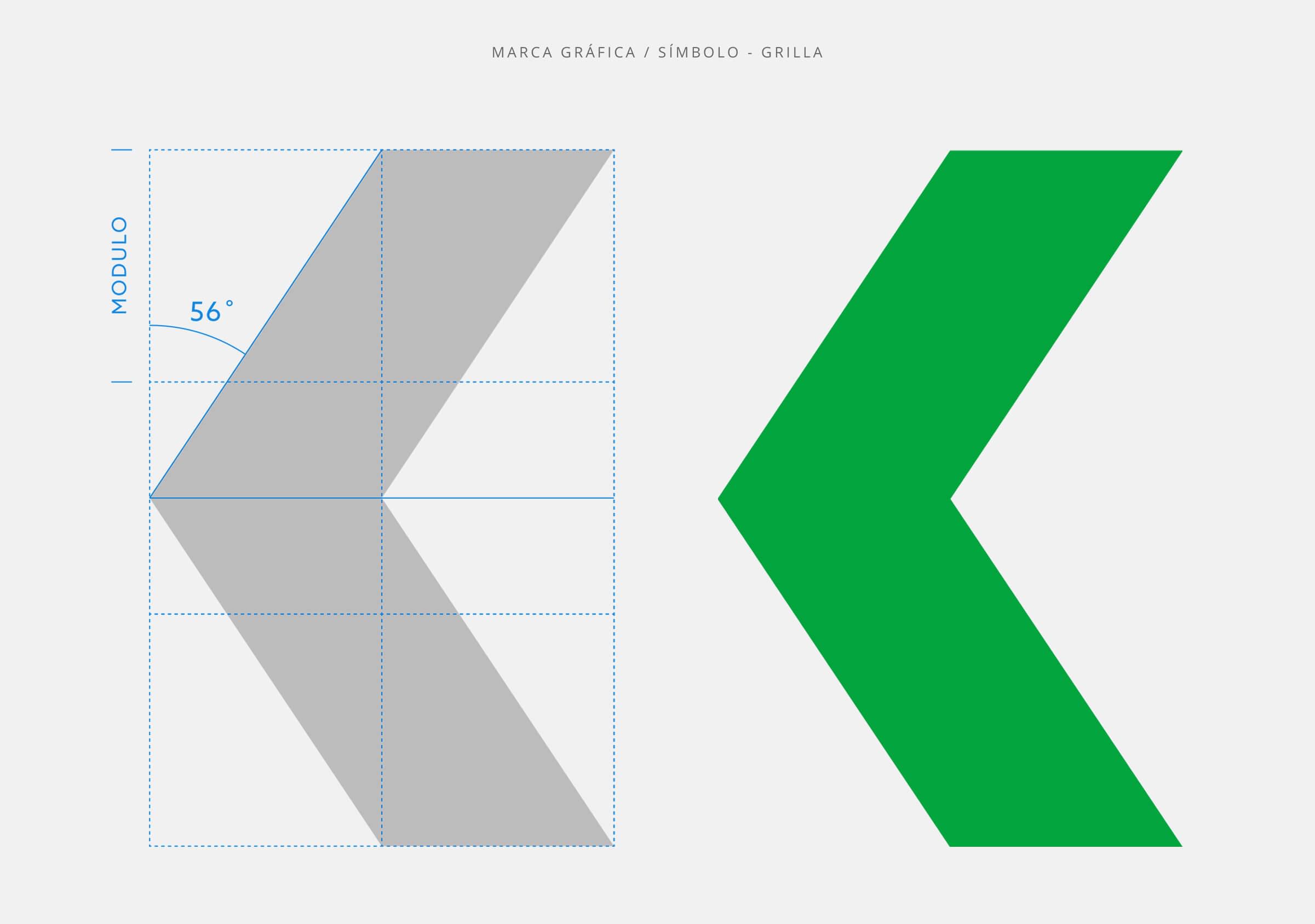
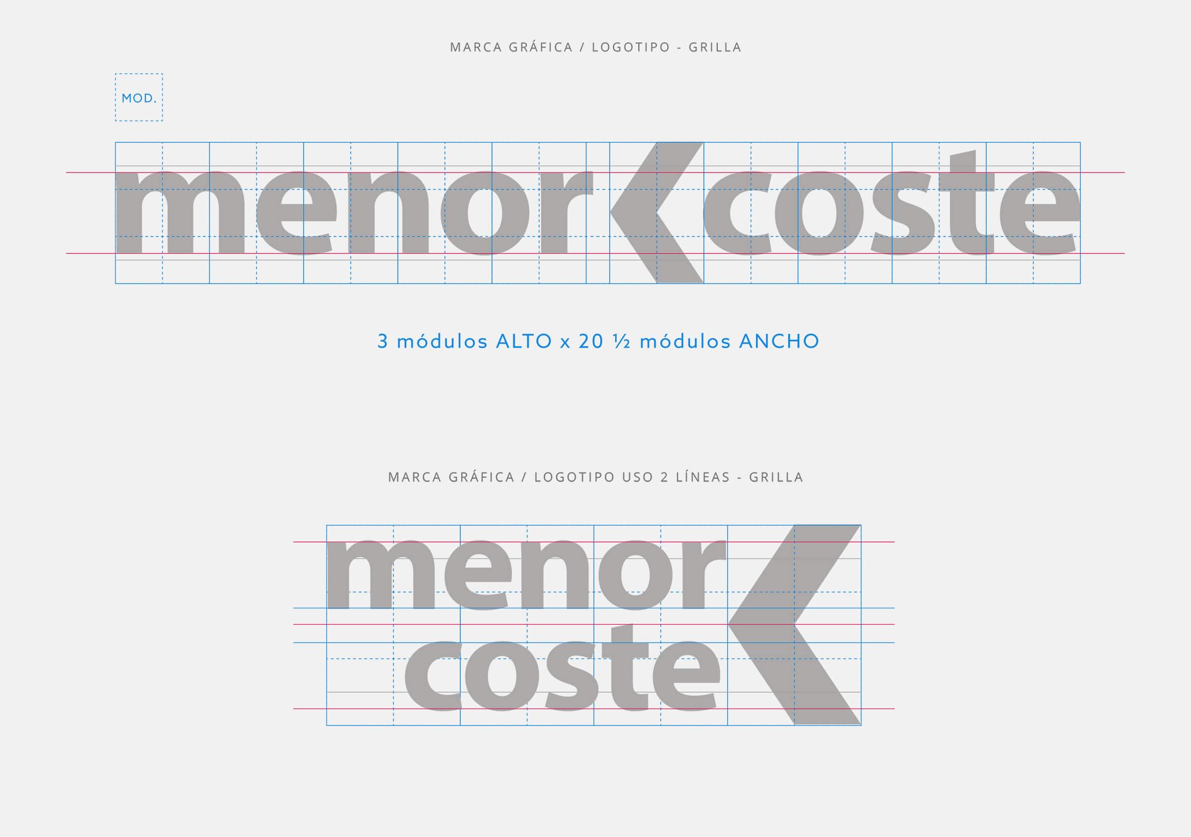
In order to generate a unique and distinctive graphic brand, we seek to complement the logo with the “minor” sign (<), which balances the space between the two words and finishes anchoring the brand name.
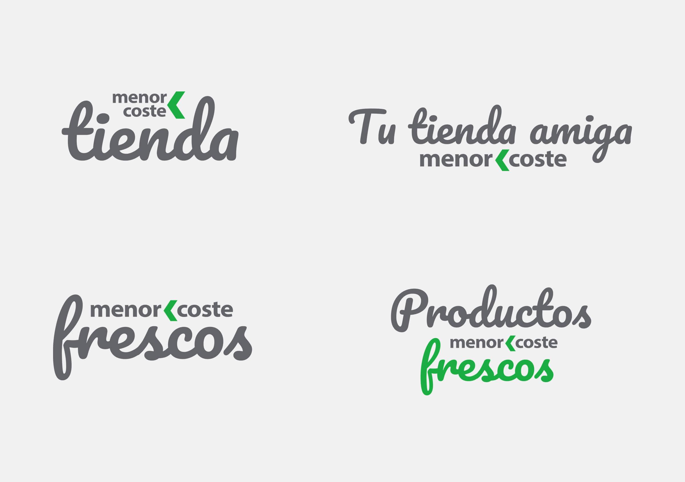
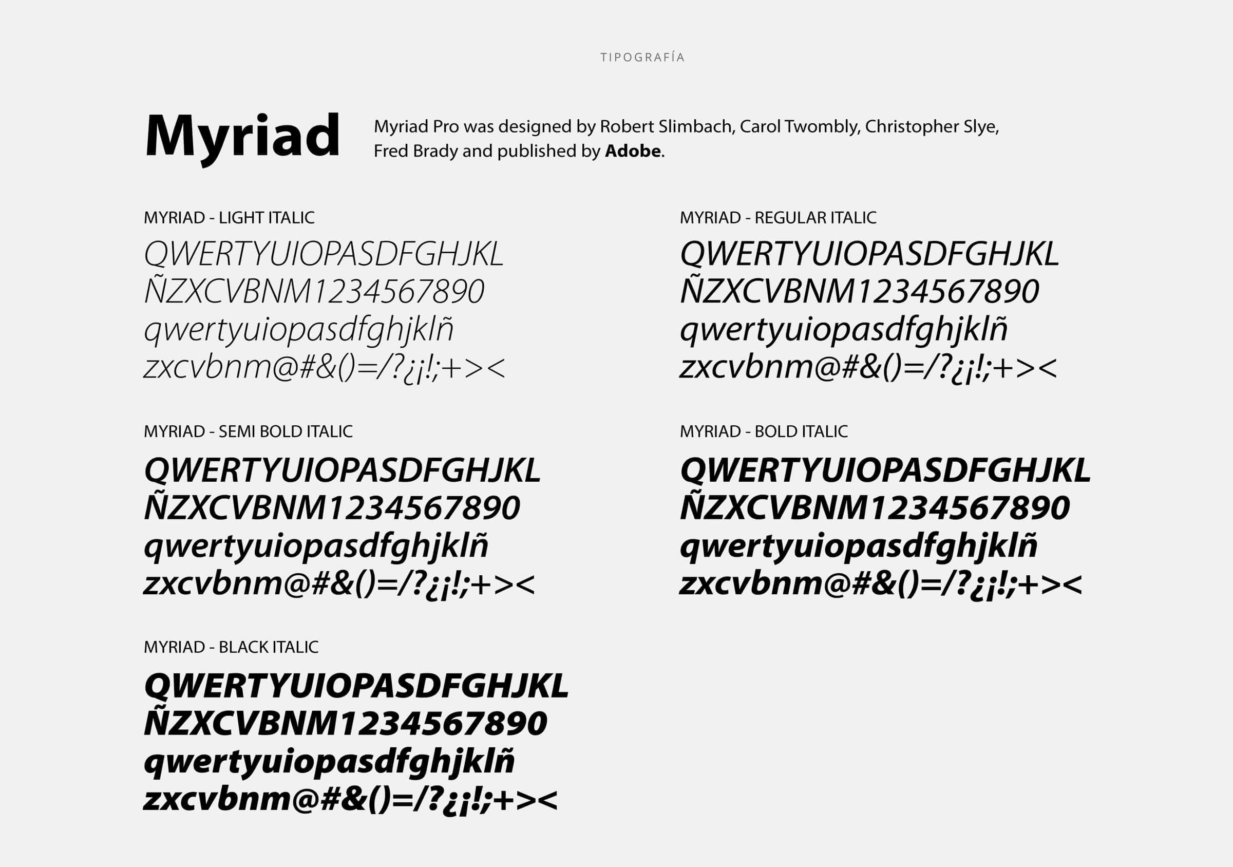
For the logo design we use the Myriad Pro typeface family, which, among its main qualities, is to be highly readable. Its soft stroke conveys warmth, closeness and confidence. Another characteristic of the chosen typeface is the wide variable, which allows the same style to be used in different ways, without losing coherence.
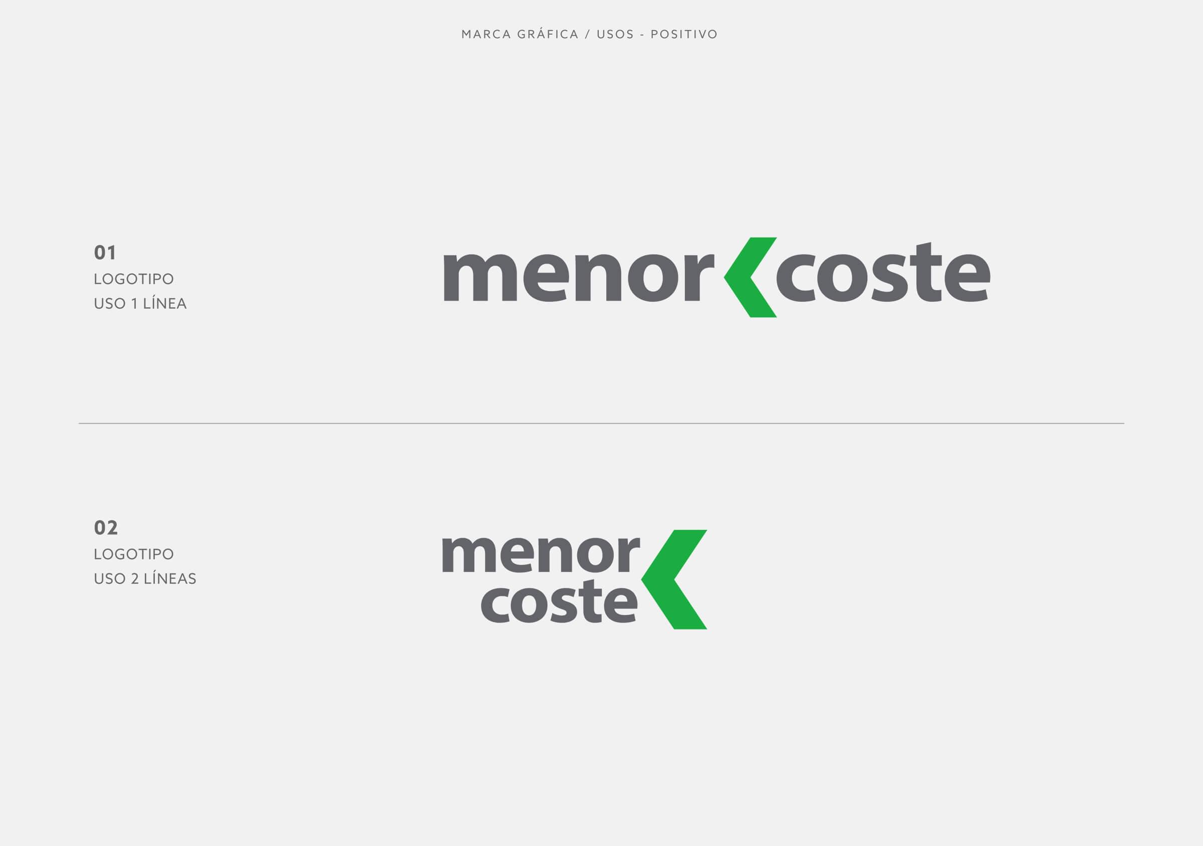
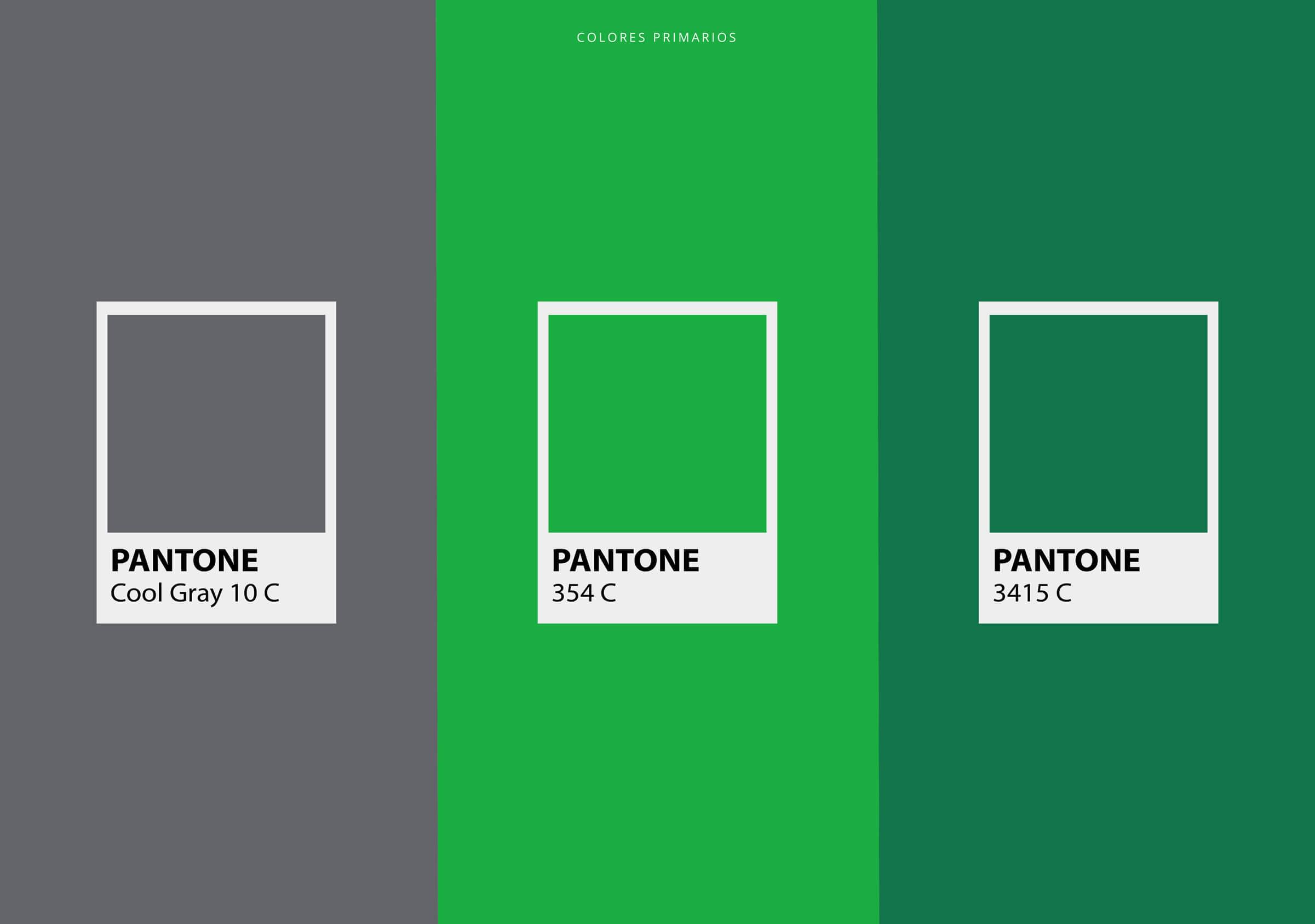
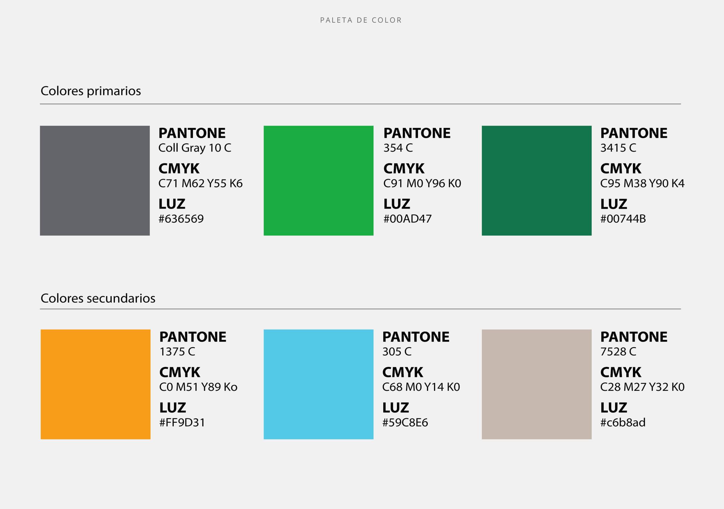
As for the color strategy, the idea was to transmit, as we mentioned earlier, the freshness, cleanliness and simplicity that make up the DNA tag.
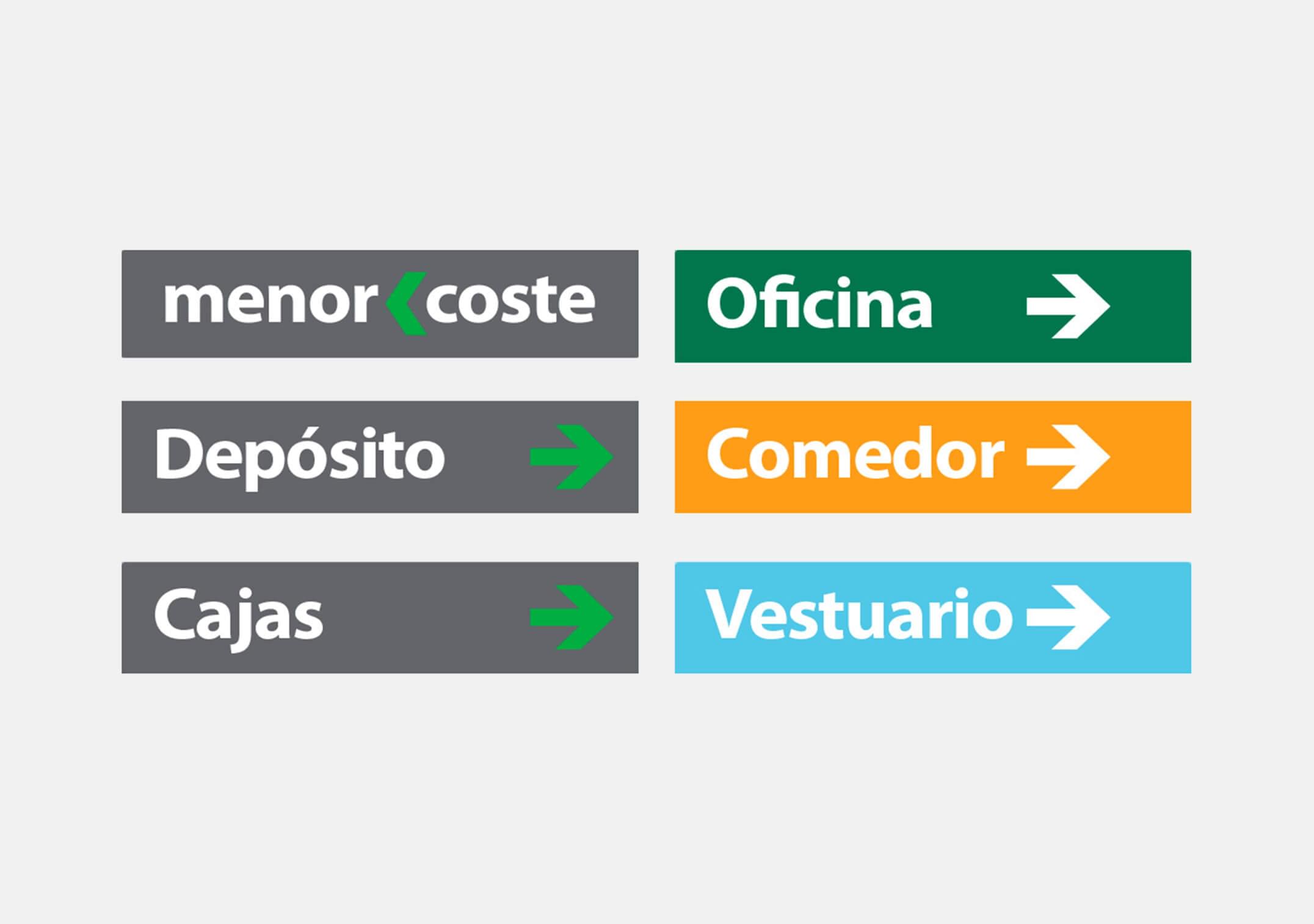
For that, the intense green was chosen as the protagonist and complemented with the gray lead. This combination is enhanced by the selection of complementary colors: orange, light blue and sand; because they give the brand greater visual richness to develop the different applications that are required for this particular case, supermarkets. In turn, they decontract, in a way, the neutrality of the main range, communicating the friendly side of the trademark proposal. Something similar occurs with the complementary typographic family, which, being calligraphic, its soft strokes, reveal the friendly side, allowing a better approach to its audiences.
