- Fuego Yámana
- /
- Abreu
Abreu
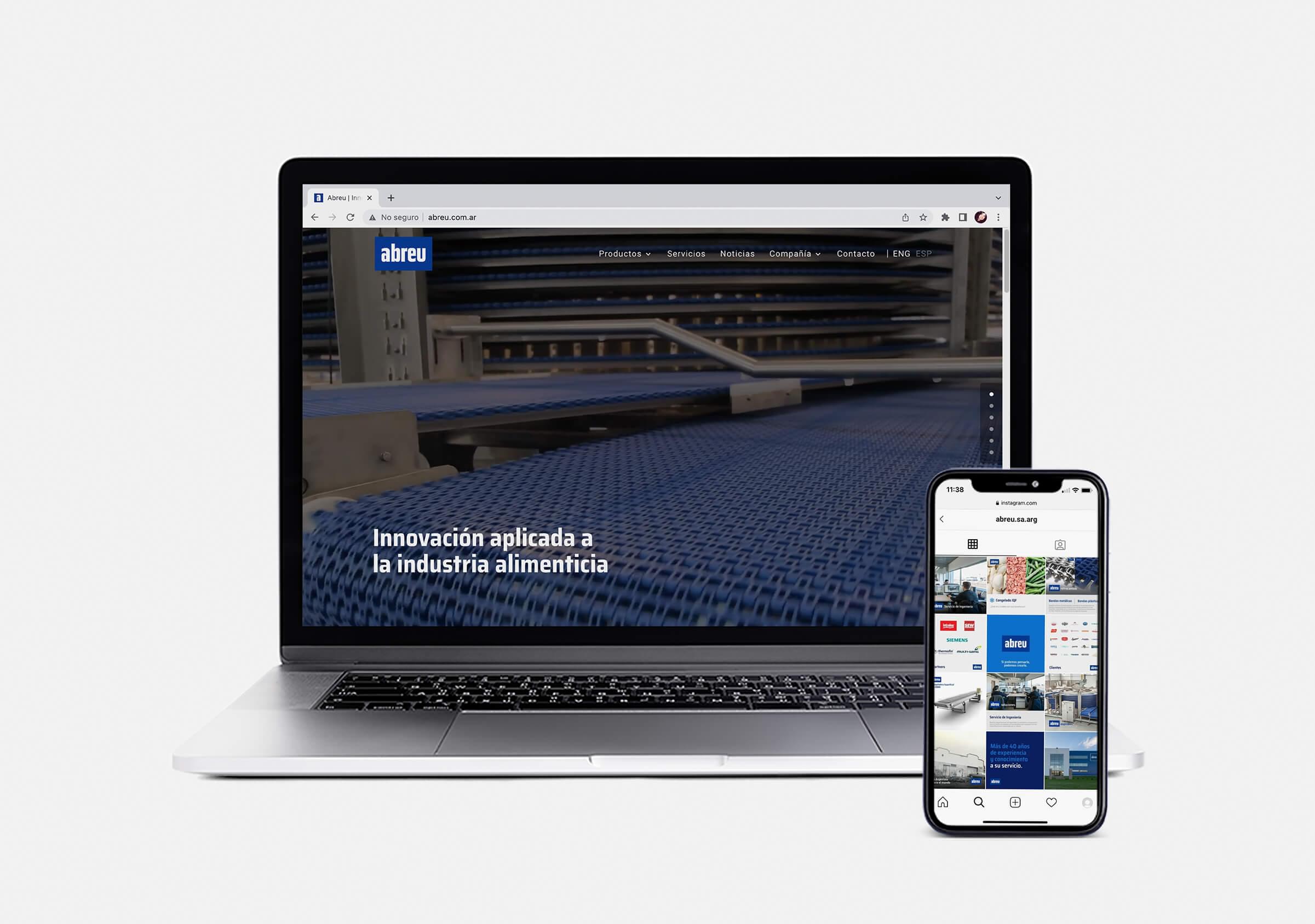
Preparing for an international industry exhibition, we worked together with Abreu to strengthen its institutional image, starting with the normalization of its brand, the creation of audiovisual material and a new website where their products and services are the heroes.
abreu.com.ar
We began our work with Abreu with a digital marketing consultancy that derived in the need to carry out several projects, starting with a brand refresh.
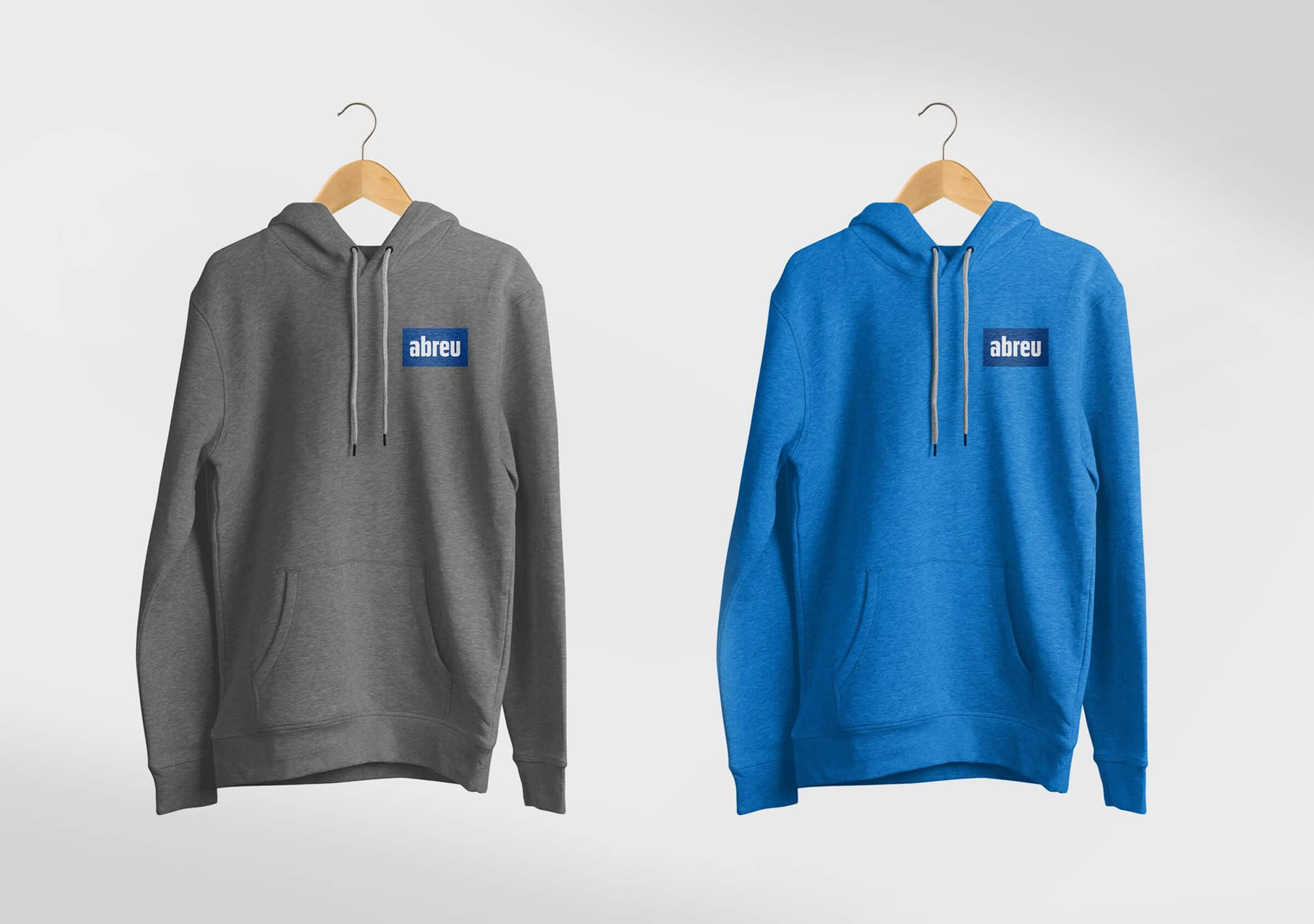
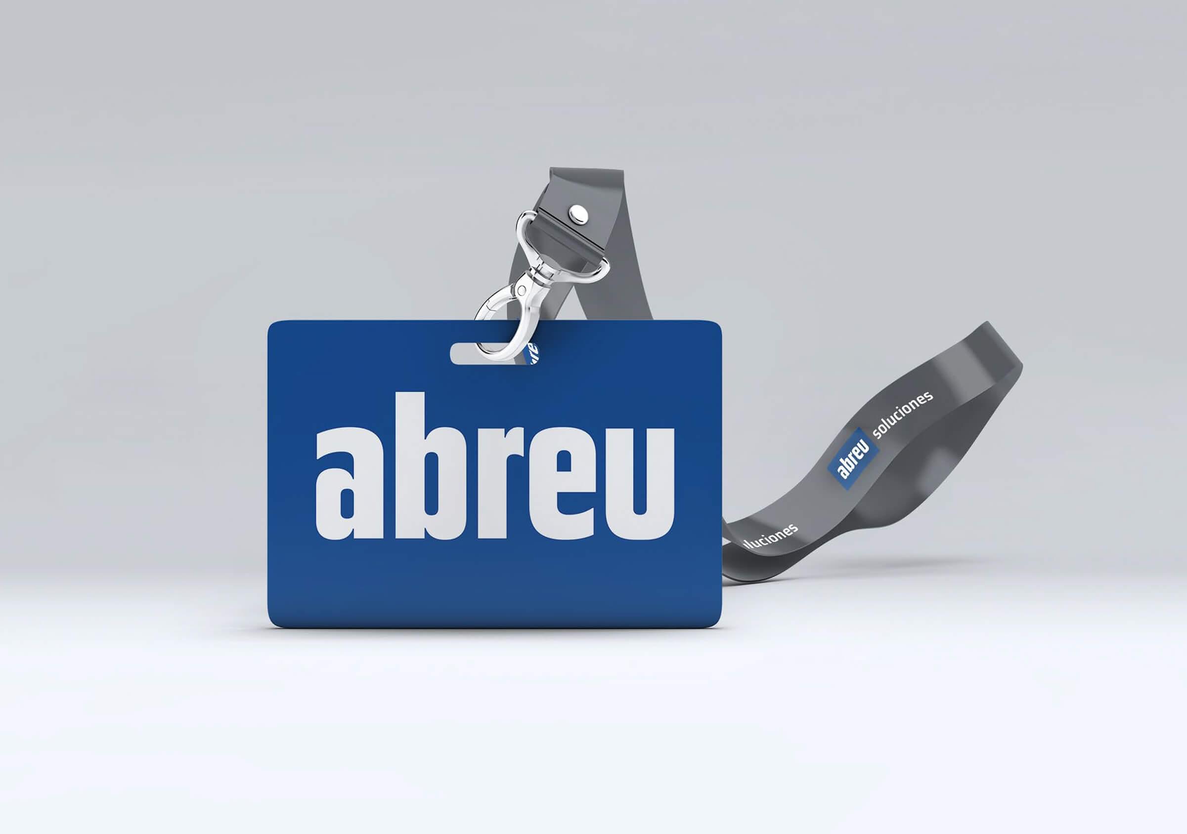
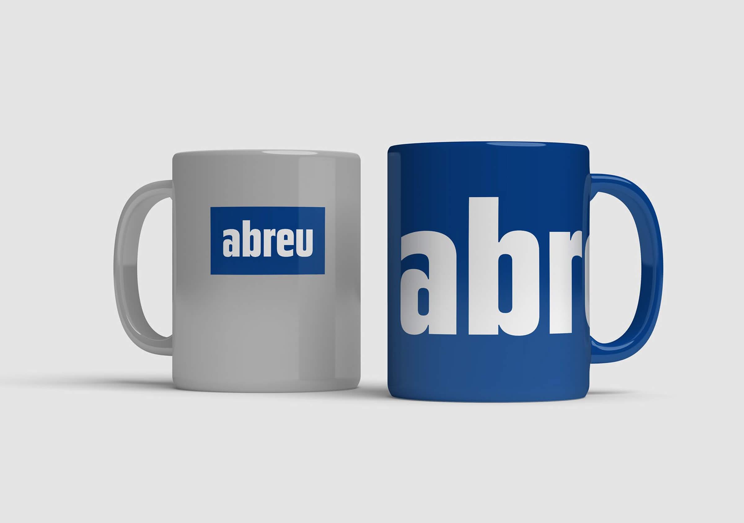
The branding project focused on adjusting and normalizing the use of their graphic brand, given the difficulties it presented (both in its legibility and in the undefined use of its container). The design work done was centered around a typographic revision and optical improvement of the characters of Abreu as well as the shape of the logo.

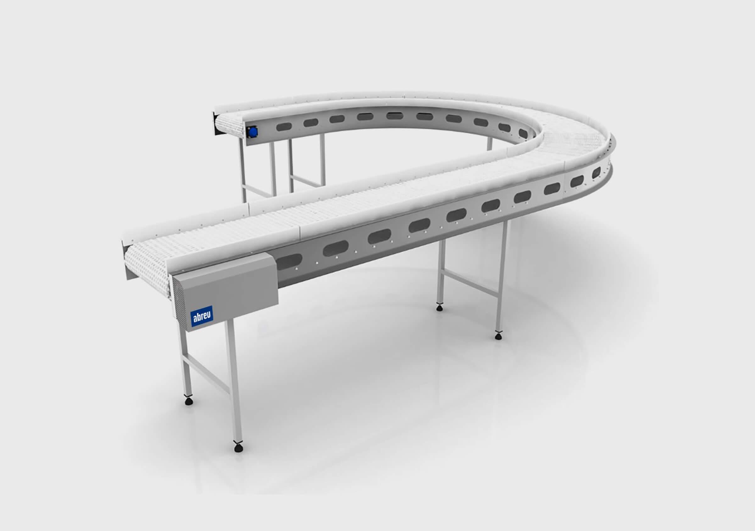
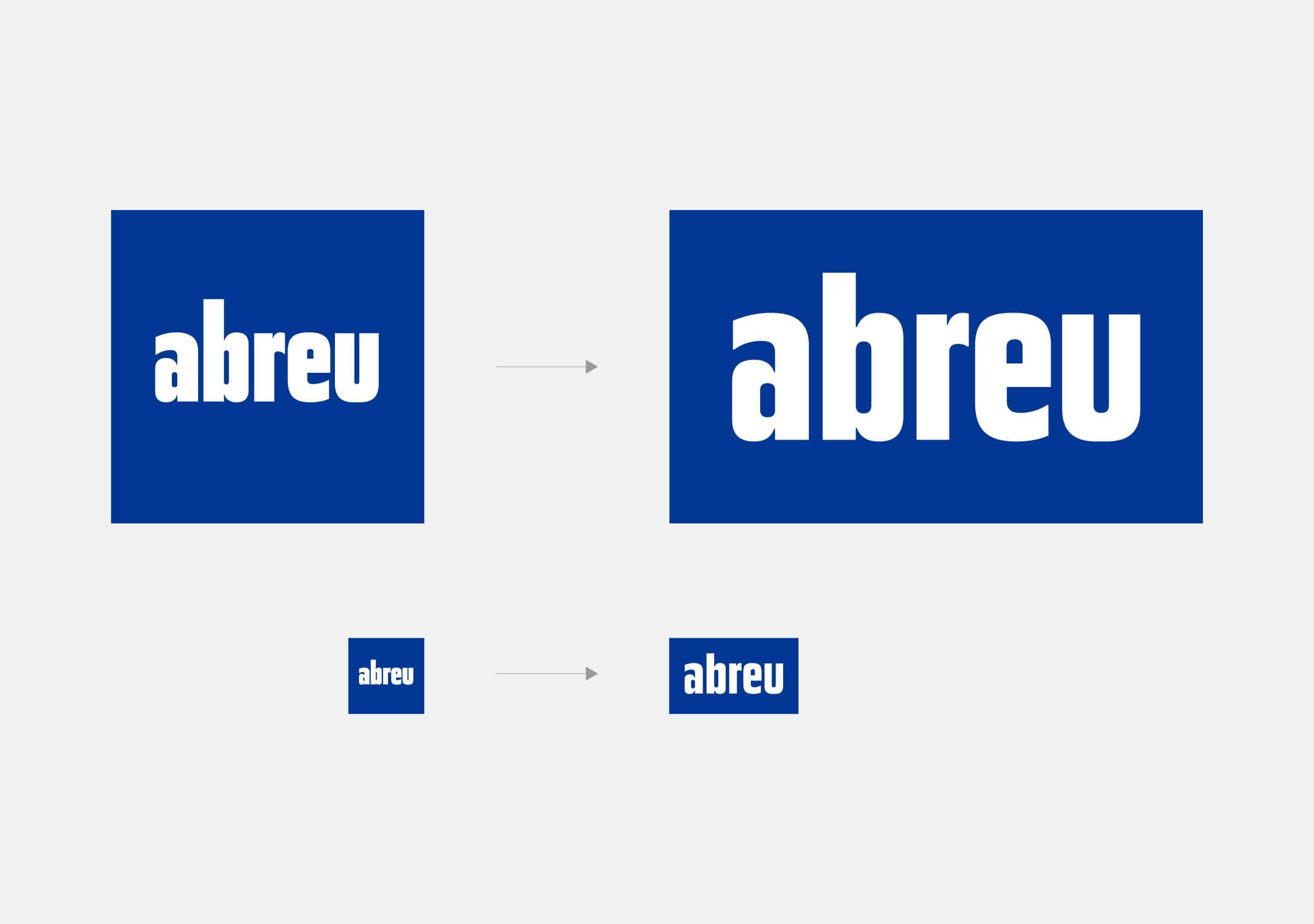
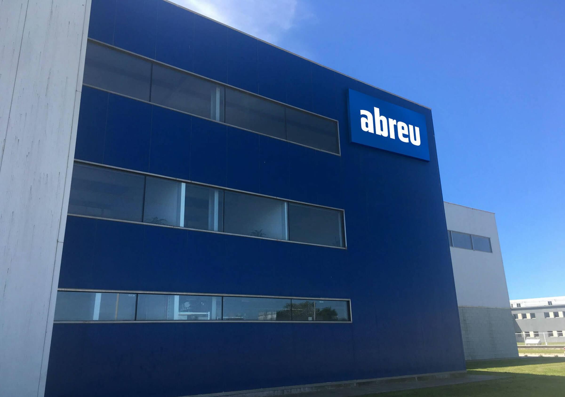
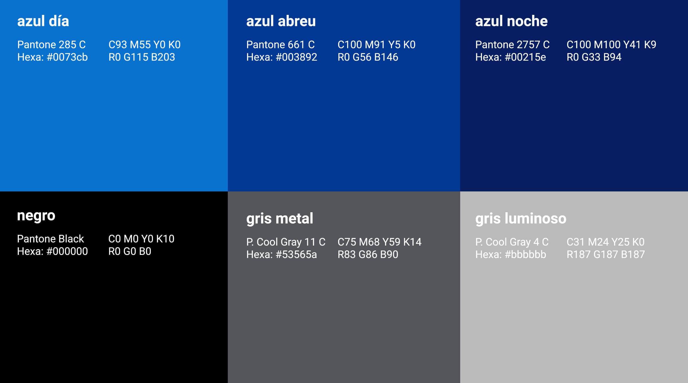
In turn, within the brand manual, a color palette and typographic system were defined to achieve consistency in the different brand applications.
This was normalized from the colors that Abreu had been using, as well as a range of tones in light-blue, blue and gray in reference to the metallurgical industry.
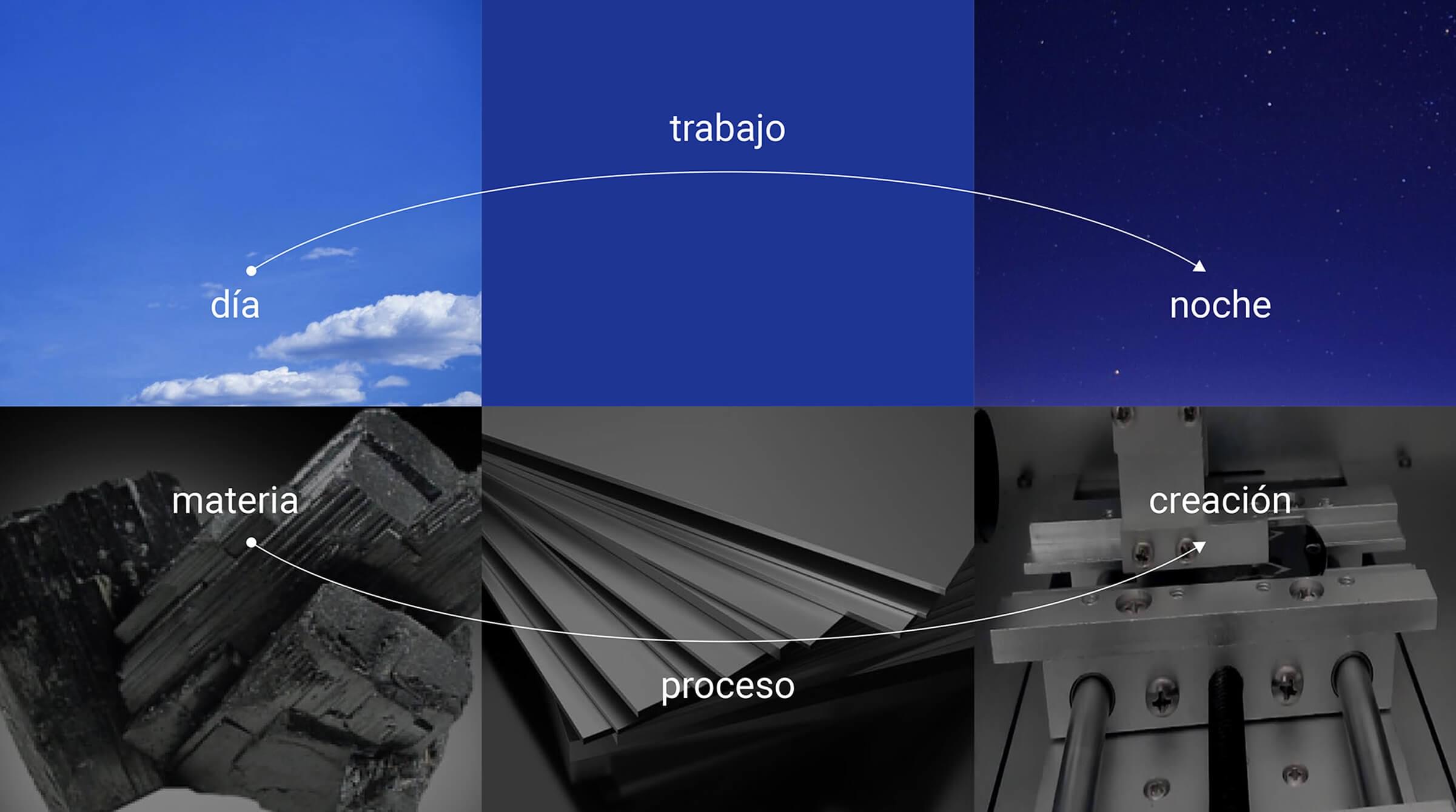
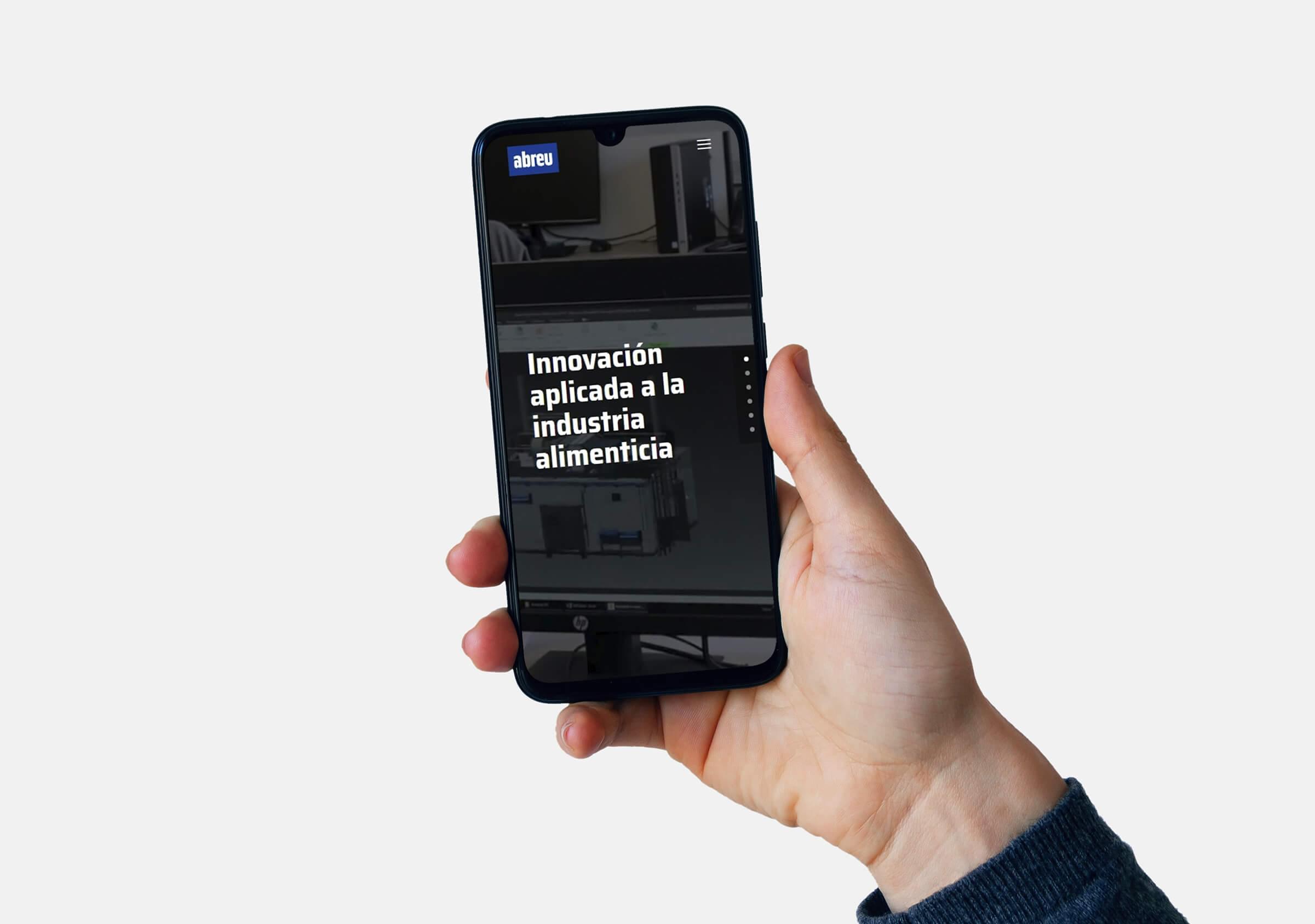
For the design and development of the website, we started with an analysis of the international ecosystem identifying it as a key opportunity to change the way they were displaying their products and services.
On the new site, Abreu’s offer is presented both from a technological solution standpoint, and in accordance with the industries in which their products can be used. At the same time, we proposed a certain level of standardization of the visual and written content, in order to achieve a more balanced and homogenized reading. Preponderance was also given to the engineering and maintenance services offered by the company (previously under exhibited).
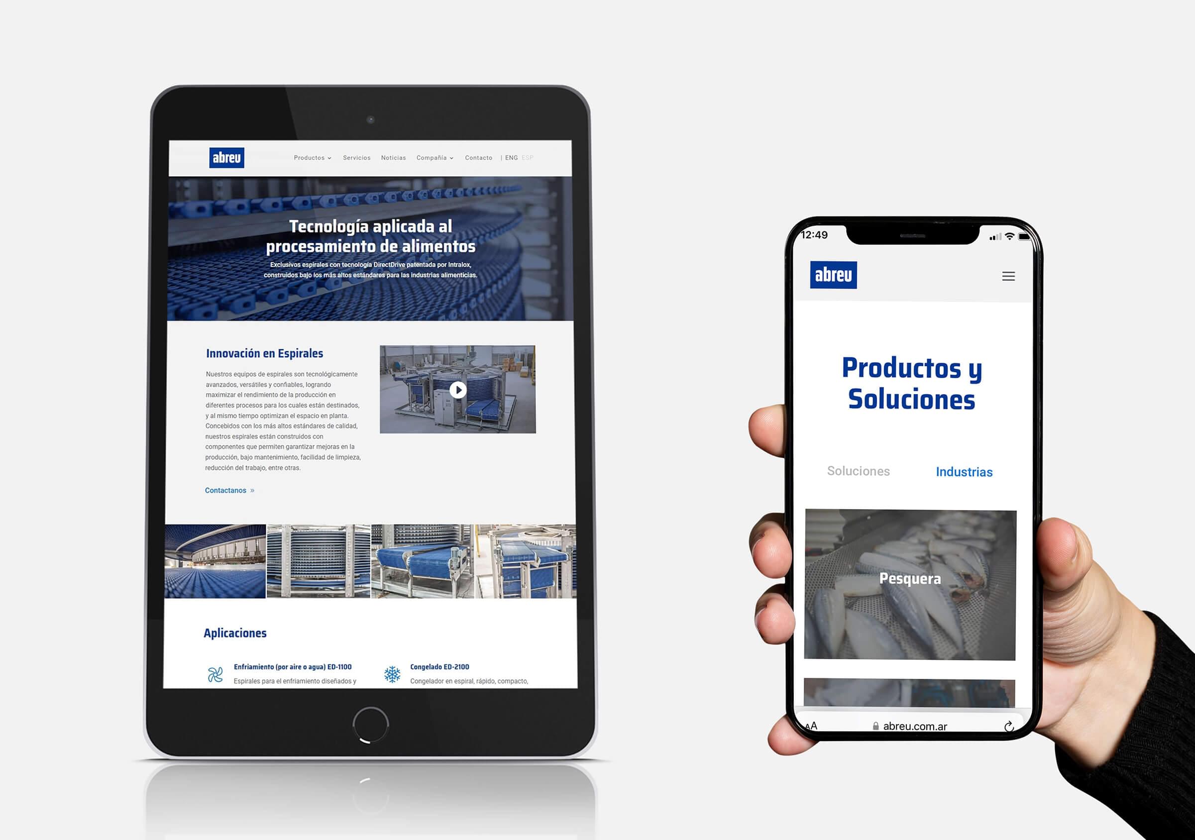
The website was enriched with audiovisual material created by the agency, such as an institutional video presentation and technical videos for some of their machinery.
To give continuity to the improvements that were carried out, work continued with a digital marketing service plan focused on strategy, advertising, email marketing, content marketing and the development of landing pages for the main products.
