- Fuego Yámana
- /
- AgroSistemas
Agro Sistemas
AgroSistemas is a company run by agronomists and computer professionals who detected that their brand needed to be updated.
agrosistemas.com.ar




The diagnosis of the situation was notorious: its differential proposal focused on the product (flexible and scalable software to optimize agricultural productivity) was not being communicated in accordance with the values of modernity, creativity and avant-garde that its managers sought to convey.
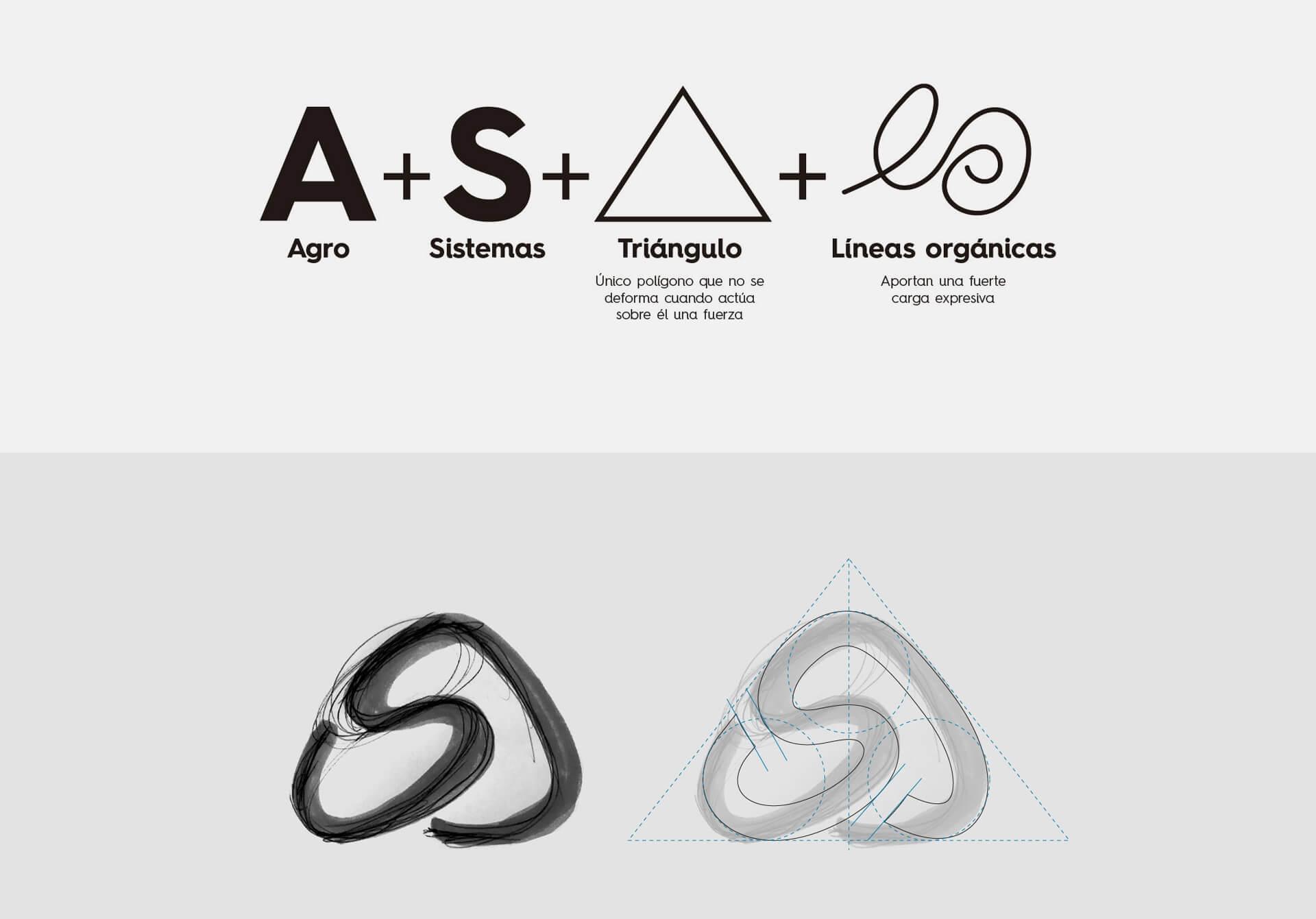
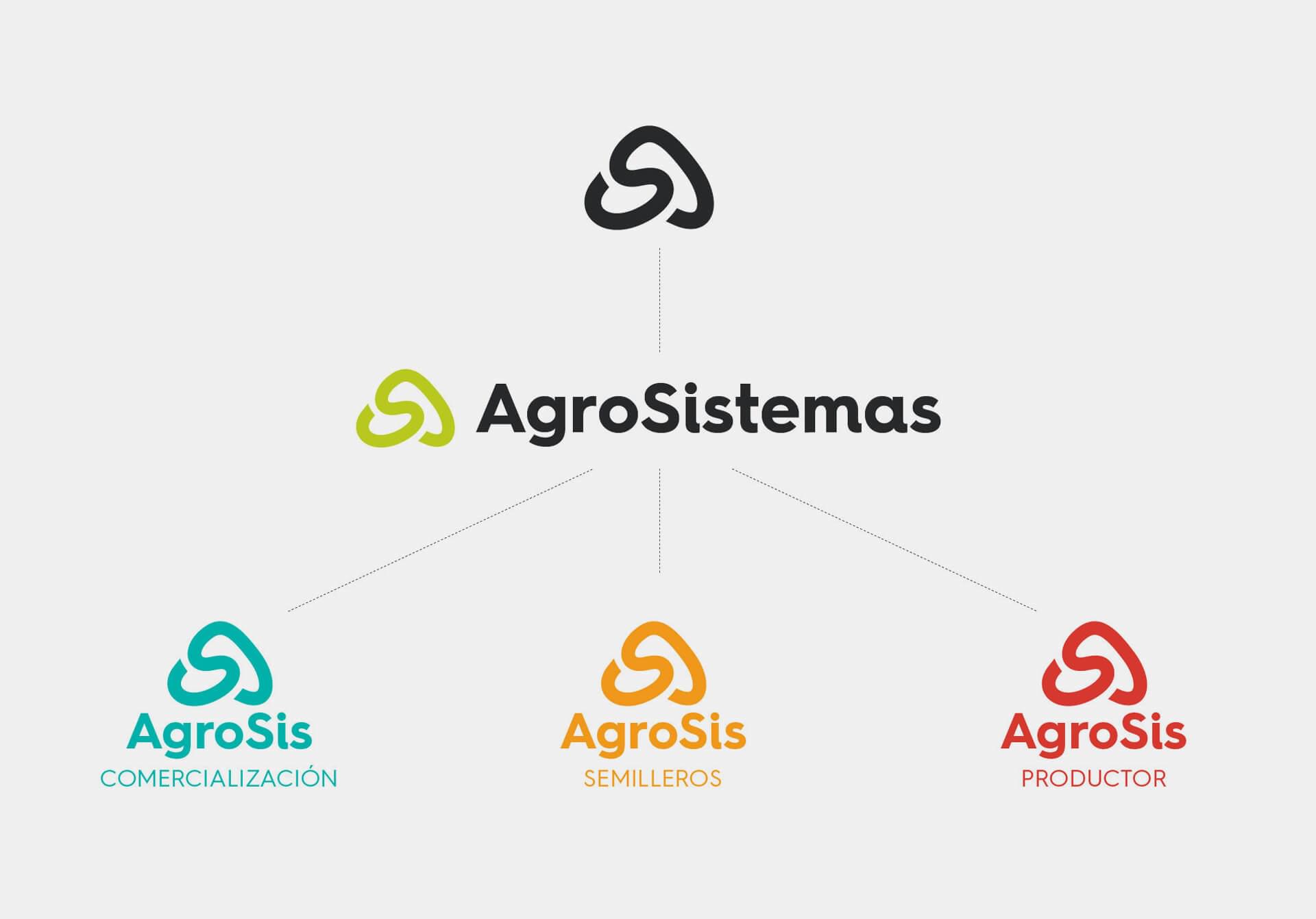
The team at Fuego Yámana began with the task of restyling the corporate image of AgroSistemas, making it more modern and congruent with the new technological trends but also with the demands of the agricultural market. We designed a new logo symbol so that the firm had a solid representation composed by a kind of triangle (A) that is affected when a force acts on it (S).

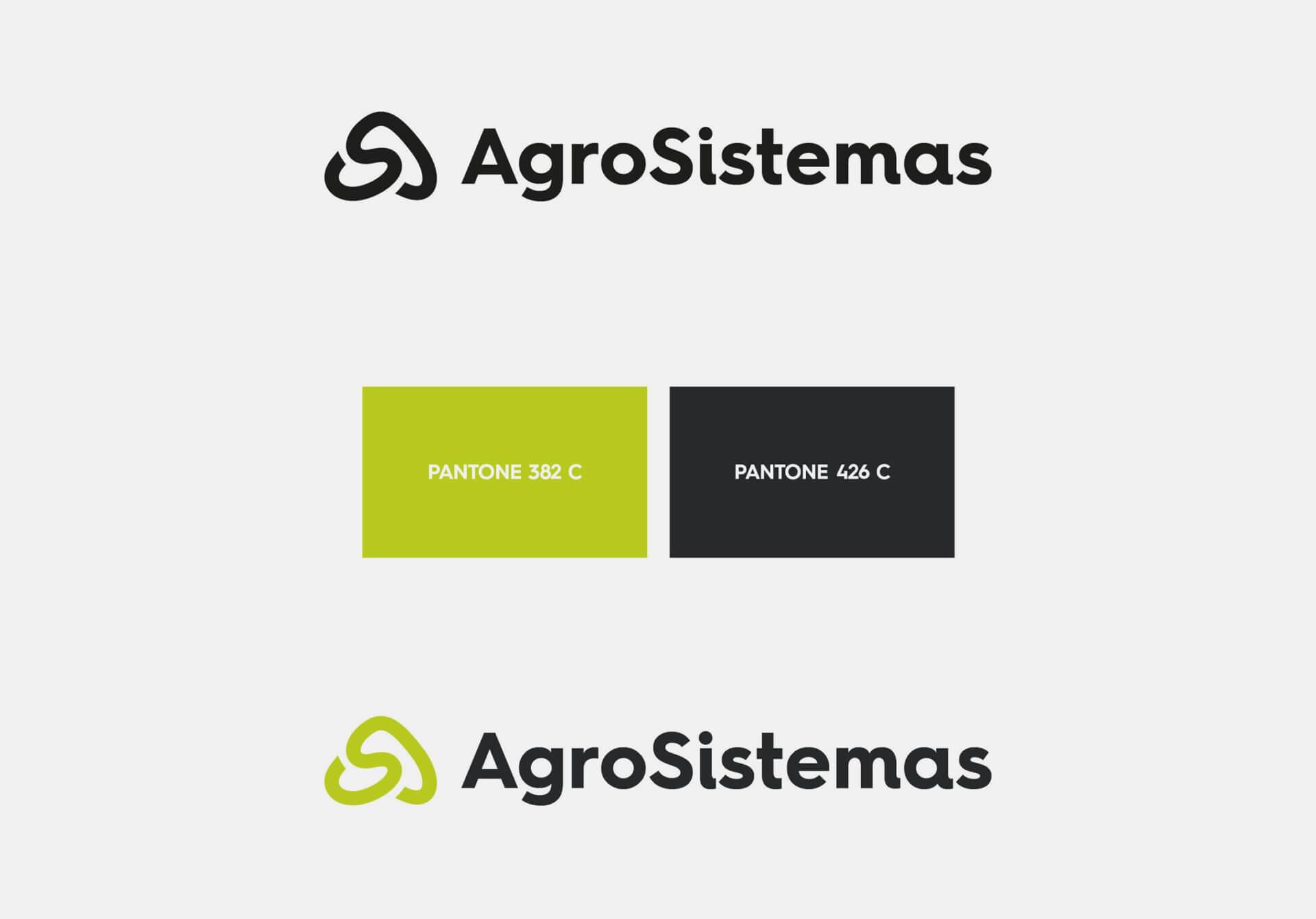
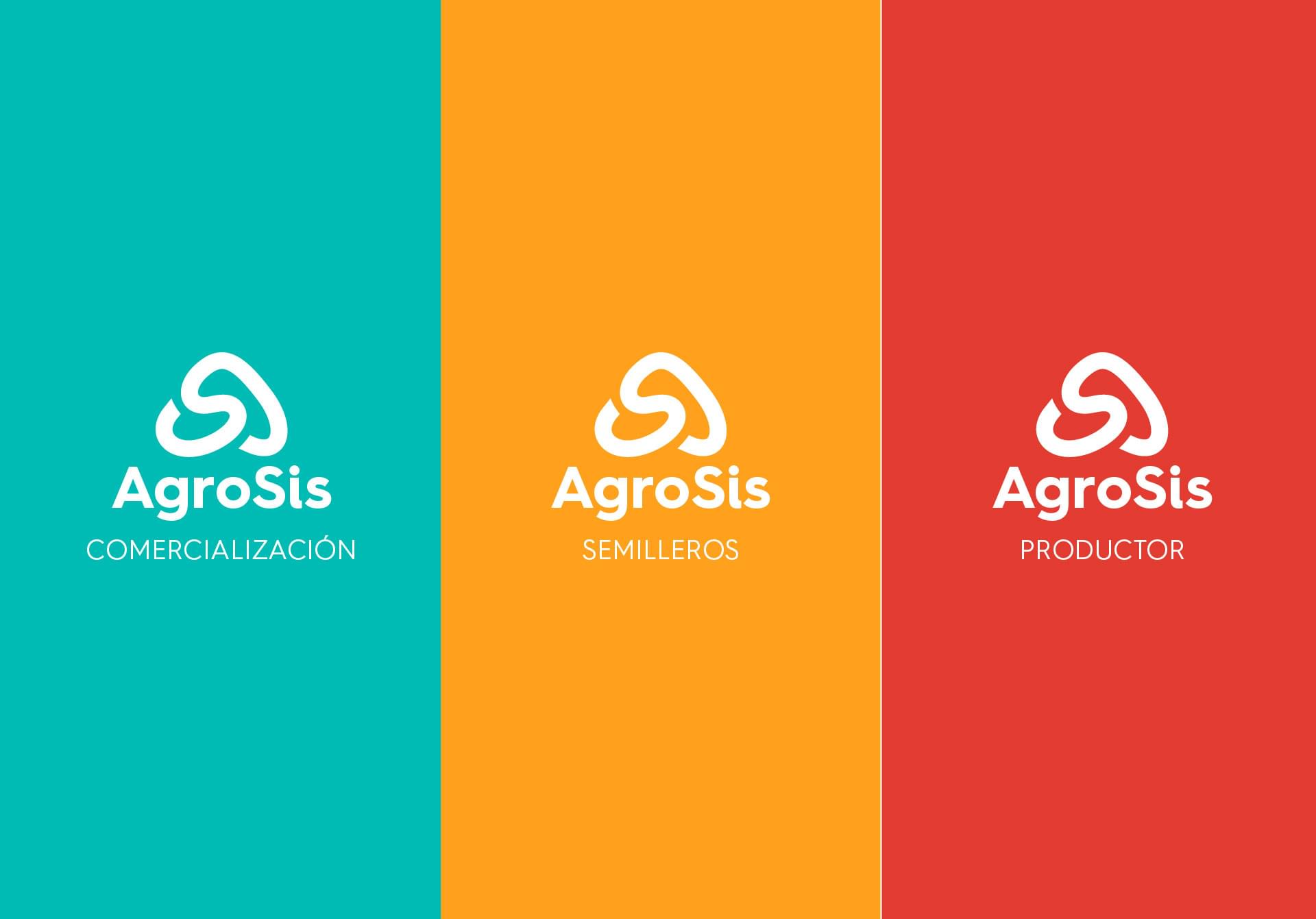
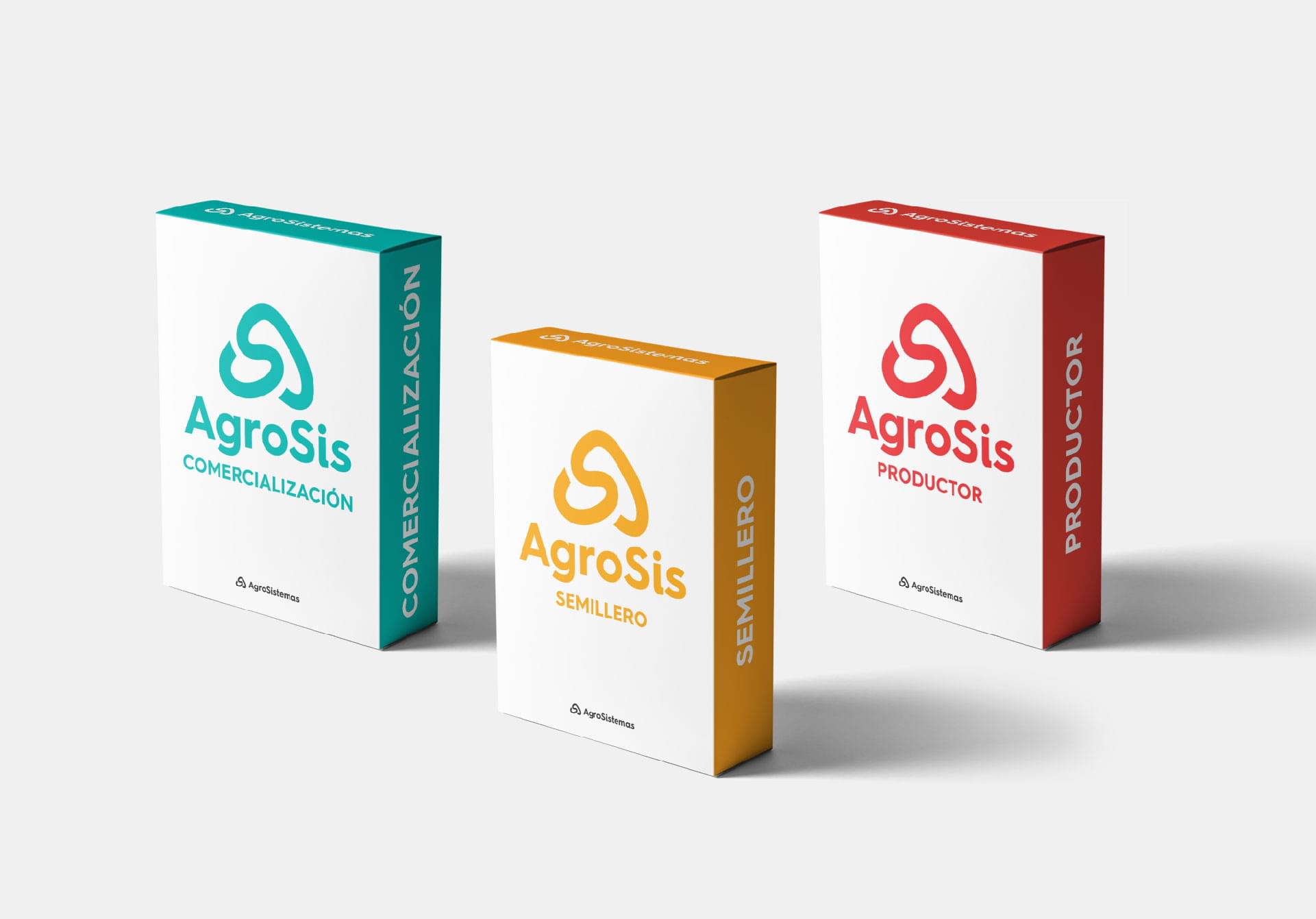
The next stage was to create a name for the new product: a seed management system. The strategic decision was to keep the root composition of their corporate identity to generate three names (one for each of the company’s main products). In this way, we worked on the creation of software names that share the common AgroSis lexeme: AgroSis Marketing, AgroSis Semilleros, AgroSis Productor.
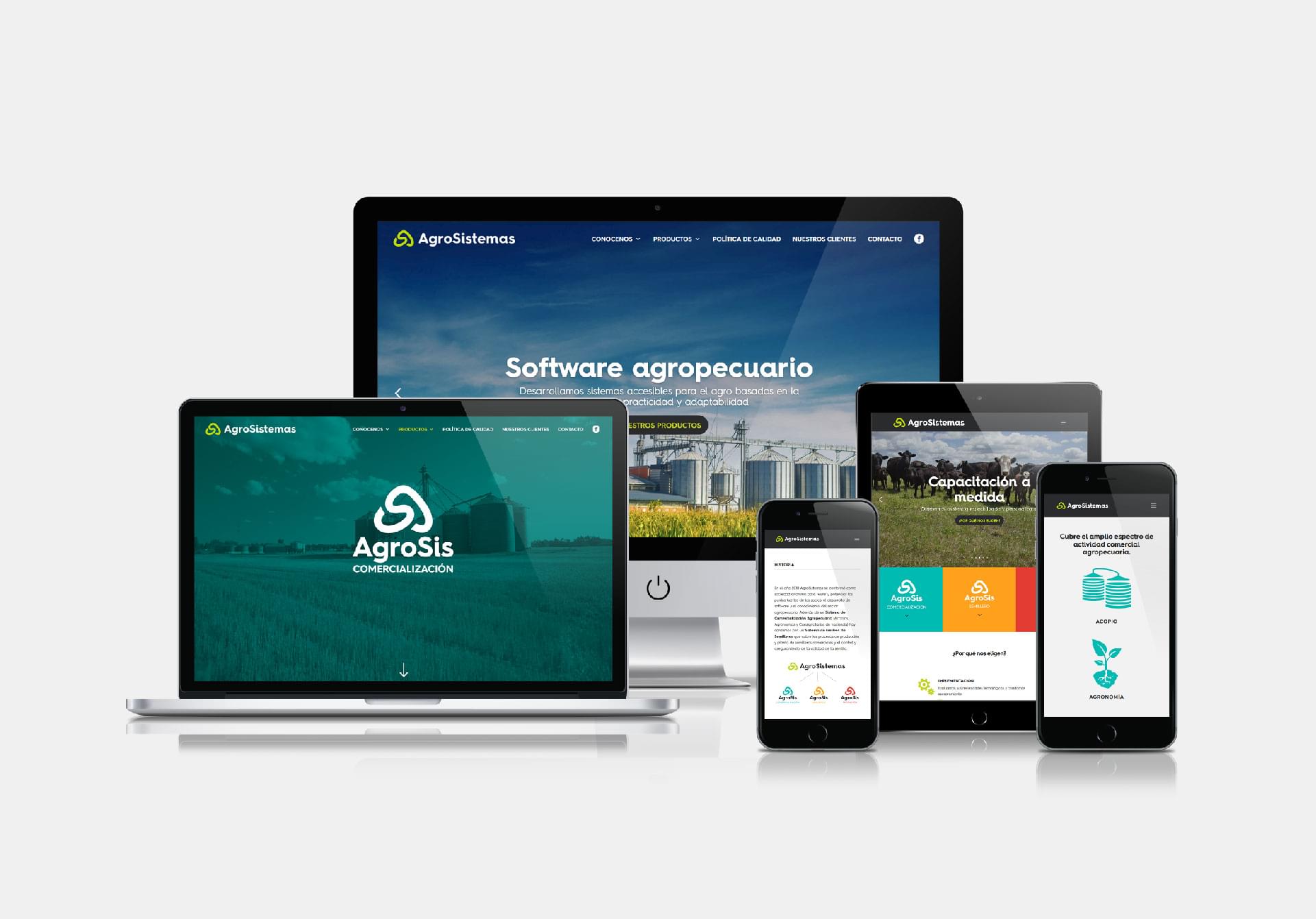
The final phase was focused on the generation of digital content and the design of a new website in order to provide a presentation consistent with its new image, provide the correct, fair and well-positioned information, stimulate customers to take action with a dynamic route of communication between the pages, responding to the new habits of mobile interaction and granting a satisfactory, correct, clean and empathetic experience to the users.
