- Fuego Yámana
- /
- C.A. Quilmes
C.A. Quilmes
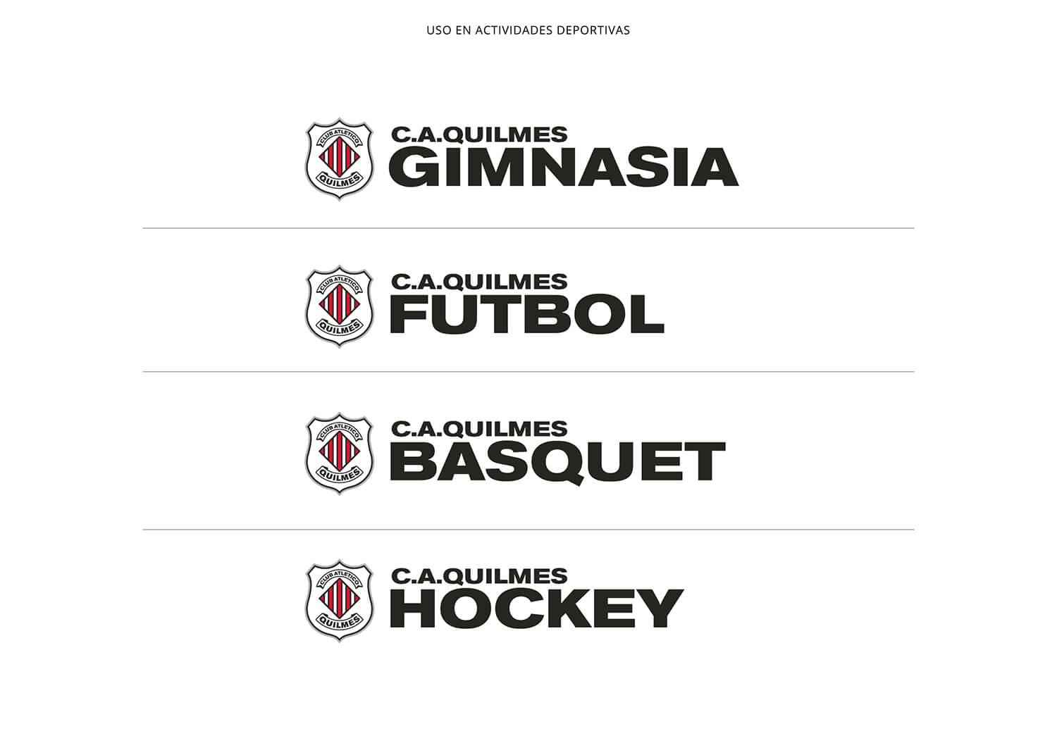
Redisigning a classic sport club. With almost 100 years of journey, Quilmes Athletic Club has implanted both its tricolor identity and its symbol in the minds and hearts of fans, athletes, youth and the community.
clubquilmes.org
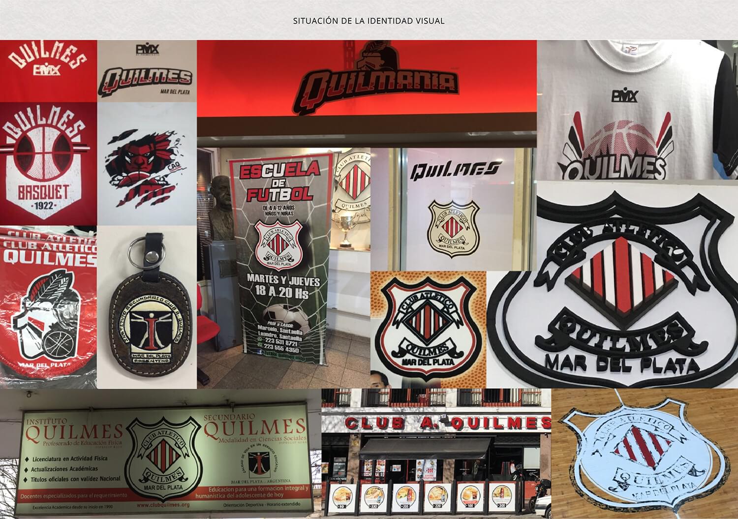
However, the lack of awareness about the value of a consistent institutional image, generated chaos and deterioration in the representative symbols of the Club, in the absence of a visual identity program.
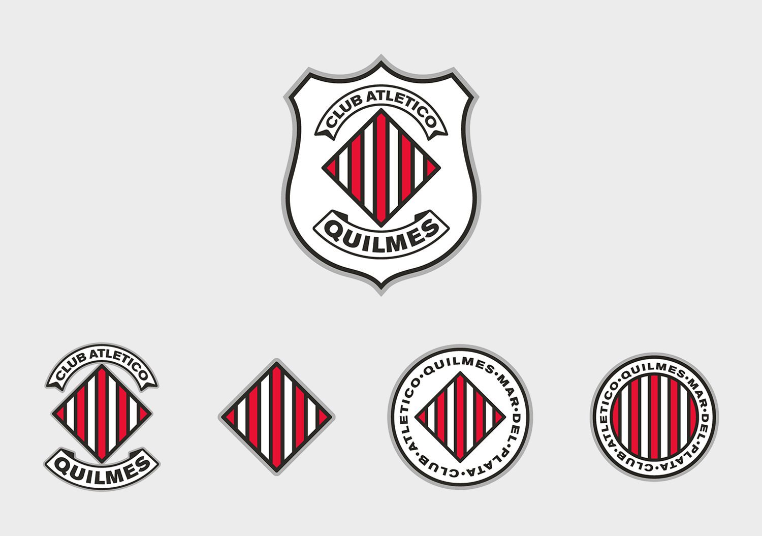

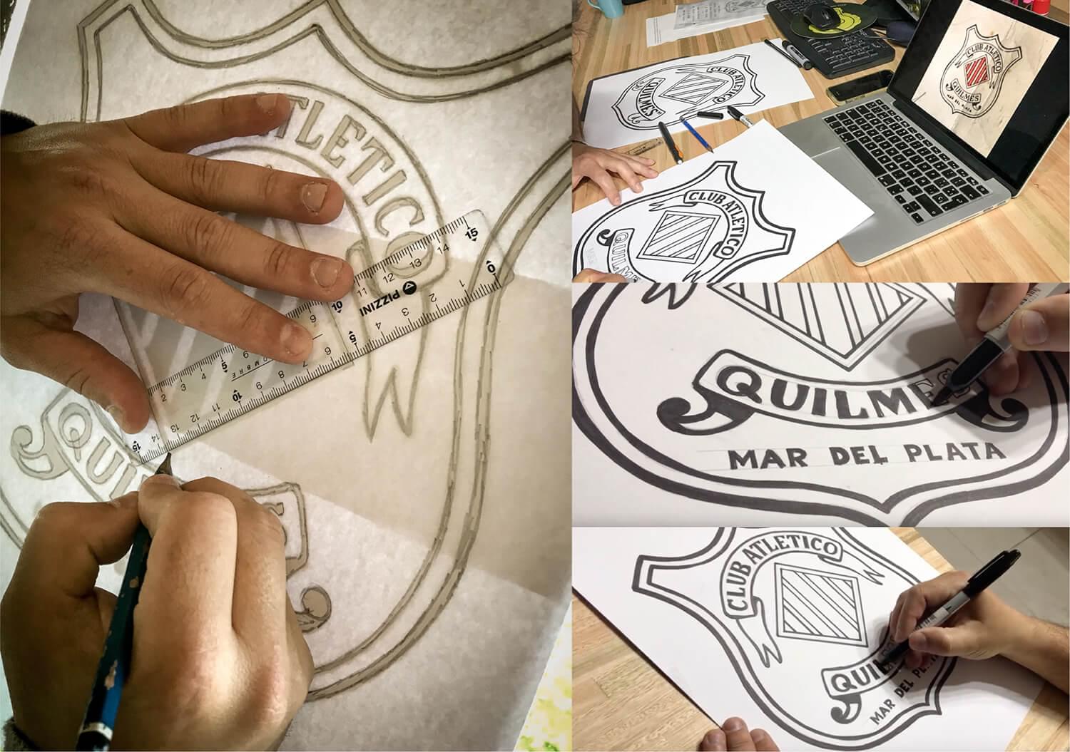
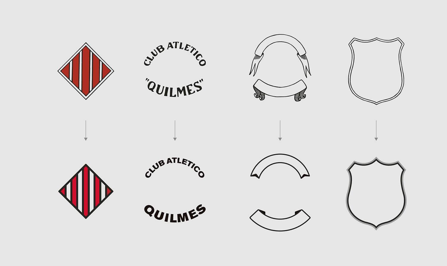
Fuego Yámana began this project, immersing itself in a journey through the history of the Club, to discover the origin and transmutation of its symbols over the years and decipher its visual essence.

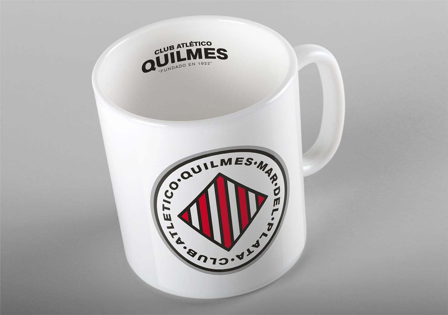
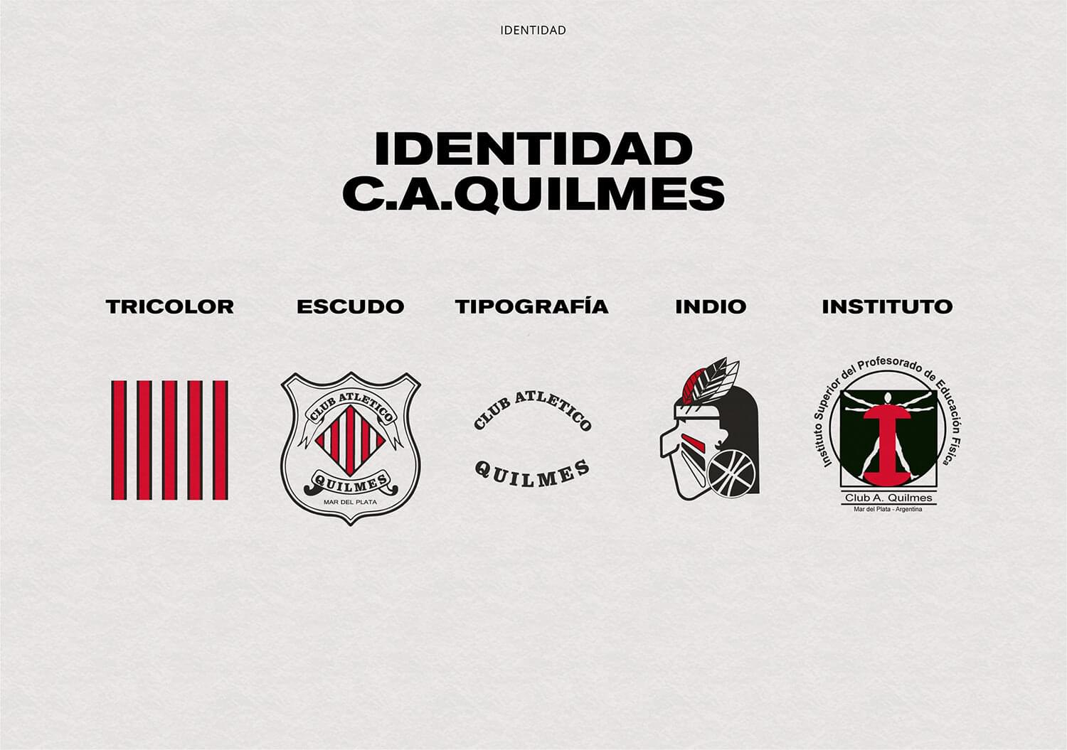
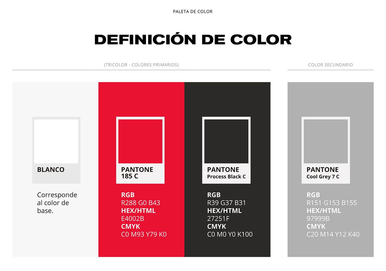
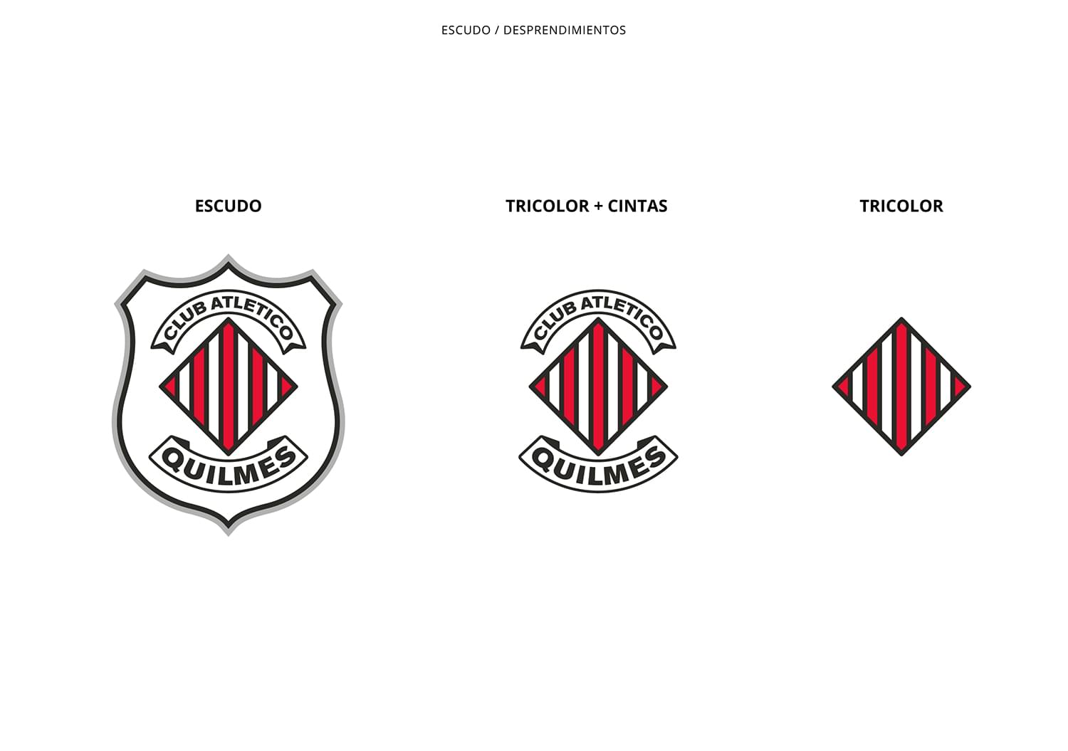
Our proposal was, from the beginning, to cling tightly to the Club’s DNA, revaluing its symbols and creating a visual identity capable of not only identifying it, but representing it and positioning it in the way that the Club deserves.
