- Fuego Yámana
- /
- DLM
De León Medina
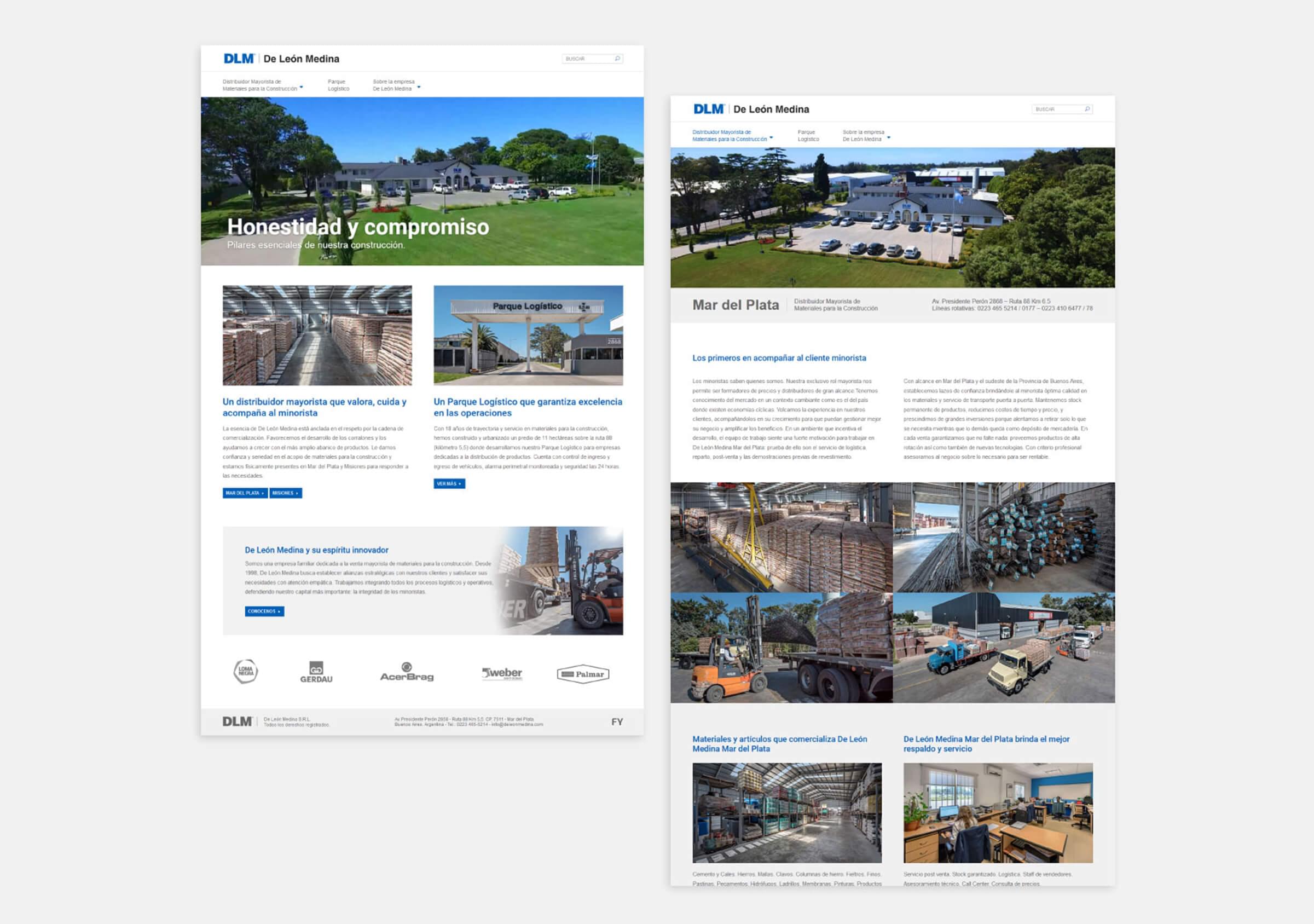
De León Medina is a family owned business dedicated to the wholesale commercialization of construction materials and hardware. They arrived at FY asking for assistance in Branding and Visual Identity.
deleonmedina.com
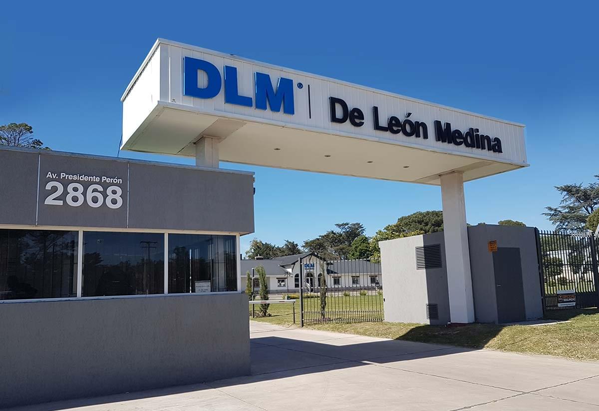
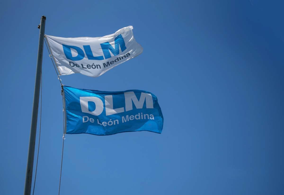
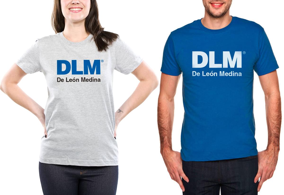
Based on their company values, such as trust, commitment, quality and honesty, we worked on a communication manifesto that expanded across all touchpoints.
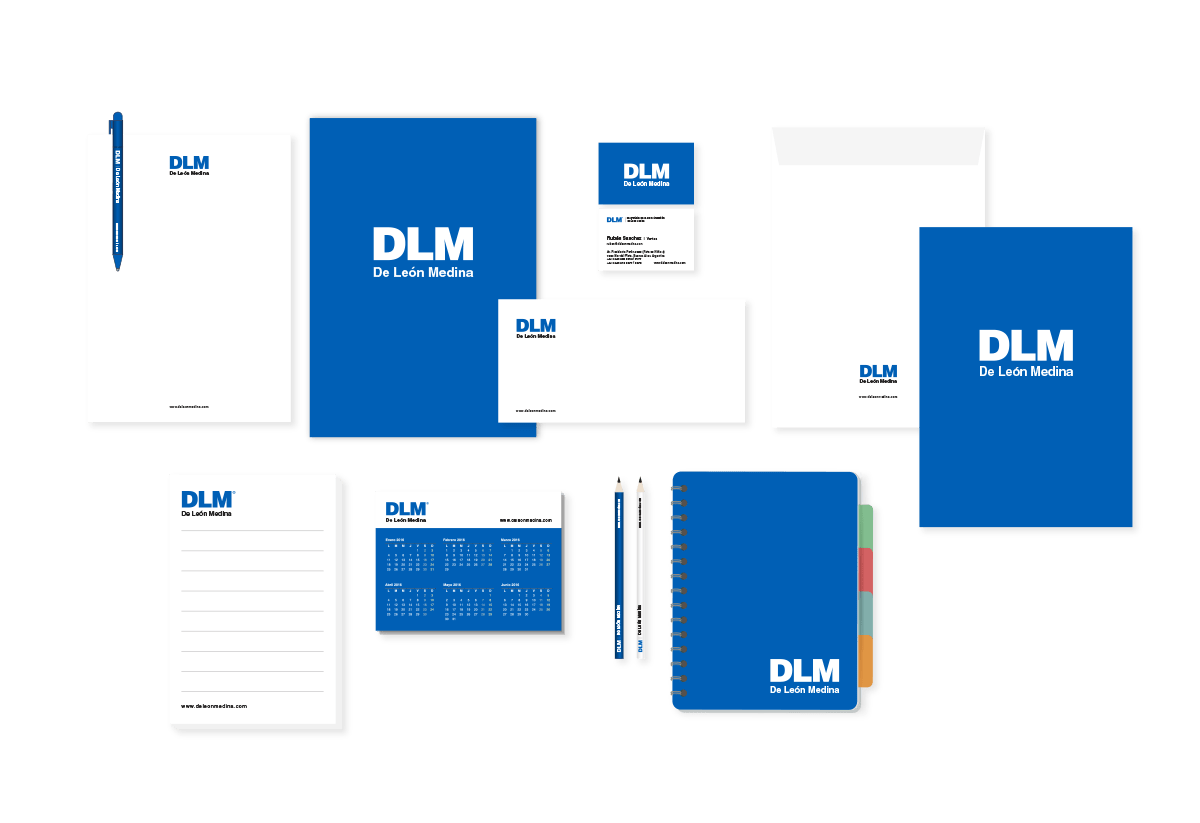
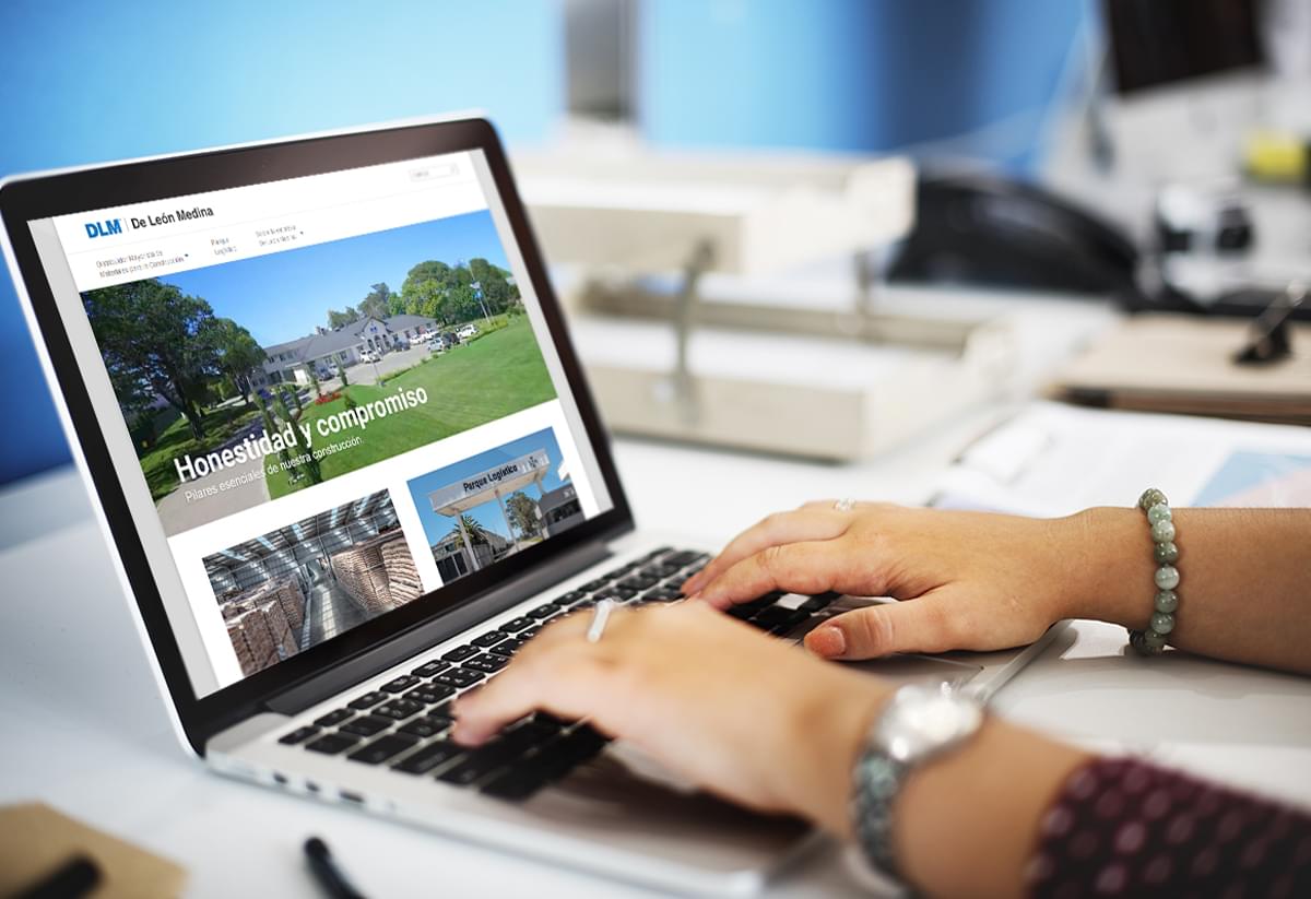
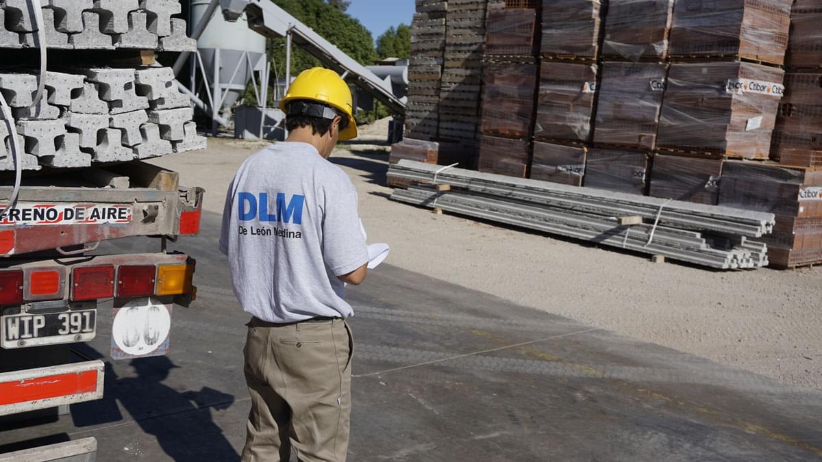
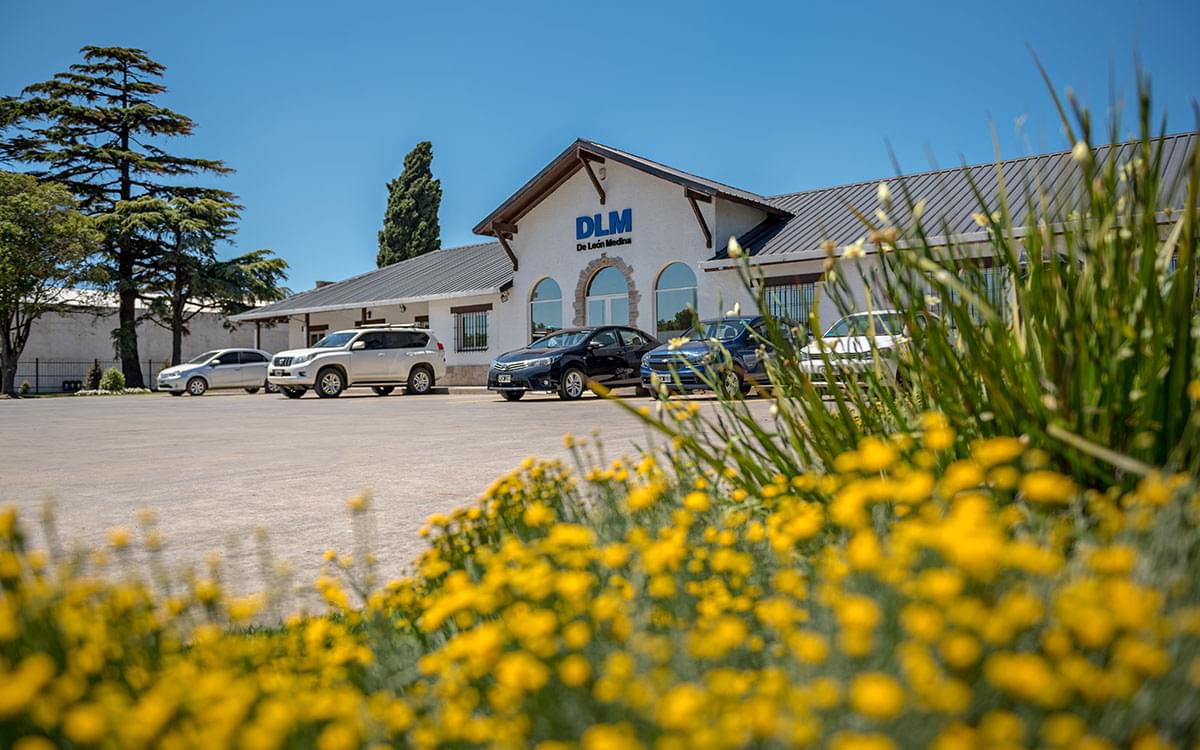
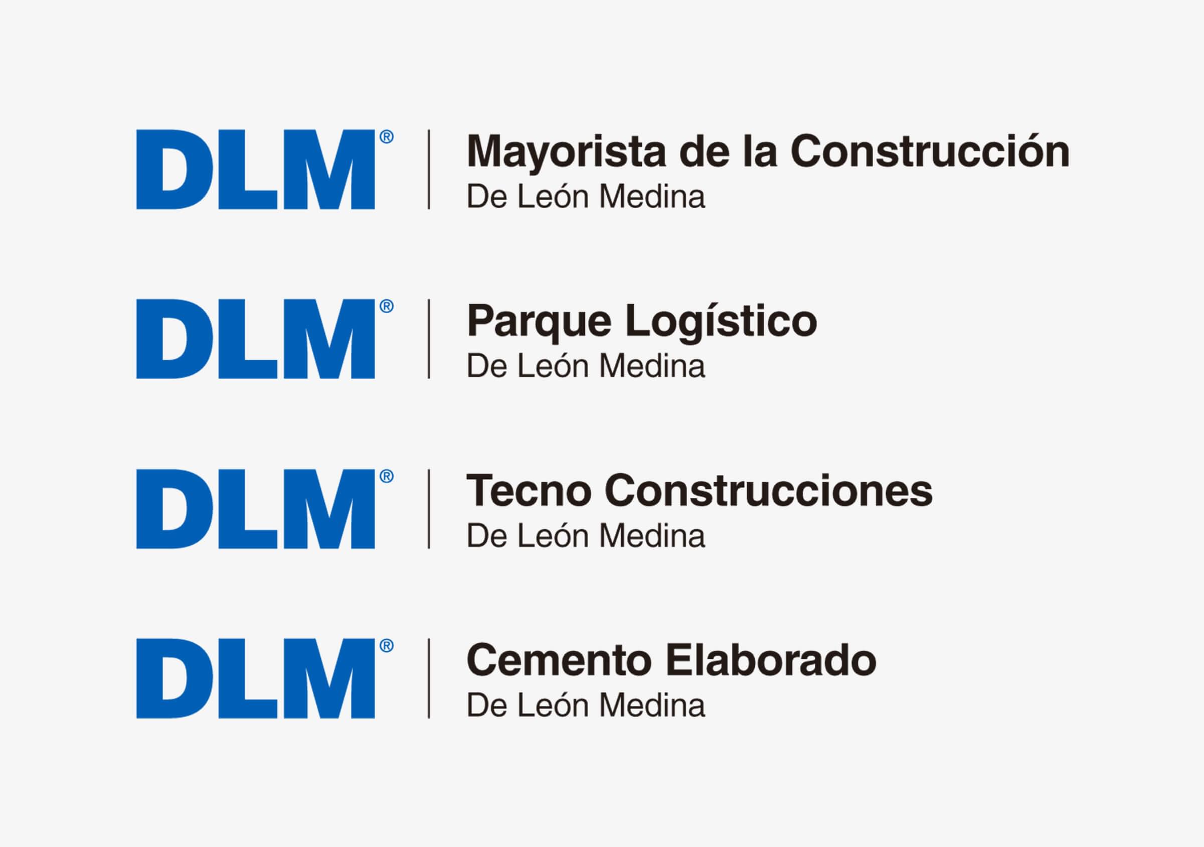
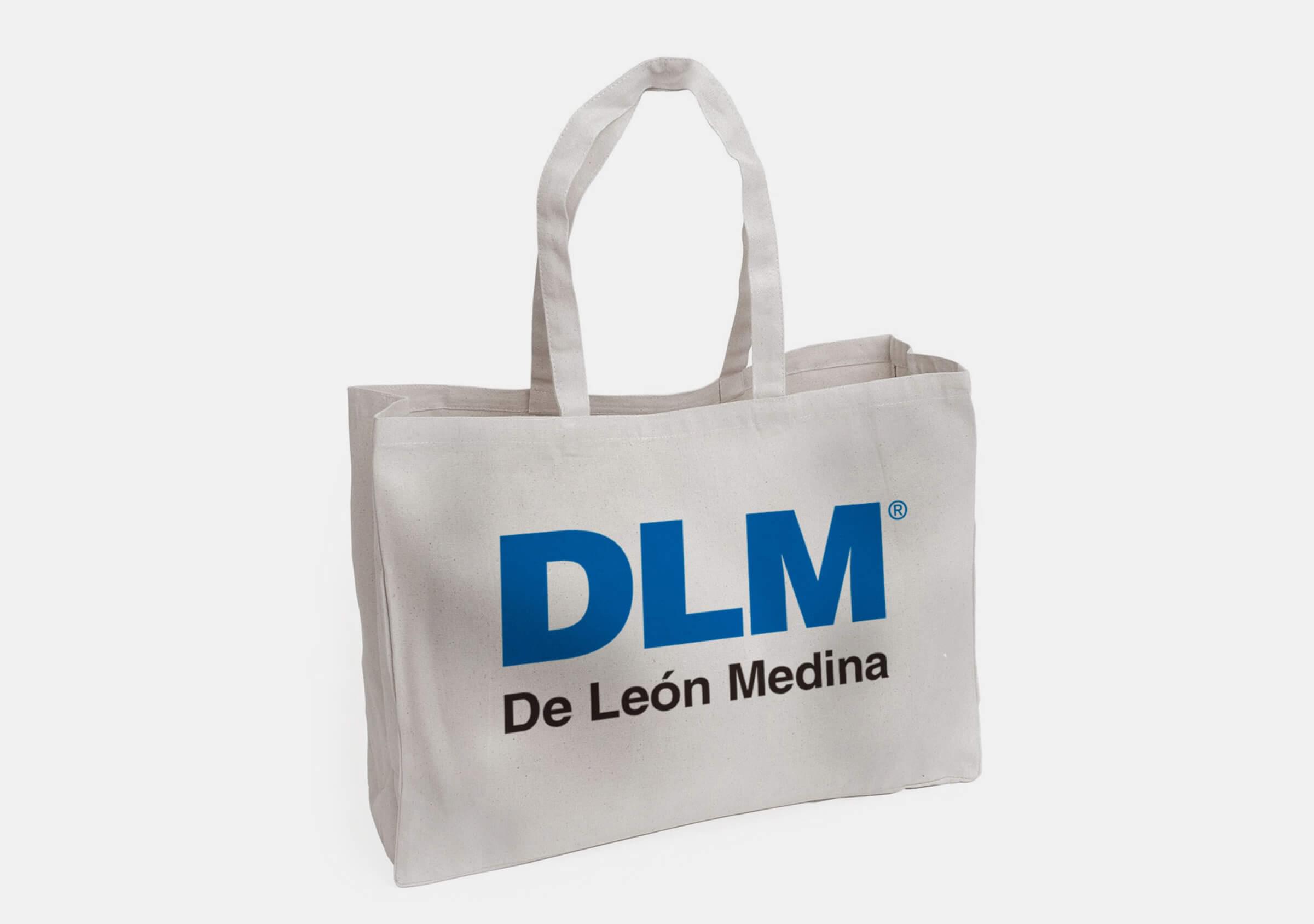
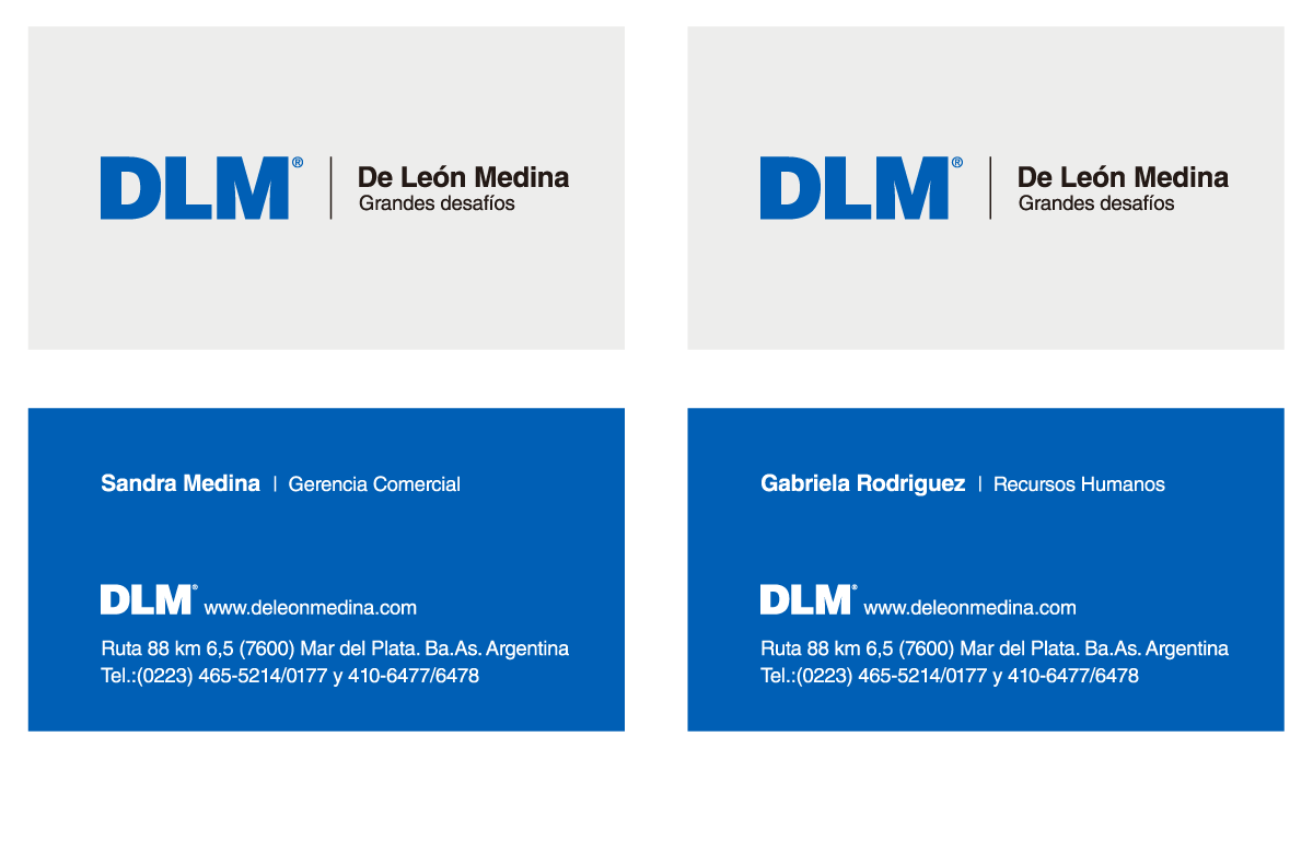
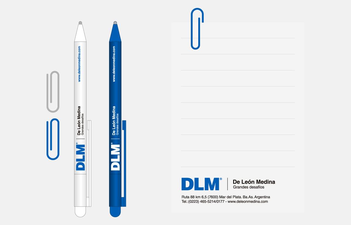
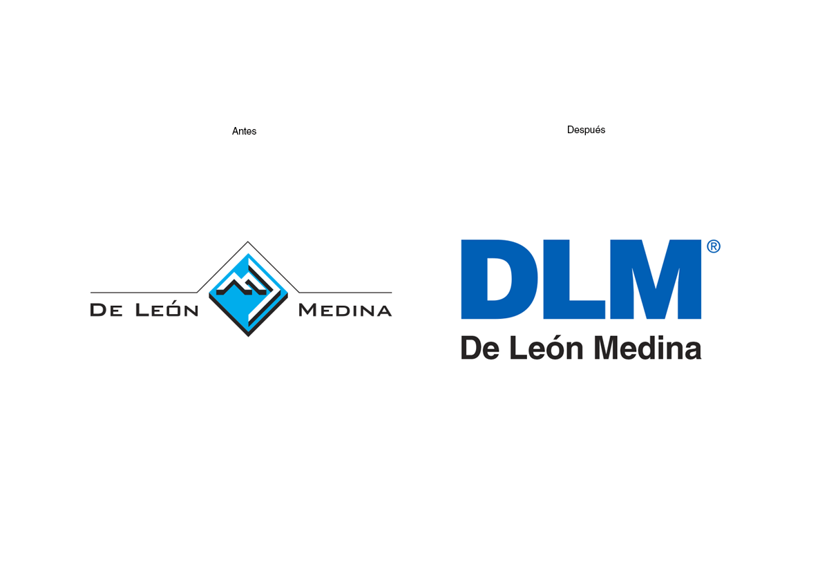
We took the strength of the acronym “DLM” as starting point to develop all brand applications, The result was a corporate identity able to hold multiple business units. We used the classic Helvetic typography to convey strength and readability. In addition, we nurtured the brand with the benefits of the blue hue, providing confidence to the message.
