- Fuego Yámana
- /
- Igeo
Igeo
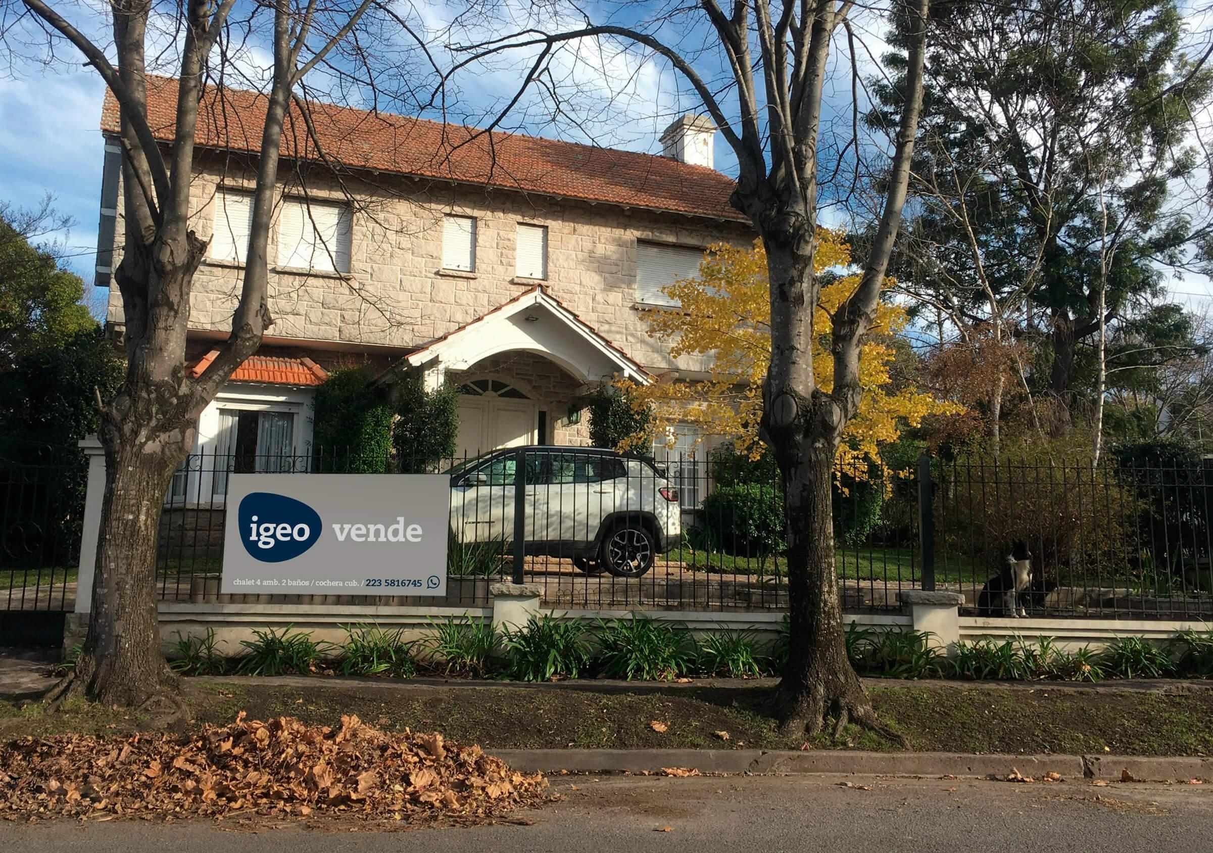
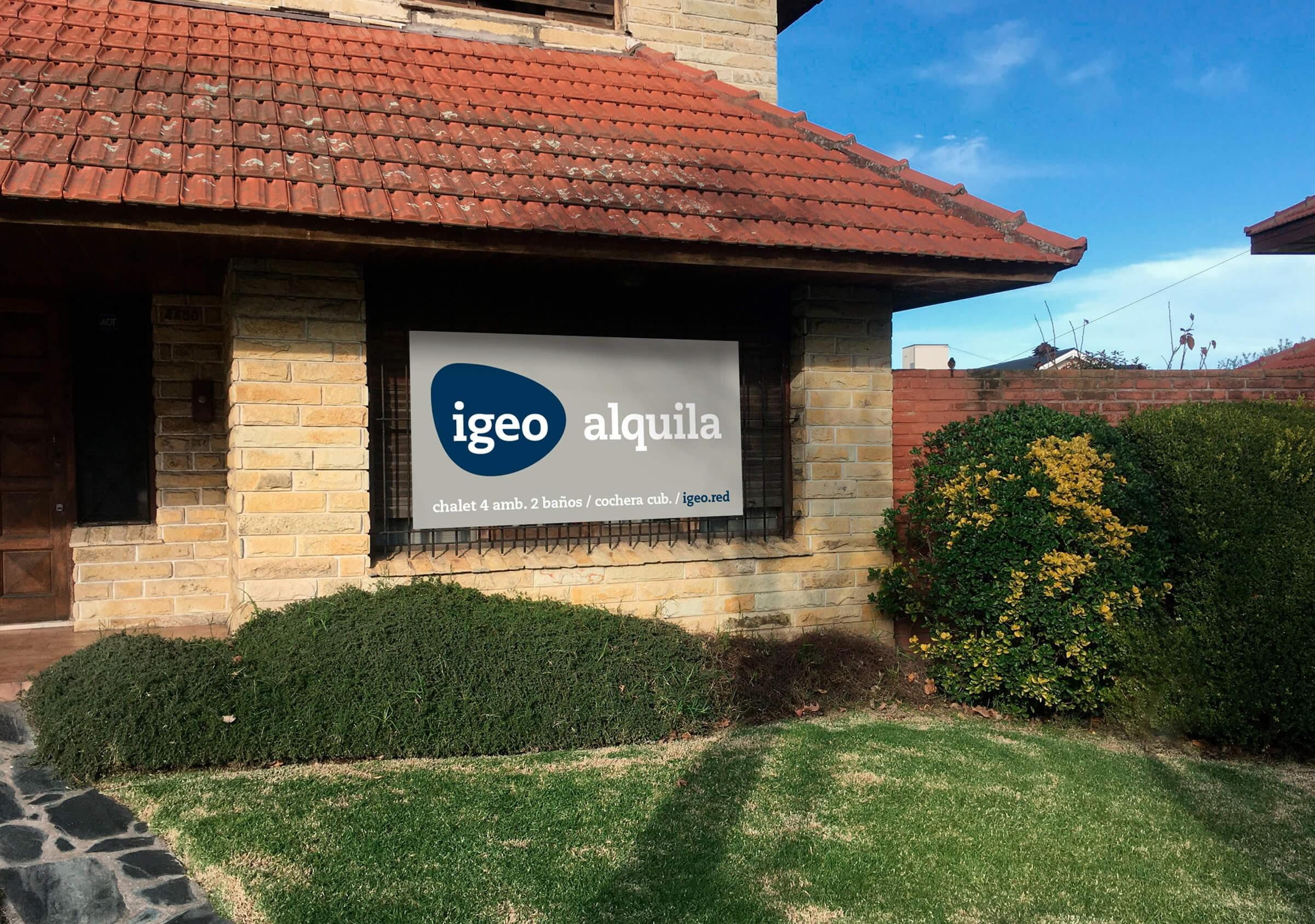
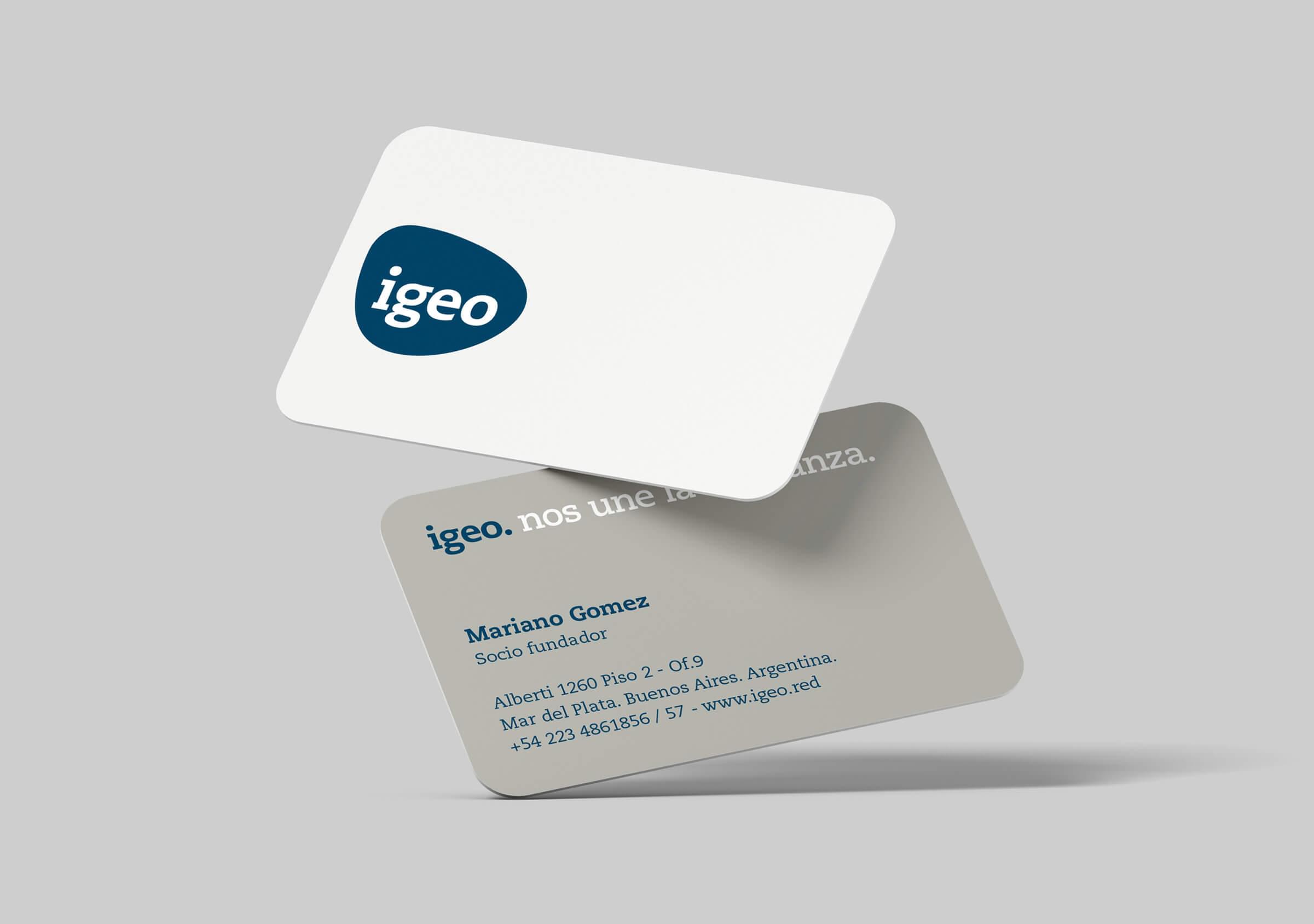
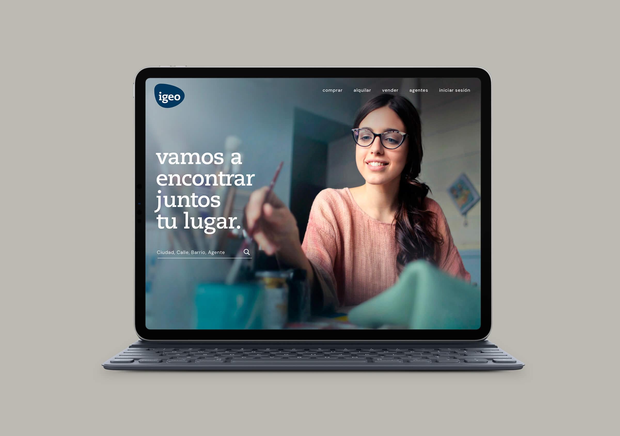
Eight well-known real estate companies from Mar del Plata came together to form a network and collaborate. Within this new initiative, we were chosen to name this project, design the new brand and create its website.
igeored.com.ar
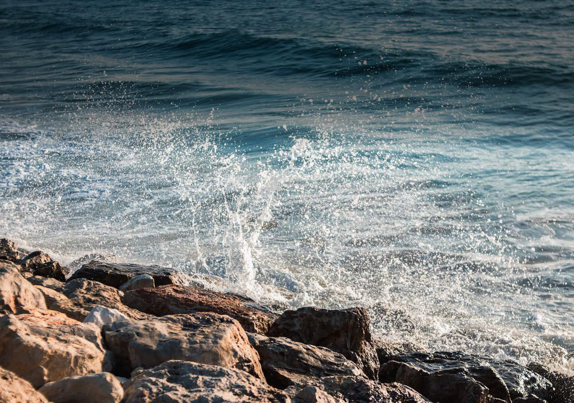
The symbolic universe from which we started the design process was the surrounding environment: Mar del Plata.
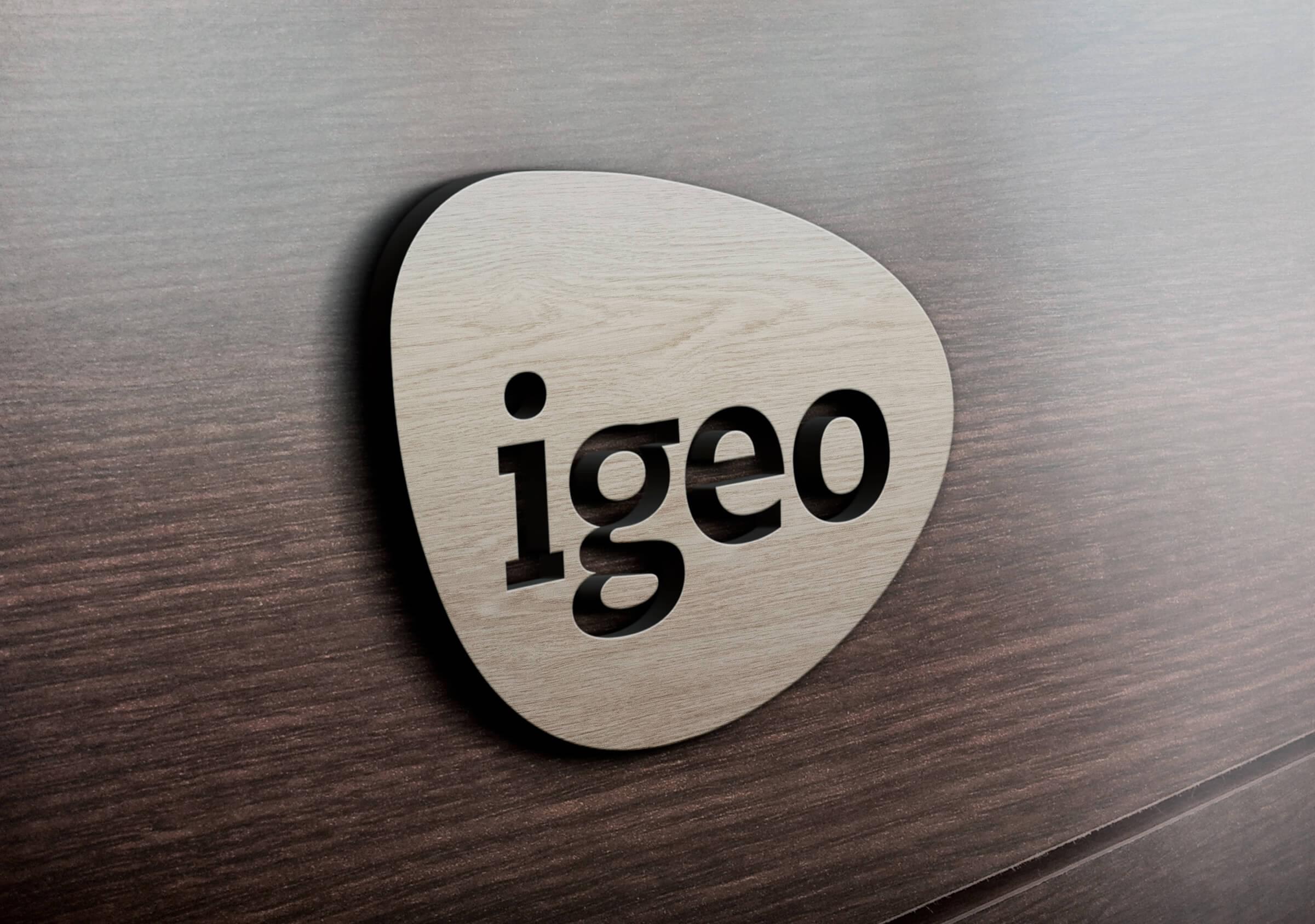
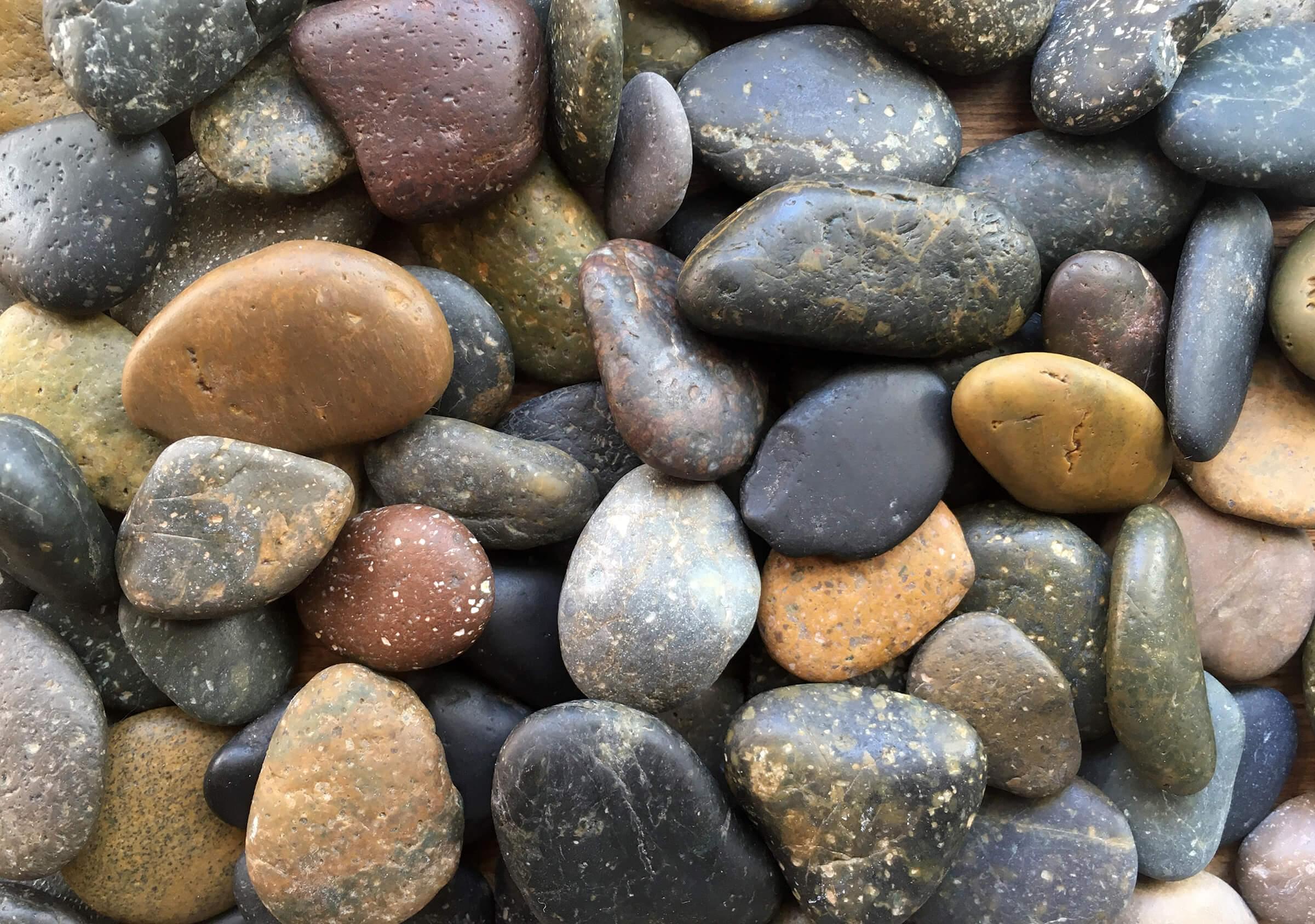
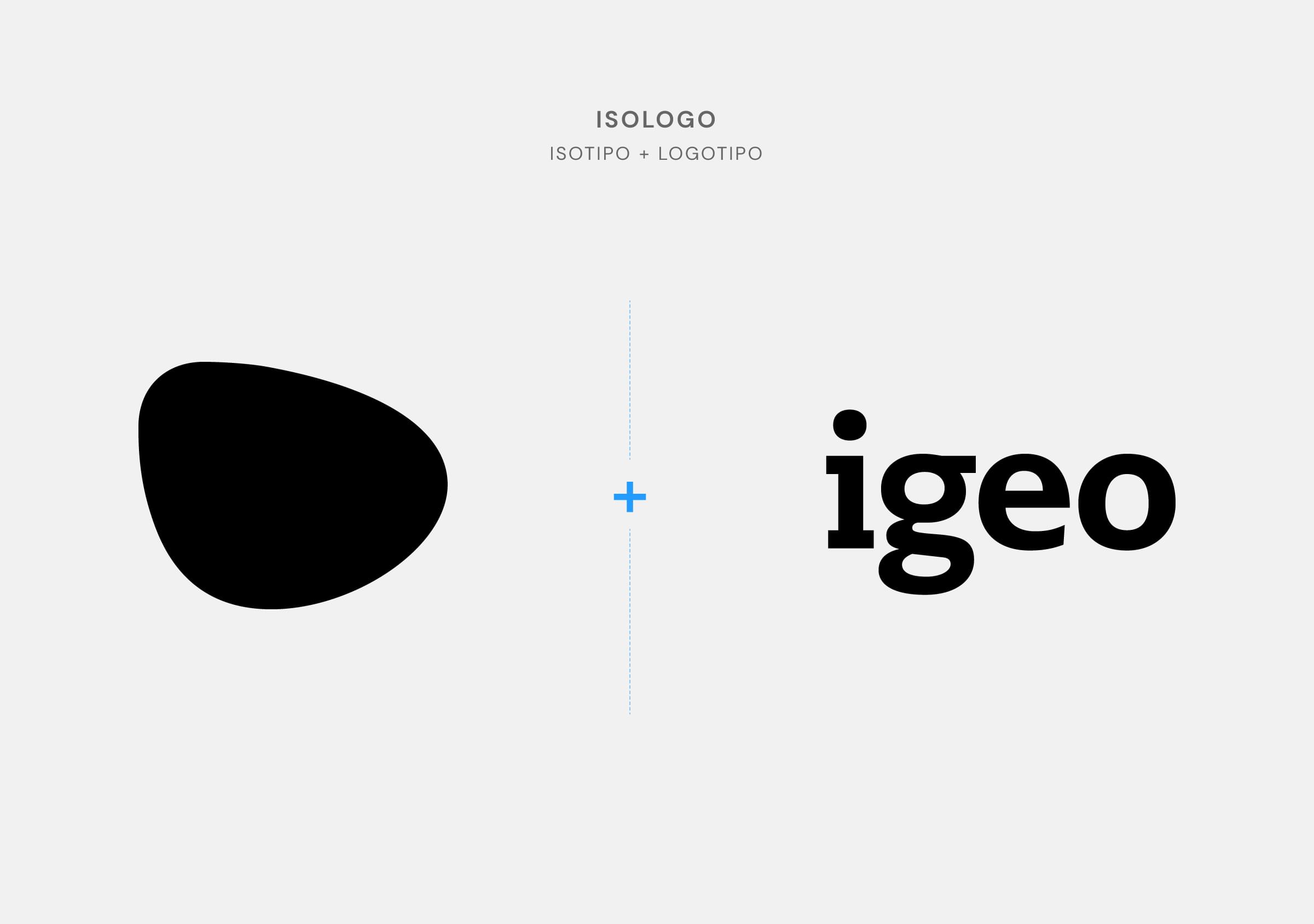
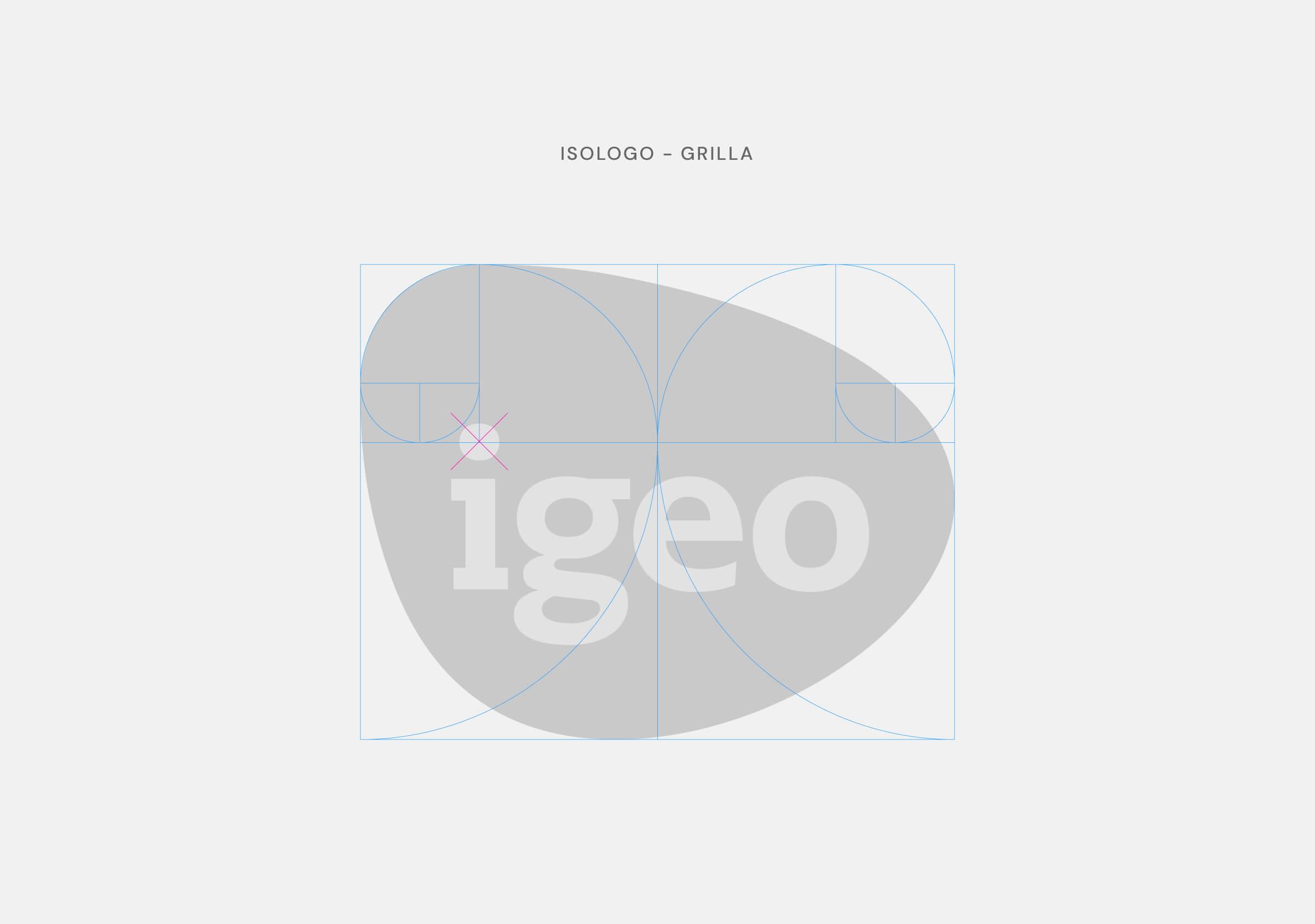
Inspired by the ocean, the coast and the “shore” pebbles, rounded by the effect of the sea and the passage of time, we created a logo framed by an organic shape similar to a stone. We aimed to associate the qualities of this element with the values that the brand wanted to convey: experience, solidity, evolution and collaboration.
Thus was born ‘igeo’, a fantasy name, registrable and capable of creating a strong association with the landscape due to the powerful prominence of the word GEO (land). The decision to add the letter “i” at the beginning incorporates the drive for innovation.
An excellent combination to create a brand that breaks with the field norm, connected with its environment and with each of the city inhabitants. Capable of connoting identity, permanence, ecosystem, strategy and innovation. The name is a simple, brief and easy to remember name.
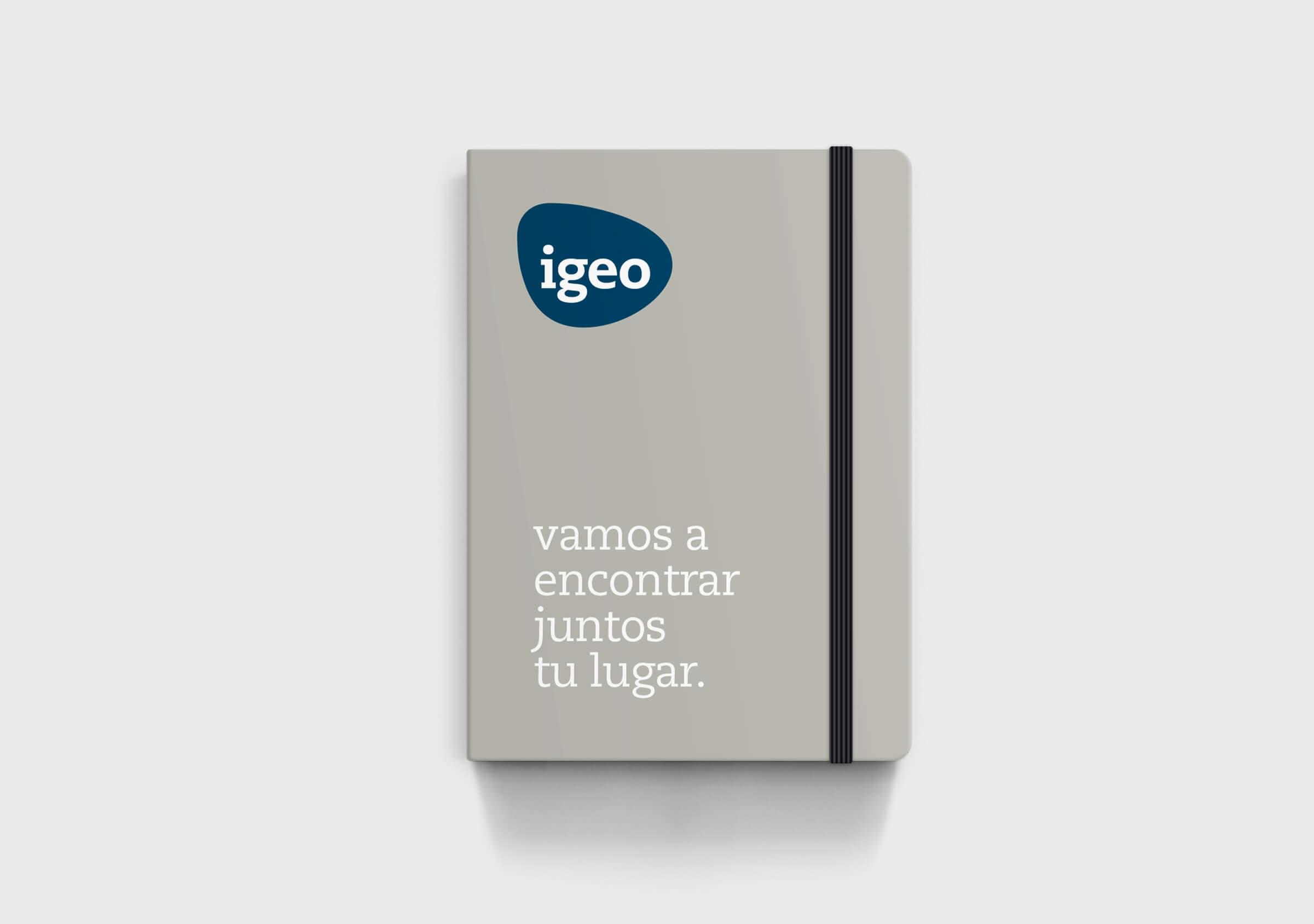
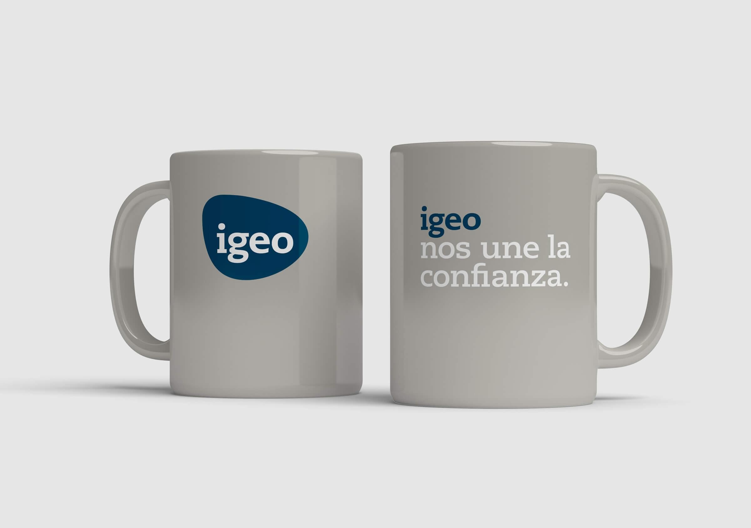
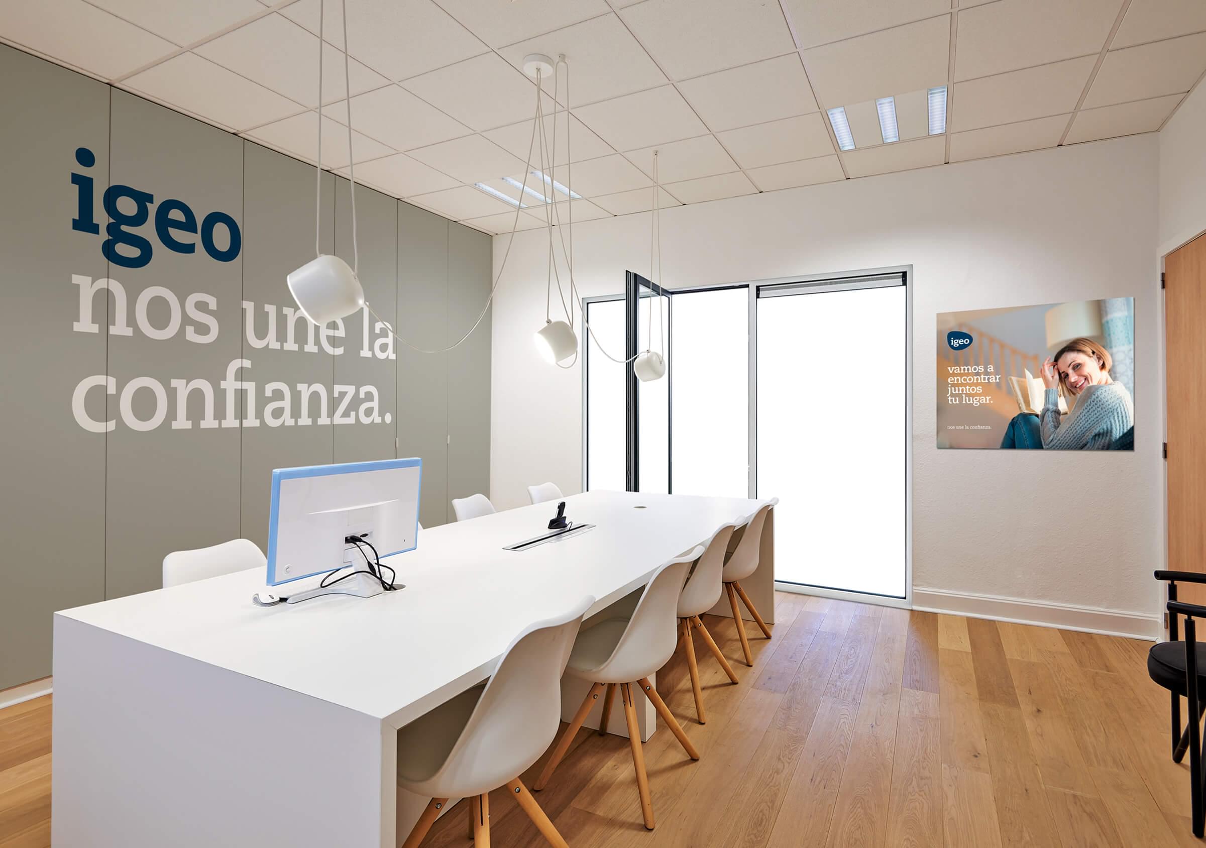
Taking into account the theory of the five skins of Hundertwasser (the skin, the clothes, the house, the city and the planet), as a second level of communication, we defined a tone and style of communication that seeks to create bonds of trust with the target, establishing a more personal and close connection.
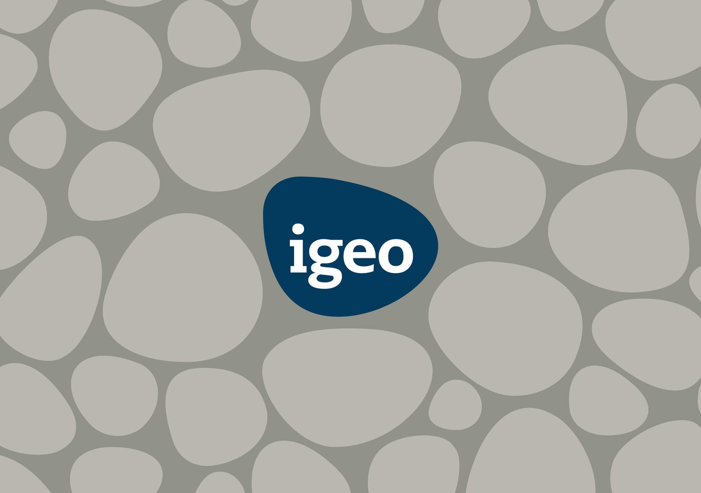
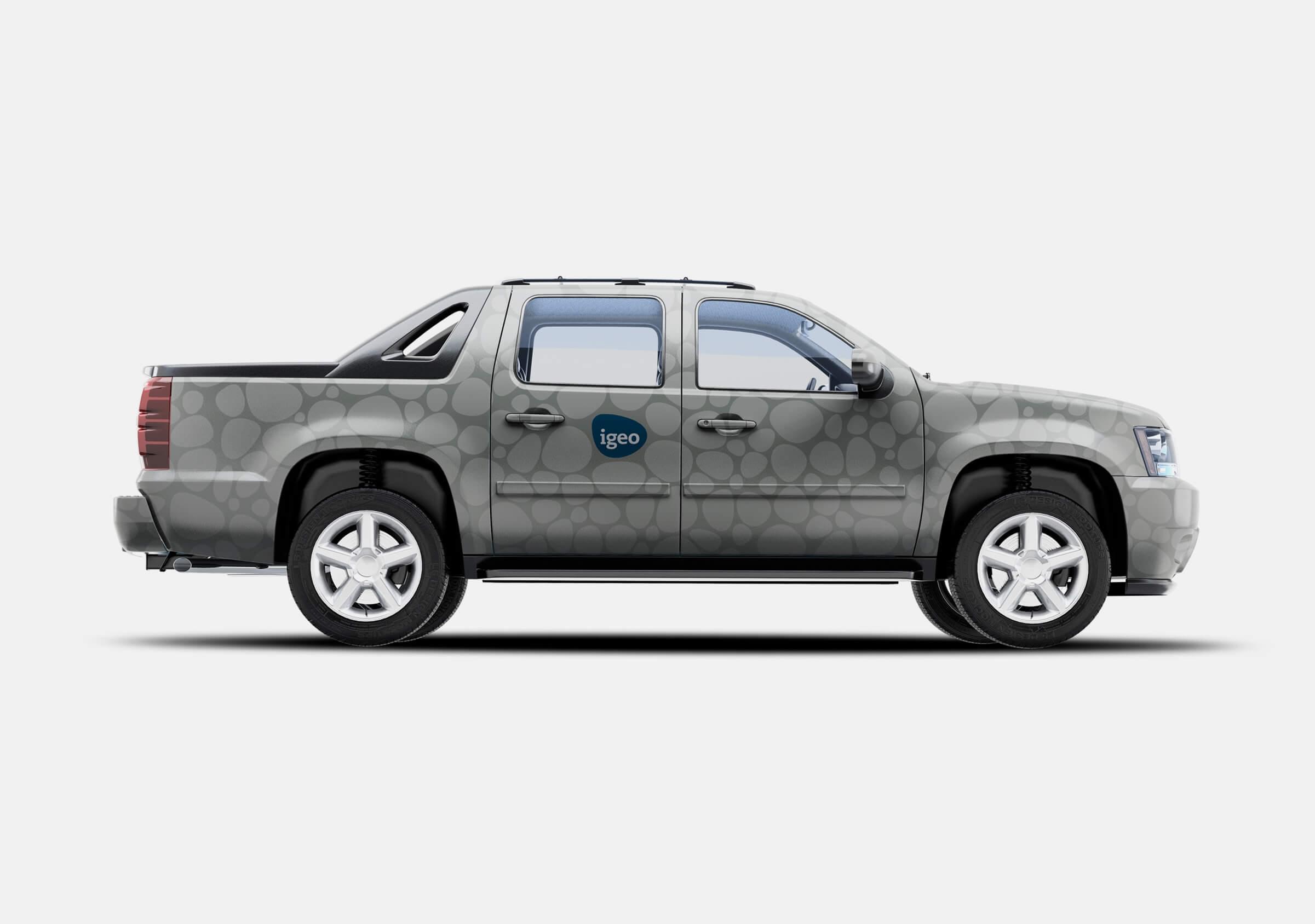
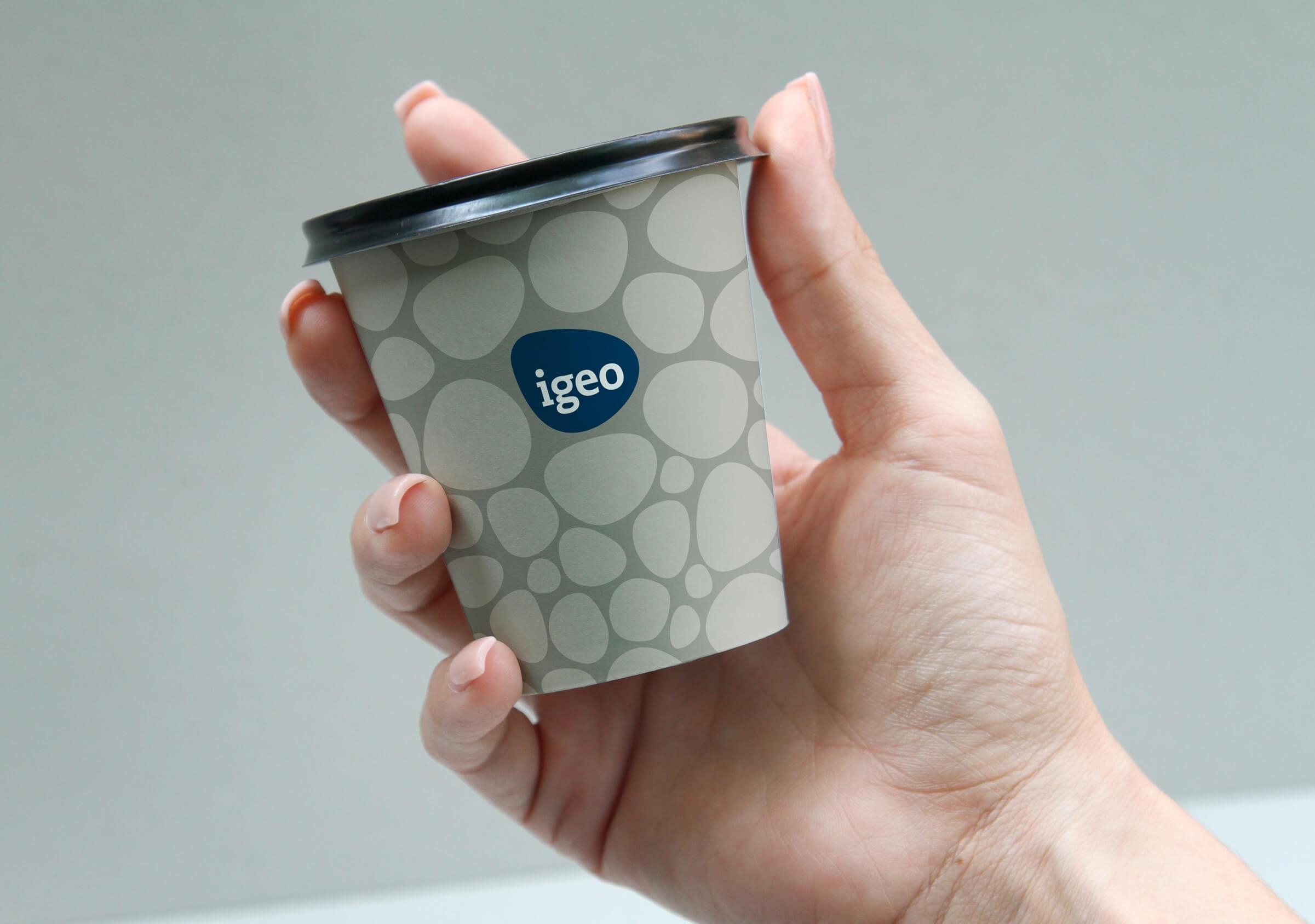
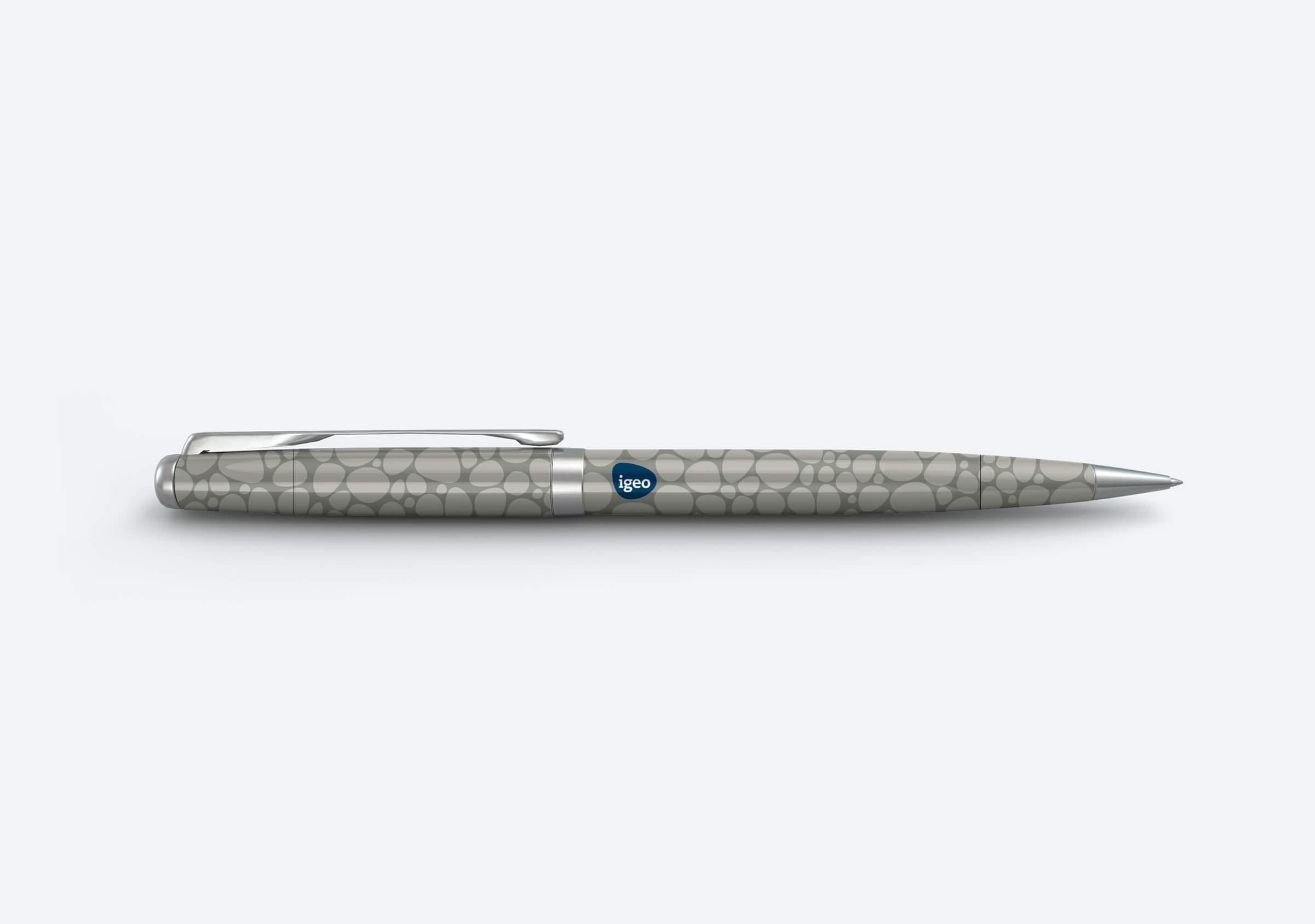
We designed a complementary visual language as wefts based on the morphology of the symbol. It adds richness to Igeo’s identity, and was thought to be implemented as a second stage of communication, once the brand begins to be known.
