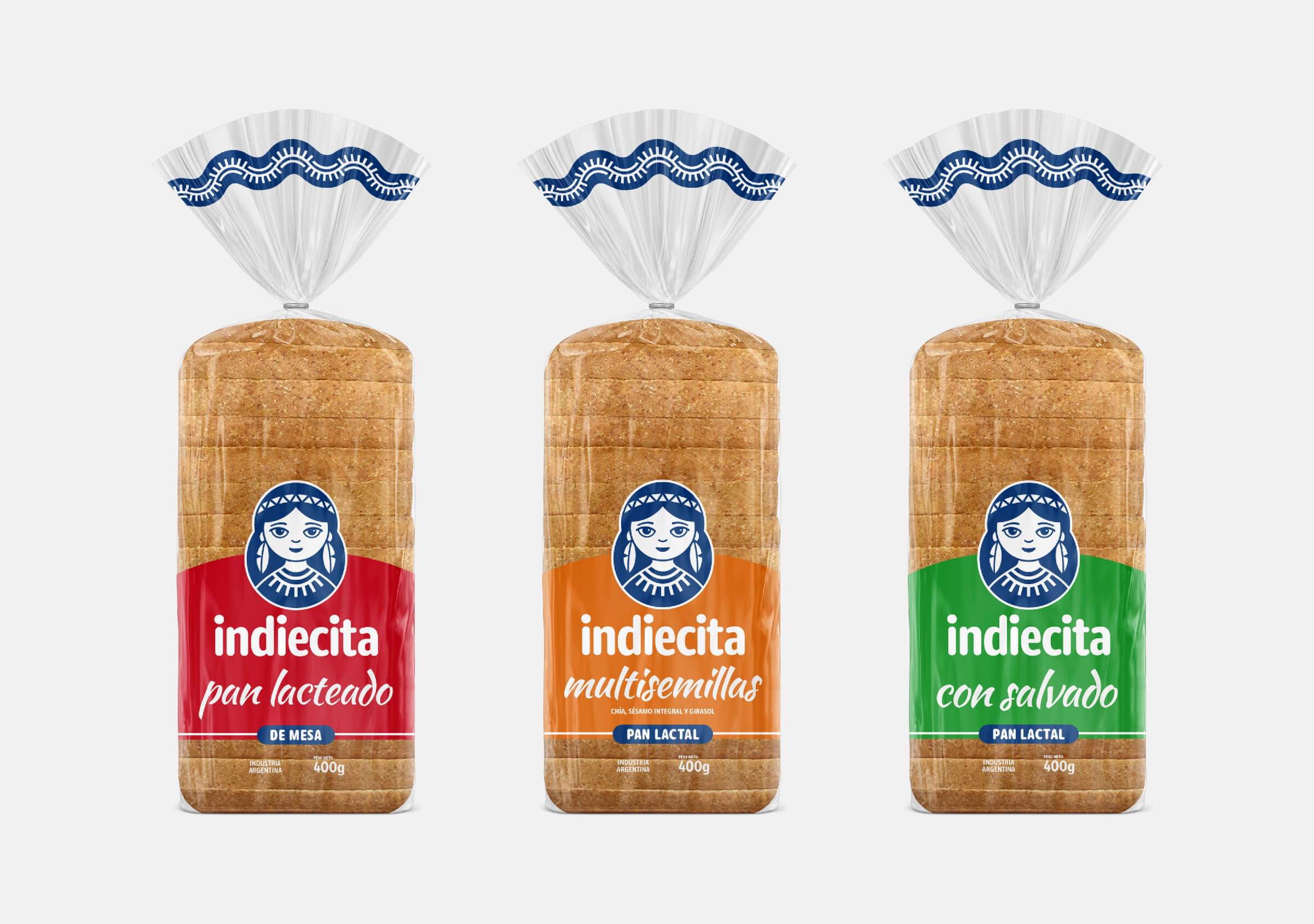
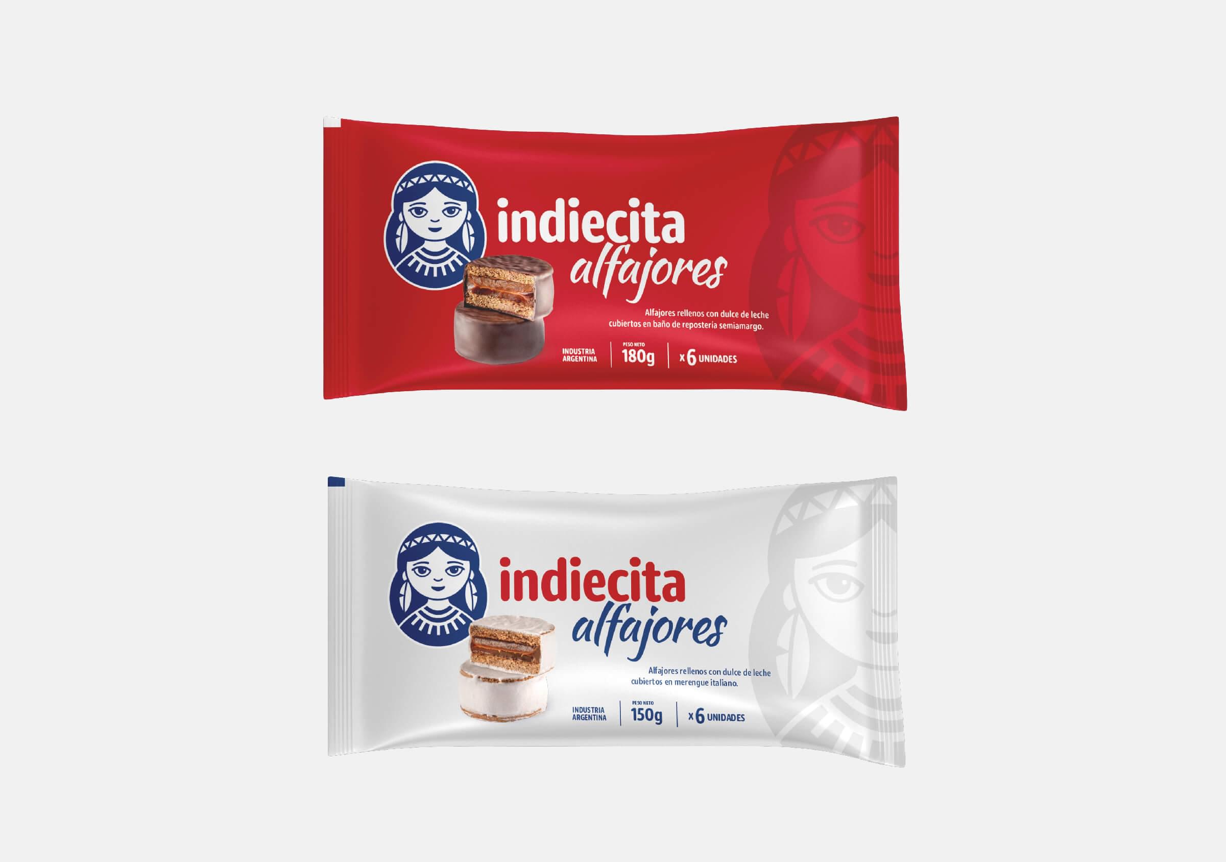
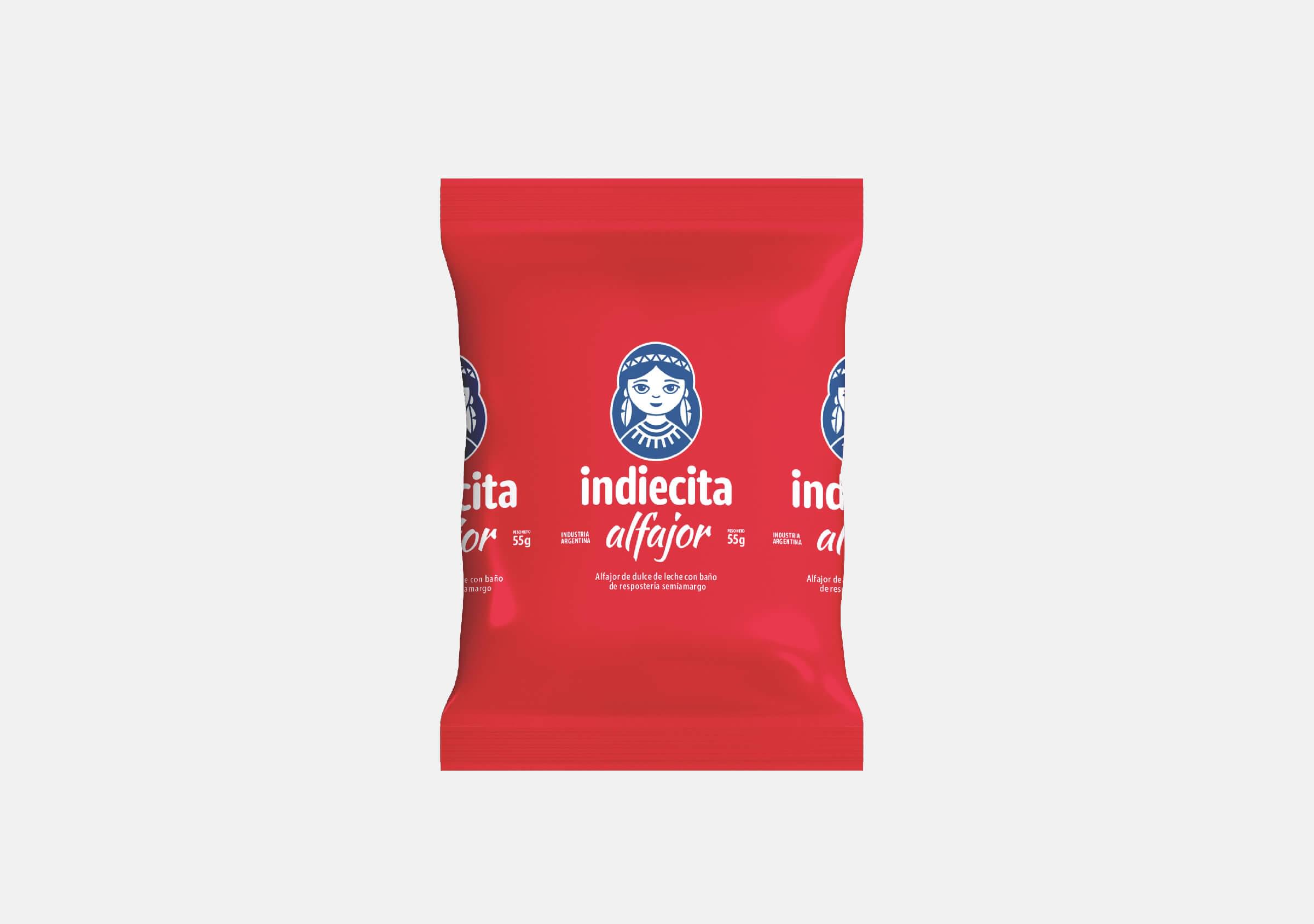
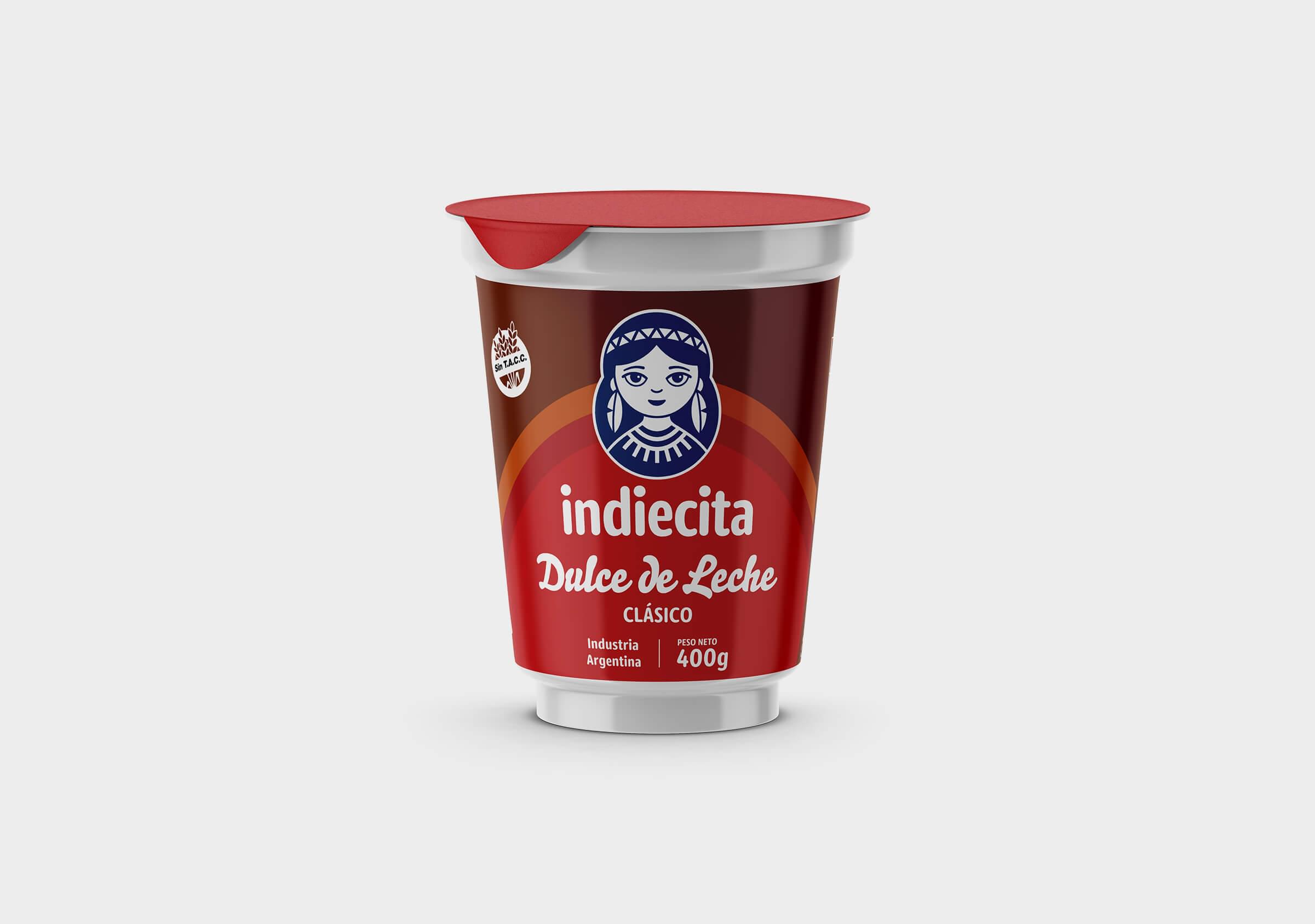
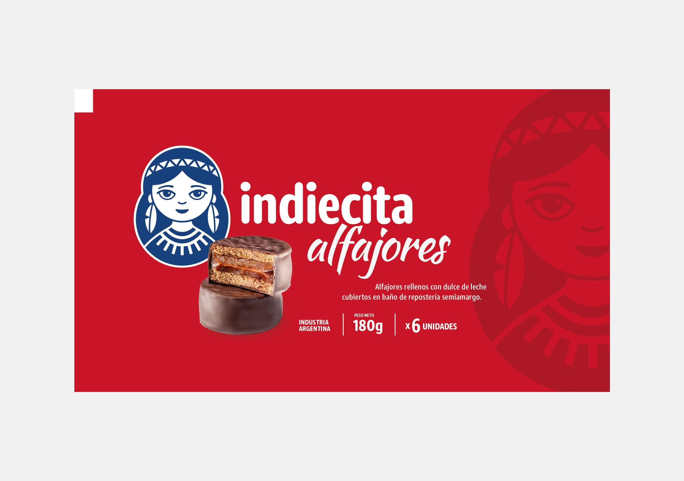
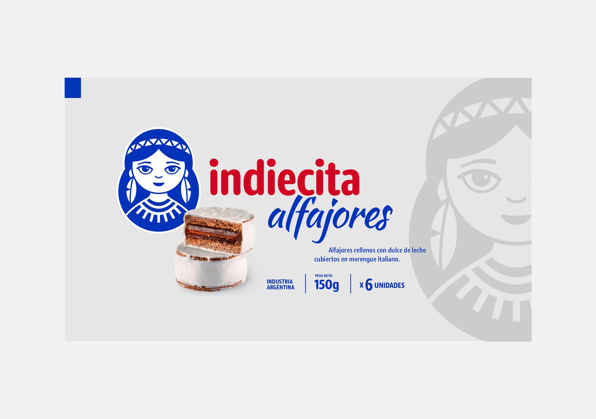
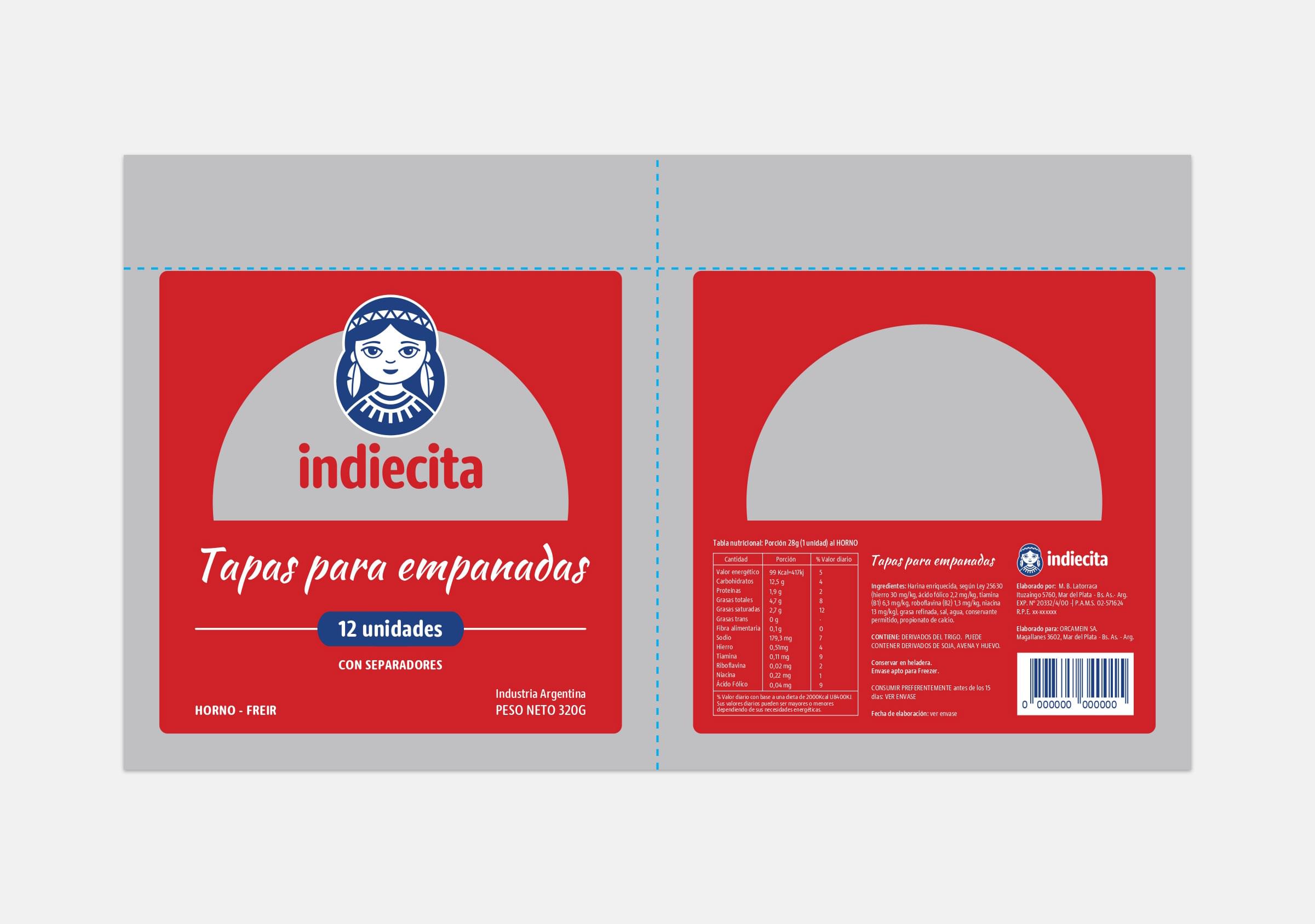
For each of the product lines, we analyzed the category visual language and the technical requirements of each package, ensuring that each food (in its particular format) was clearly identified as part of the Indiecita portfolio, while standing out from its competition. In the case of the dulce de leche, for example, we incorporated a shade of brown into the palette so that the product was recognised by the market as a caramel spread. In the breads we used different tones by type of bread (wheat, bran and multiseed). On the other hand, for the alfajores, we carried out a photo session, which allowed us to include an image of the product on pack, providing visual richness and resulting in more attractive packaging.
