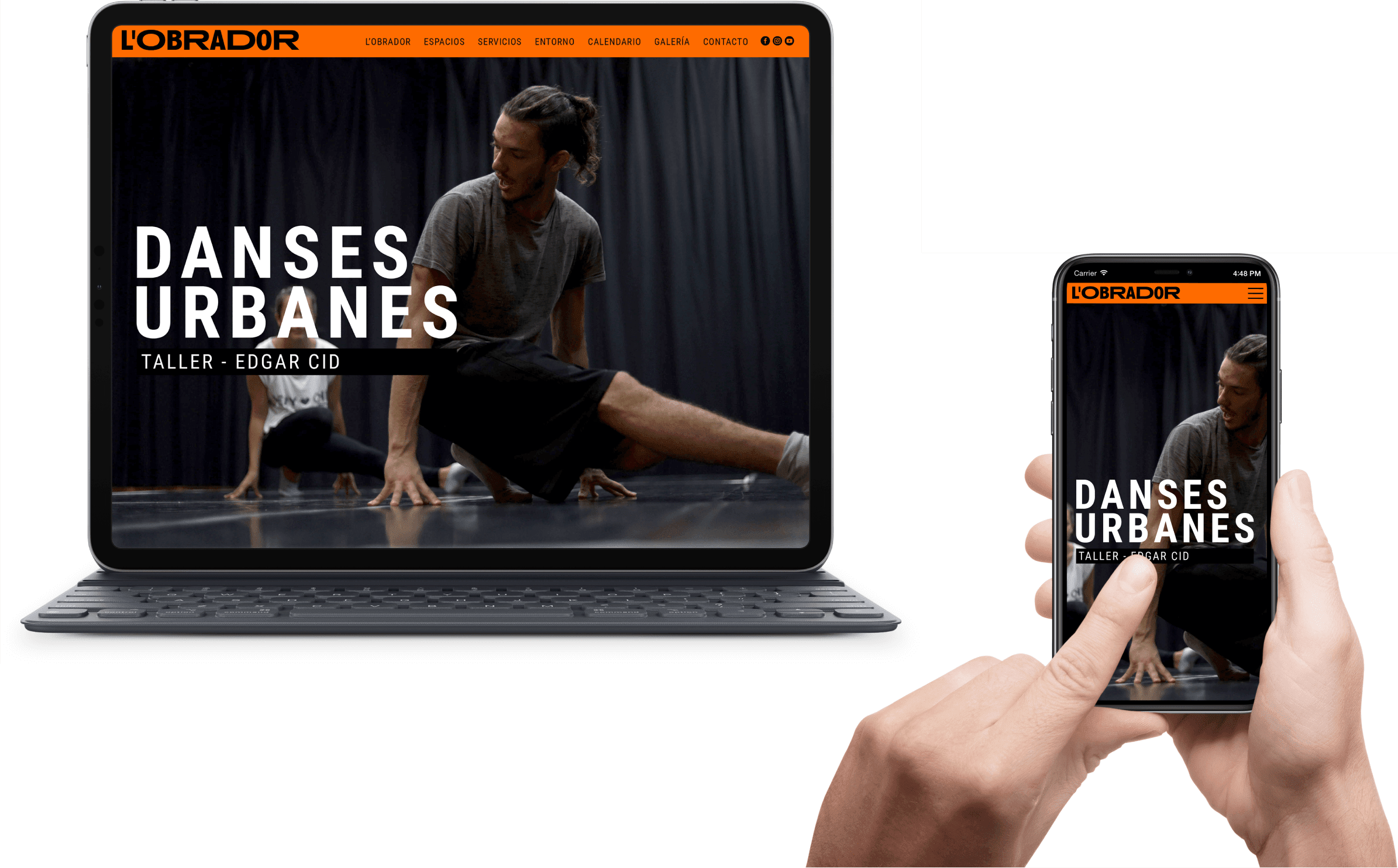
- Fuego Yámana
- /
- L’Obrador
L´Obrador
L’Obrador is a center for creation and exploration of movement, located in Delta del Ebro (Spain). Headquarters of the contemporary dance company ROPA – for which we had already carried out a rebranding – in this instance we were called again to redesign this brand.
espailobrador.com
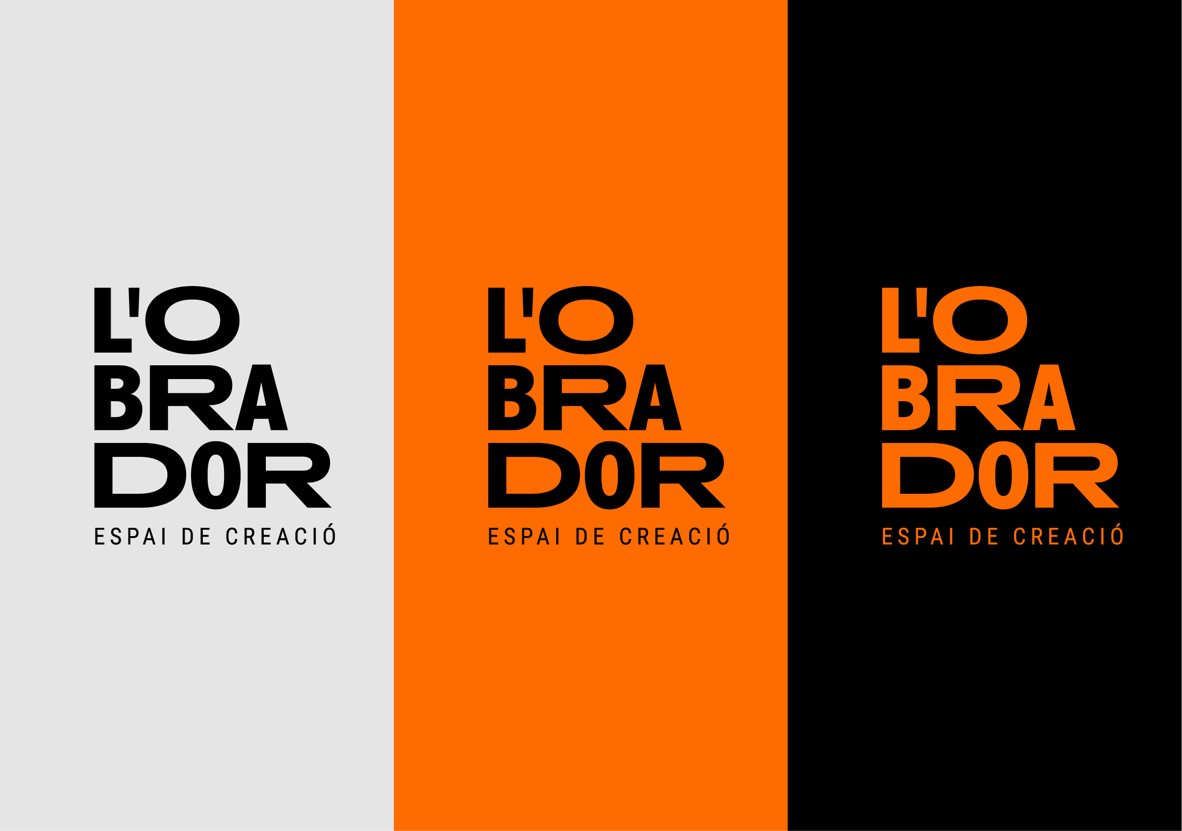
The proposed graphic brand strategy consisted of designing a logo composed solely of the letters of L’Obrador, modifying the use of upper and lower case letters in order to improve the legibility of the name.
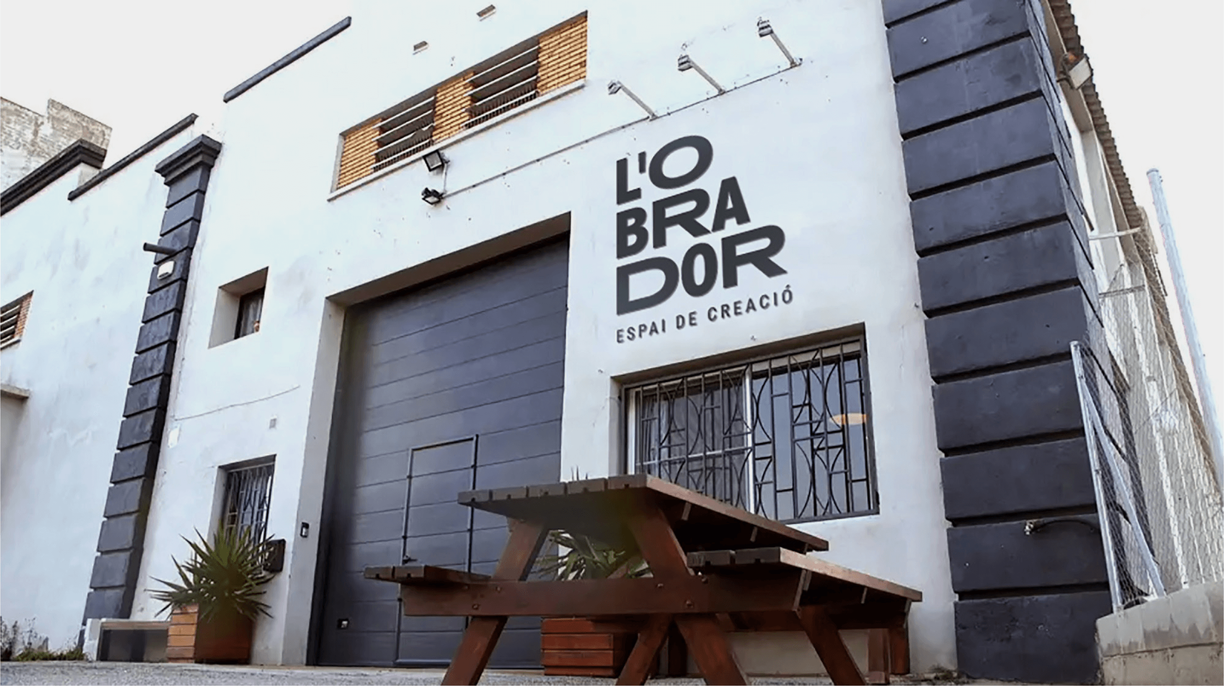


We were looking for a typography with personality, which, together with the composition of the word, would be capable of providing uniqueness to the graphic brand, while at the same time, giving freedom and creativity when applying it in various pieces, allowing to naturally accompany the main values of the brand: the promotion of talent, transculturality and innovation.
The use of the Anisette Std typeface in a set of uppercase and lowercase letters made it possible to achieve the distinction and character of the sought-after brand, which was enhanced with the use of color. For the primary palette, we kept black, intensifying the orange used in the original logo. The secondary colors proposed are vibrant, providing a lot of strength and wide use.
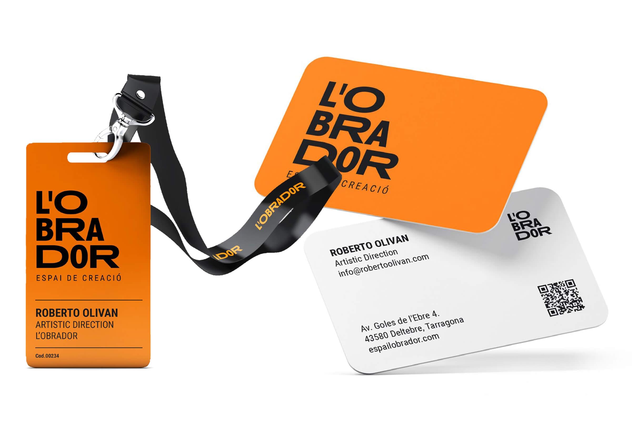
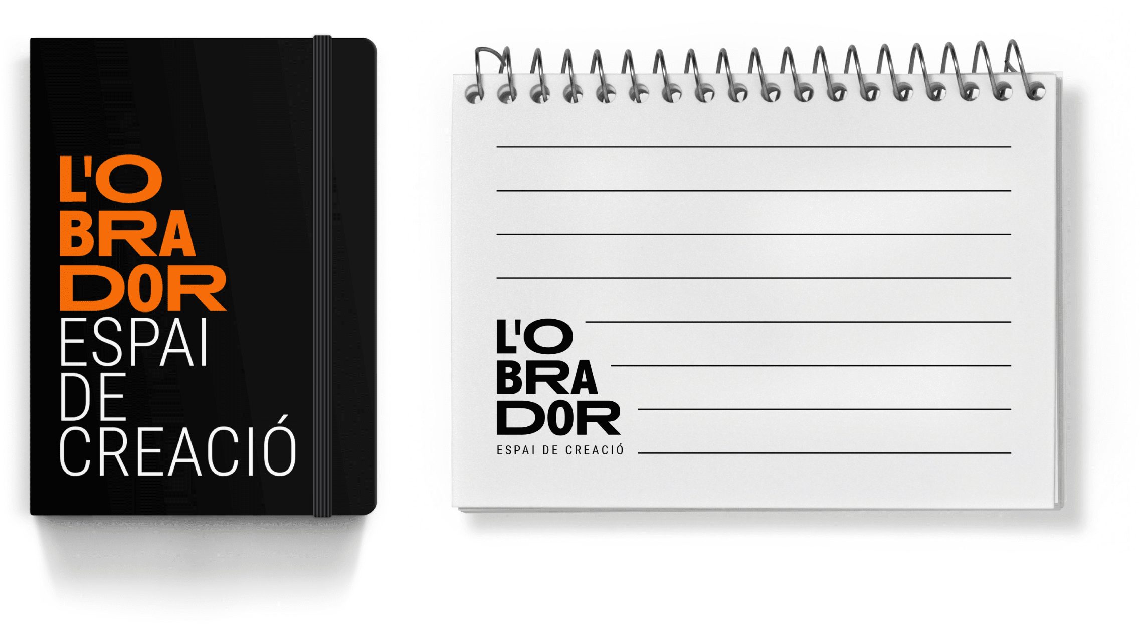
The new visual identity proposed is of contemporary design, with visual proposals that break with the traditional and, just as the company does with movement, invite us to explore the limits of each instance of communication.
