- Fuego Yámana
- /
- Velati
Velati
Velati is a real estate company with a long history and recognition in the city of Mar del Plata. As part of their office remodeling and the beginning of a new communication line, they detected the opportunity to update their visual identity.
velati.com.ar
Studying the history of the brand, we detected that it had gained high recognition at the same time it possessed some attributes as its good readability. Its symbol, consisting of an orange V symbolizing two building structures (monoblock style), associated the logo with the construction industry, the bricks and the buildings, but it was far from the idea of an empathetic brand and lacked the link to people and their relationships, which the company wanted to highlight.
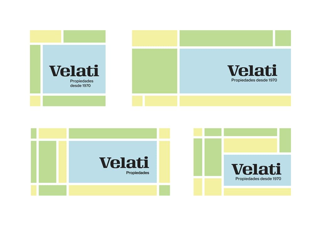
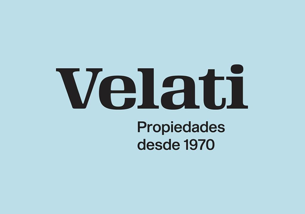
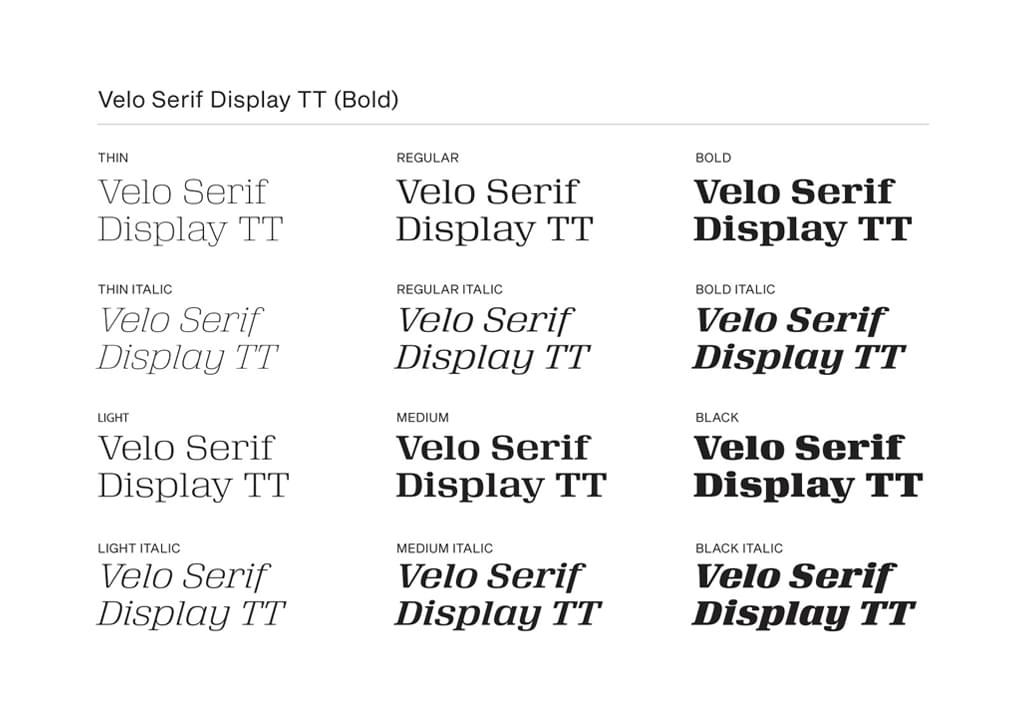
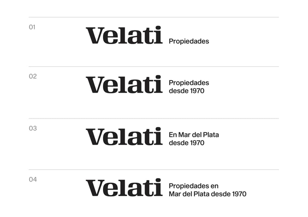
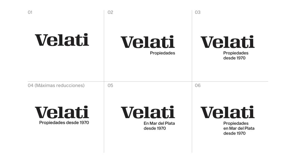
Starting from the concept, we seeked a simple and efficient image, capable of allowing connotations with human quality, people and bonds of trust, leveraging the maturity and prestige gained through more than 50 years of experience. Thus we decided on a typography based brand logo, maximizing the name as the protagonist of the new visual identity. The distinctive Velo Serif Display TT (Bold) typeface was selected to fulfill this function.
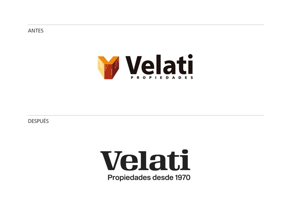
At the same time, we incorporated the descriptive line “Properties in Mar del Plata since 1970”, to highlight their experience in the field, using the complementary Sequel Sans typeface.
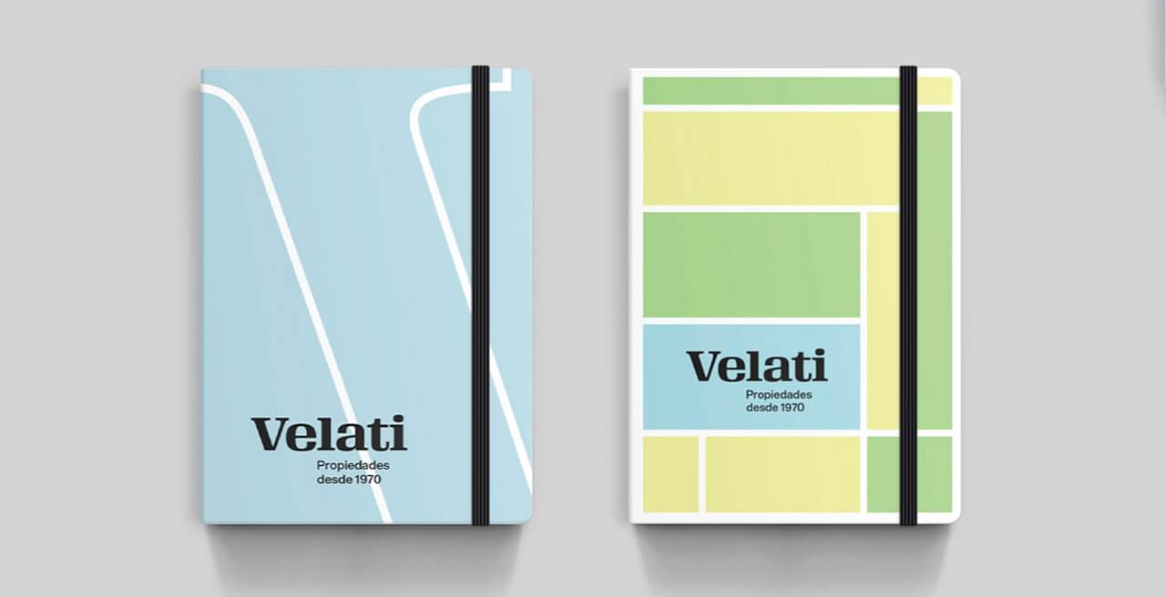
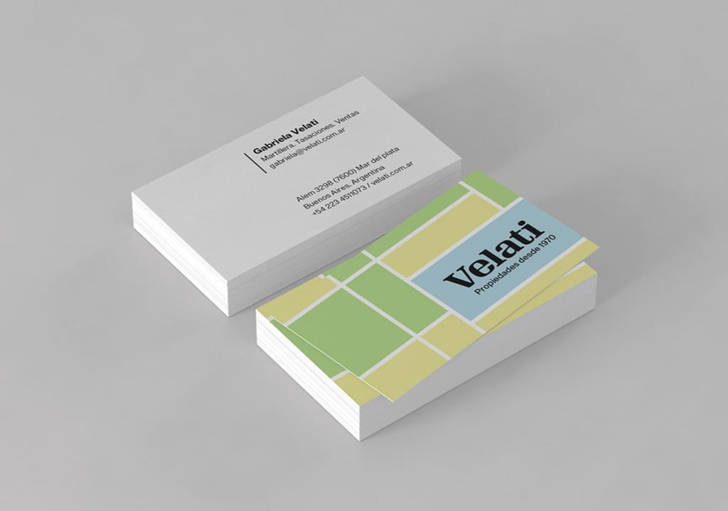
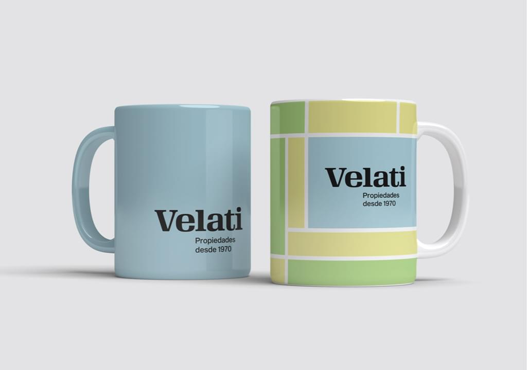
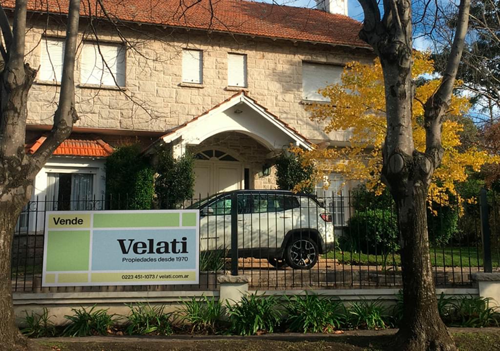
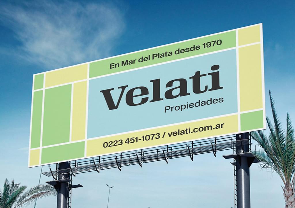
Inspired by the patterns of the urban landscape, as well as those that decorate facades (made up of stones, mosaics or other materials), we designed a background graphic, in the Mondrian style, that gives the brand a strong imprint, which differentiates it and visually stands out within the real estate business. In this way we aimed to reflect the values of closeness, warmth and uniqueness that Velati wanted to convey with their new identity.
